
Basic section
The Basic section is a two-column (50/50) layout pattern for presenting a single topic with a mix of content blocks. It can include text, images, videos, lists, code snippets, logos, and call-to-action elements.
Choose this pattern to communicate a single topic that can be clearly conveyed in a side-by-side, two-column structure.
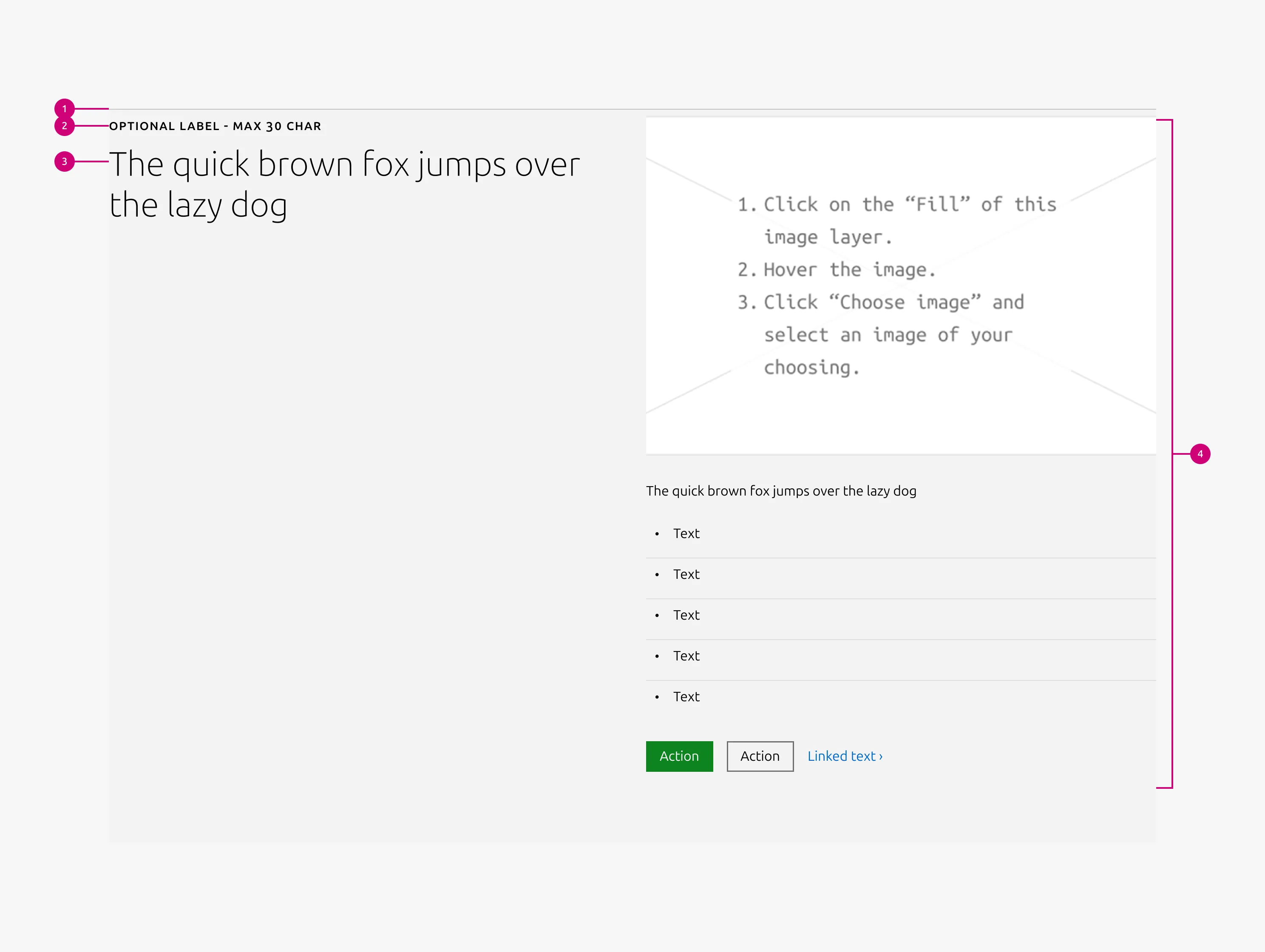
Anatomy
Usage
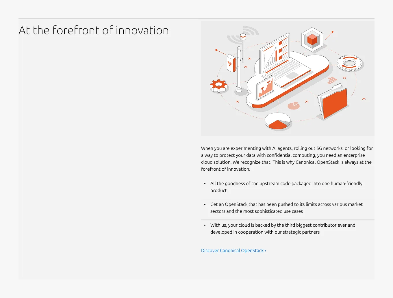
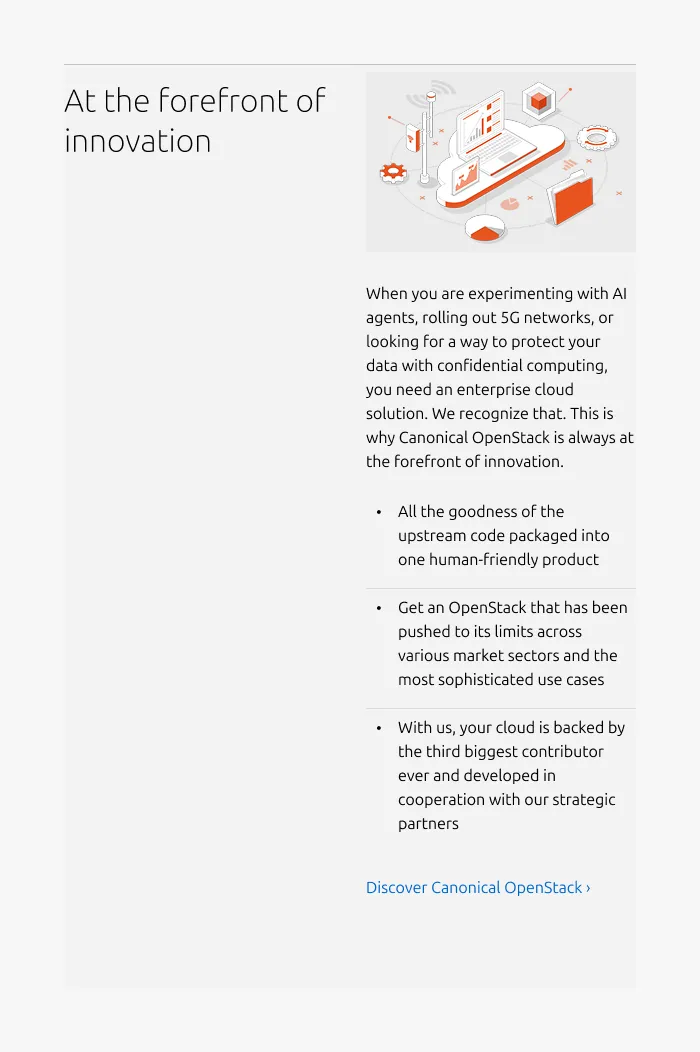
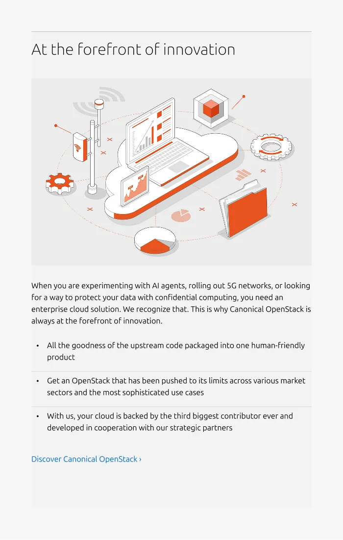
Use the Basic section to communicate one idea and support that idea in a variety of content blocks. To promote readability and cohesion, limit each section to seven or fewer content blocks. This section works best when the copy is concise and each block supports the main topic. Avoid mixing unrelated messages or different content types. The Basic section typically works best with a title on the left and supporting material on the right. For medium size, the macro has 50/50 and full-width variants to accommodate different content needs.
Layout
Basic section adapts across screen sizes. On medium screens, the layout is configurable: content can split(50/50) or stack vertically(full-width). On small screens, content always stacks.
Supported UI blocks for the Content area
- Subtitle / subheading - Add more hierarchy beneath the title, using H4 or H5.
- Description / body text - Use for long-form descriptions or explanations, when full sentences and paragraphs work best.
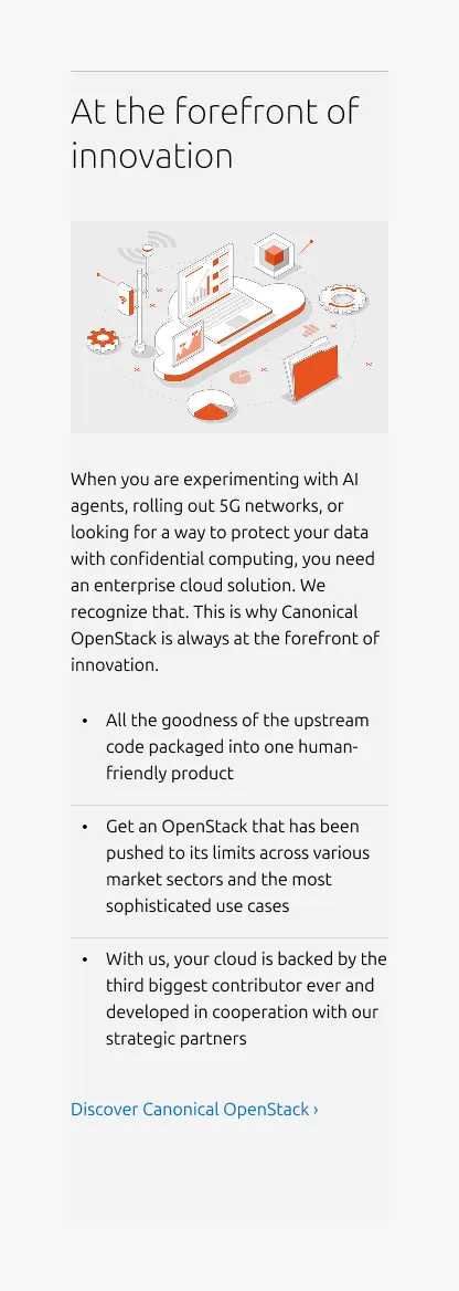
- Image - Include a 3:2 or 16:9 ratio image to illustrate or enhance the content including: photography, isometric illustrations, diagrams, and similar visuals. The image can include an optional caption.
- Video - Embed and link video content in 16:9 ratio.
- List - List up to 10 items, with bullet type options including: none, bullet, status, or number.
- Code block - Display pre-formatted code.
- Logo block - Display related logos such as customers or partners.
- Linked logo block - Display logos that link to additional resources.
- CTA block - Share one or more call-to-action elements, including a primary button, secondary button, and link.
- Notification - Highlight alerts, updates, or contextual messages within the section.
When to use
- You’re not sure what other section to use, this is the fallback
- To present one clear topic with supporting explanatory content
- For both marketing and informational content that requires a flexible pattern
- The 50/50 layout balances text and media for better readability.
When not to use
- When multiple topics or groups require clearer separation, or the content needs to be quickly scanned like a list. Consider the Tiered list, Equal heights, or Divided section instead.
- If one content block is sufficient, use the section for that particular purpose. For example, the Logo section, Linked logo section, or Resources.
- When an immersive or highlight-oriented layout is appropriate, use the Rich vertical list, or Text spotlight or Data spotlight sections.
Examples
Responsive
Medium dimension (50/50 split)
Medium dimension (full-width)
Small dimension
Properties
| Name | Type | Required | Description | Constraint | Options | Default option |
|---|---|---|---|---|---|---|
| Section rule | object | Yes | The rule component indicates the beginning of a new pattern | Only use the default style for the section-level rule | default | default |
| Heading | string | Yes | 4-column width heading using H2 | Up to 60 characters | - | - |
| Linked heading | single select | No | The heading may function as a link when clearly indicated. | - | default, link | default |
| Subheading | string | No | The subheading provides additional hierarchy beneath the main title | h4: up to 100 characters h5: up to 160 characters | h4, h5 | h5 |
| Block item bottom padding | single select | No | The type of padding applied to the block item | The last block item of the pattern/block must not have bottom padding. | none, shallow | none |
| Medium layout | single select | No | Indicate layout for the medium dimension | - | 50/50, full-width | full-width |
| Bottom padding | single select | Yes | The type of padding applied to the bottom of the pattern | - | default, deep, shallow, none | default |
| Eyebrow | string | No | The eyebrow placed above the heading using muted heading | Up to 30 characters | - | - |
| Body | string | No | 4-column width body text | Up to 600 characters | - | - |
Child properties
CTA block
| Name | Type | Required | Description | Constraint | Options | Default option |
|---|---|---|---|---|---|---|
| Primary CTA | string | No | The CTA used with the positive button style. It indicates a high-priority, positive action and is reserved for hero areas or other key call-to-action sections. | Up to 20 characters | - | - |
| Secondary CTA | string | No | The CTA using the default button style. It is used for most actions that are positive but not primary, and may serve as the main CTA in non-hero sections. | Up to 20 characters | - | - |
| Link CTA | string | No | The text link used for contextual actions or pathways to more information. It uses a chevron (›) to indicate navigation to additional content or pages. | Up to 60 characters | - | - |
Code
| Name | Type | Required | Description | Constraint | Options | Default option |
|---|---|---|---|---|---|---|
| Text | string | Yes | The code that is being shown inside of the code component. | - | - | - |
Notification
| Name | Type | Required | Description | Constraint | Options | Default option |
|---|---|---|---|---|---|---|
| Type | single select | Yes | What semantic type the notification is. | - | information, negative, positive, caution | - |
| Border | boolean | No | Wether the notification has a border or not. Borderless notifications are used for example in Table. | - | true, false | true |
| Inline | boolean | No | Wether the title and description of the notification are being shown in one line. reduces the overall height of the notification allowing it to be used where space is at a premium. | - | true, false | false |
| Title | string | No | Sets the content of the title. | - | - | - |
| Description | string | No | Sets the content of the description. | - | - | - |
| Dismissible | boolean | No | Wether or not the notification can be dismissed. If it can be dismissed the dismiss button is being shown. | - | true, false | true |
| Actions | slot | No | Allows to give associated actions with the notification. | Action link components | - | - |
| Time stamp | string | No | Can be set to the timestamp when the event when that triggered the notification took place. | Date formatted string | - | - |
Logo block
| Name | Type | Required | Description | Constraint | Options | Default option |
|---|---|---|---|---|---|---|
| Logo block | object | Yes | The logo block showcases a group of related images, such as a group of customer or partner logos. | - Avoid exceeding 10 logos - Linking individual logos is not allowed | - | - |
Linked logo block
| Name | Type | Required | Description | Constraint | Options | Default option |
|---|---|---|---|---|---|---|
| Linked logo image | object | Yes | 16:9 image container with the logo image inside | - | - | - |
| Link text | string | Yes | The link text for the logo | Up to 60 characters | - | - |
Images
| Name | Type | Required | Description | Constraint | Options | Default option |
|---|---|---|---|---|---|---|
| Image | slot | No | The container for placing visual content such as images, illustrations, or diagrams. | - | - | - |
| Image aspect ratio | single select | No | Indicate ratio of the image | - | default, 16:9, 3:2 | default |
| Image aspect ratio | single select | No | Indicate ratio of the image | - | default, 16:9, 3:2, 2:3, cinematic, square | default |
| Image responsive aspect ratio | multi select | No | Change the aspect ratio of an image container, depending on the screen size | - | 16:9, 3:2, 2:3, cinematic, square on large, on medium, on small | - |
| Image caption | string | No | Optional HTML caption below the image | - | - | - |
List
| Name | Type | Required | Description | Constraint | Options | Default option |
|---|---|---|---|---|---|---|
| List | slot | Yes | The grouping of multiple list items. | Minimum 2. Maximum 10 items. | - | - |
| Orientation | single select | Yes | Whether the list is displayed horizontally or vertically. | - | Vertical, horizontal. | Vertical |
| Text | string | Yes | Sets the content of the list | Up to 250 characters | - | - |
| Marker | single select | No | Decorator for a single list item. | All items in the same level of nesting must have the same marker type. No marker allowed when using dots to separate horizontal lists. | None, bullet, roman number, arabic number, alphabet letter, icon | Bullet |
| Divider (vertical list) | boolean | No | Whether has muted rule between list items | - | true, false | true |
| Divider (horizontal list) | single select | No | Whether the list has vertical line as a separator or a dot. | Dot-separated lists can’t have markers. | None, line, dot | line |
| Nesting level | number | No | Hierarchical list structures | Only vertical lists. | 1-3 | 1 |
Change log
| Who | When | What |
|---|---|---|
| Isaac Kim | 21.11.2025 | Initial commit |
| Maximilian Blazek | 13.02.2026 | Added links |