
CTA block
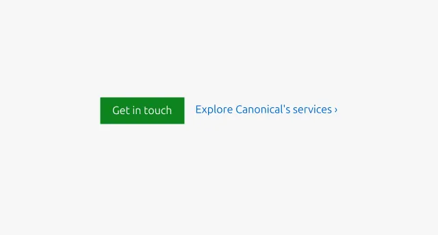
The CTA (call to action) block presents one or more related actions that guide the user toward the next step within a section, such as learning more, making contact, or downloading a resource. It supports primary, secondary, and link-level CTA, all of which are optional and can be combined depending on the context. It provides a visually prominent way to highlight key next steps and should be used when you want to encourage decisive user engagement within a page or section.
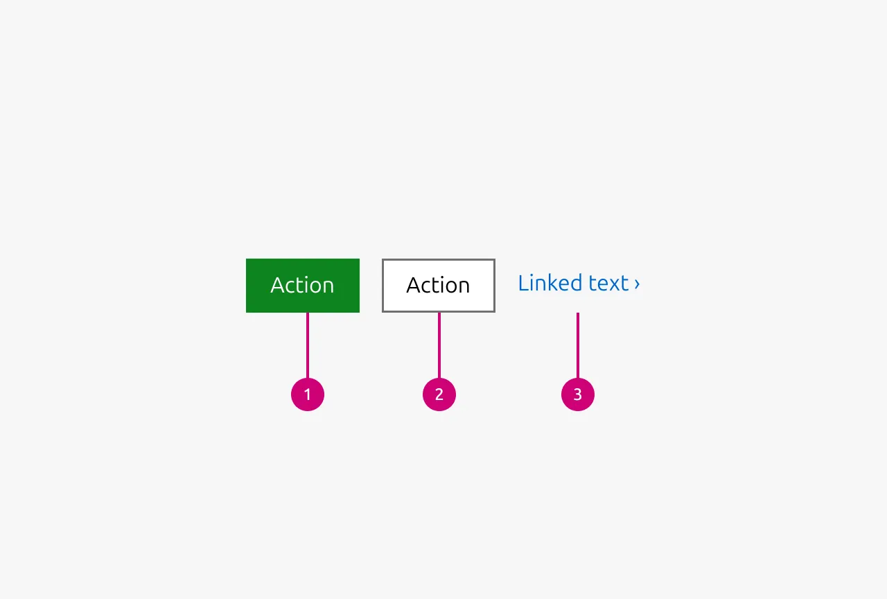
Anatomy
Usage
Use the CTA block to indicate a clear next step in the user journey. Copy should start with an accurate, inclusive verb and clearly state where the user will end up. The block supports primary, secondary, and link-level actions, all of which are optional and can be combined depending on the context.
Choose the appropriate action type based on the priority of the task: use a Primary CTA only in sections that require a clear, high-emphasis step; use Secondary CTA for general navigation or supportive flows; and use Link CTA for lightweight, contextual paths to additional information. Keep copy short, action-oriented, and descriptive of where the user will end up. For more detailed content best practices, refer to the copy style guide.
When to use
- When a section needs to present one or more clear next steps related to its content.
- When guiding users toward a conversion, task, or content pathway that benefits from visual grouping.
- When the section requires a defined hierarchy of actions, such as highlighting one main option and supporting it with alternatives.
When not to use
- When more than three competing actions must be shown together.
- Use a list with link type or restructure content to limit actions to one clear choice.
- When the actions are not related or cannot be meaningfully grouped together in one block.
- Separate them across individual subsections or sections.
- When the primary purpose of a section is to present and emphasise a single CTA.
- Use CTA section instead.
- Button type (Primary CTA, Secondary CTA): when the text cannot be expressed clearly within 20 characters.
- Use Link CTA instead.
Properties
| Name | Type | Required | Description | Constraint | Options | Default option |
|---|---|---|---|---|---|---|
| Primary CTA | string | No | The CTA used with the positive button style. It indicates a high-priority, positive action and is reserved for hero areas or other key call-to-action sections. | Up to 20 characters | - | - |
| Secondary CTA | string | No | The CTA using the default button style. It is used for most actions that are positive but not primary, and may serve as the main CTA in non-hero sections. | Up to 20 characters | - | - |
| Link CTA | string | No | The text link used for contextual actions or pathways to more information. It uses a chevron (›) to indicate navigation to additional content or pages. | Up to 60 characters | - | - |
Child properties
Button
| Name | Type | Required | Description | Constraint | Options | Default option |
|---|---|---|---|---|---|---|
| Type | single select | No | Type controls the semantic type of the button. | - | default, base, brand, positive, negative | default |
| State | single select | No | The state the button is currently in. | - | default, hover, active, processing, disabled | default |
| Size | single select | No | Controls the size of the button. Smaller sizes can be used in places where space is at a premium. | - | default, small, dense | default |
| Text | string | No | Determines the Text that is being displayed in the button. Either text or an icon needs to be provided. If no text is provided but an icon is it is an icon only button | - | - | - |
| Icon left | single select | No | Determines the type of icon that is shown in the button on the left side. Either the text or this icon needs to be provided. If only this icon is provided then it is an icon only button. If no icon is provided the icon is not shown | - | Available icons in Vanilla | - |
| Icon right | single select | No | Determines the type of icon that is shown in the button on the right side. While there is no restriction which icon can be shown here be aware that semantic icons should be shown on the left. For the most part only chevrons are used on this side. | - | Available icons in Vanilla | - |
Change log
| Who | When | What |
|---|---|---|
| Maximilian Blazek | 13.02.2026 | Added links |
| Isaac Kim | 08.12.2025 | Initial commit |