
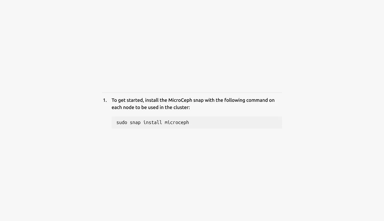
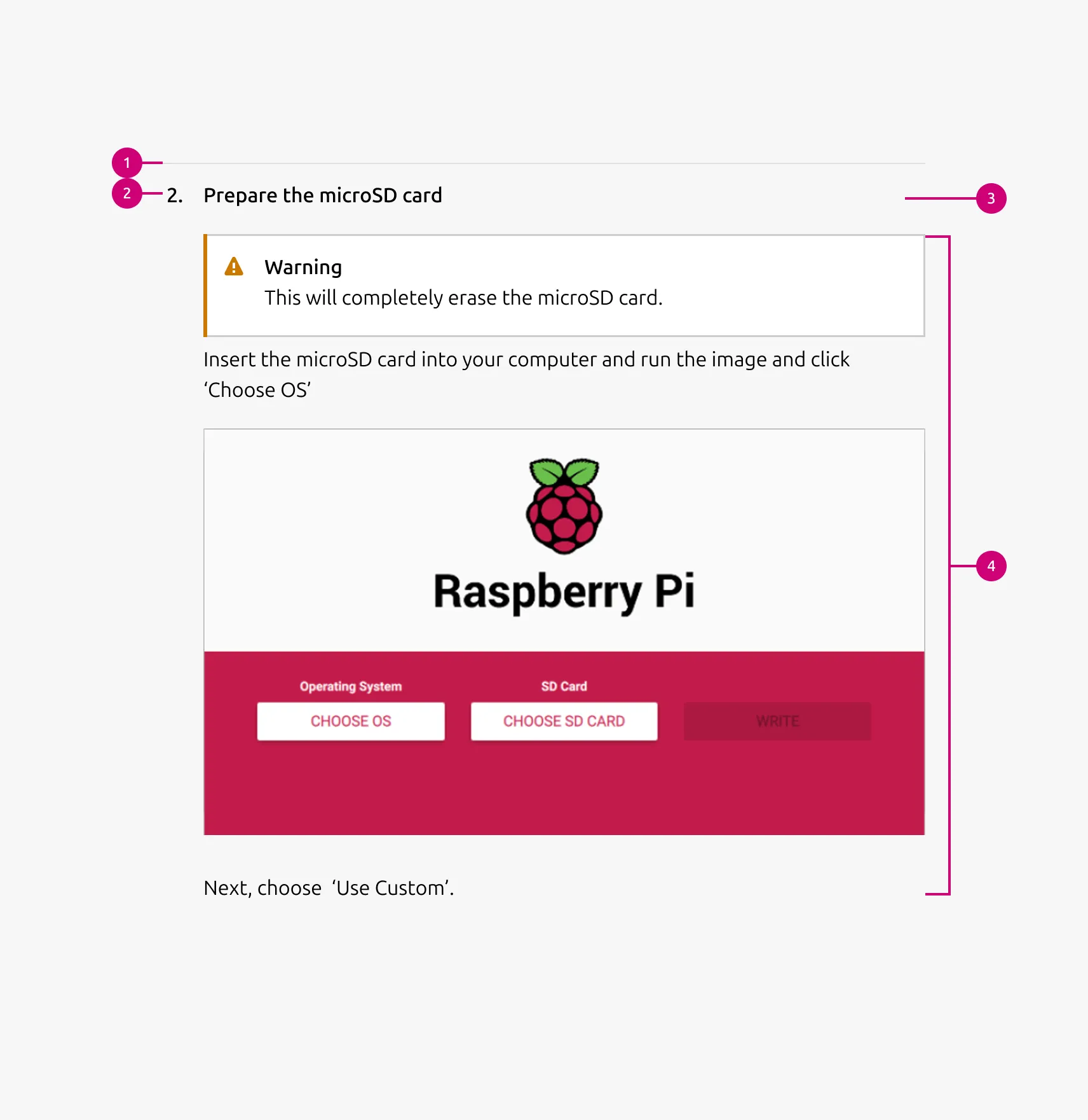
Divided block
The divided block is a content unit that represents a single step, stage, or content item. It supports a wide range of content types, including text, Images, videos, List, Code, Logo block, Notification, and CTA block. This block is used as the primary content unit in the Divided section.
Anatomy
Usage
Use Divided block to present multiple related items within a single section while keeping each item clearly separated. It works best when each item may require a different combination of content elements.
Divided block is well-suited for step-based content such as tutorials, setup guides, onboarding flows, or implementation processes. It also works for presenting multiple items within a single topic — such as stages in a workflow, feature explanations, or grouped content items — where internal separation is needed without introducing a full section break.
Supported UI blocks for the Content area
- Description / body text - Use for long-form descriptions or explanations, when full sentences and paragraphs work best.
- Image - Include a 3:2 or 16:9 ratio image to illustrate or enhance the content including: photography, isometric illustrations, diagrams, and similar visuals. The image can include an optional caption.
- Video - Embed and link video content in 16:9 ratio.
- List - List up to 10 items, with bullet type options including: none, bullet, status, or number.
- Code block - Display preformatted code.
- Logo block - Display related logos such as customers or partners.
- Linked logo block - Display logos that link to additional resources.
- CTA block - Share one or more call-to-action elements, including a primary button, secondary button, and link.
- Notification - Highlight alerts, updates, or contextual messages within the section.
When to use
- Each item represents a single step, stage, or content item within a broader topic
- Items need clear visual separation while remaining part of the same section
- Each item may contain a different combination of content types
- Content requires richer structure than a simple heading and body
When not to use
- All blocks share the same content structure — use Basic section without a dividing rule instead
- The image is the primary content with only brief supporting text — use an Equal height block instead
- Content is purely text-based — use Tiered list instead
Properties
| Name | Type | Required | Description | Constraint | Options | Default option |
|---|---|---|---|---|---|---|
| Block rule | object | Yes | The rule component to separate each block | - | mute | mute |
| Heading | string | No | 4-column width H5 heading for divided block | Up to 160 characters | true, false | true |
| Bullet style | single select | No | The bullet style defines how the block heading is visually presented within each divided block. When the bullet option is used, an additional 32px indent is applied to the content area below the heading to align the content visually with the bullet marker. | - | number, bullet, status, none | number |
| Block item bottom padding | single select | No | The type of padding applied to the block item | The last block item of the pattern/block must not have bottom padding. | none, shallow | none |
Child properties
Images
| Name | Type | Required | Description | Constraint | Options | Default option |
|---|---|---|---|---|---|---|
| Image | slot | No | The container for placing visual content such as images, illustrations, or diagrams. | - | - | - |
| Image aspect ratio | single select | No | Indicate ratio of the image | - | default, 16:9, 3:2 | default |
| Image aspect ratio | single select | No | Indicate ratio of the image | - | default, 16:9, 3:2, 2:3, cinematic, square | default |
| Image responsive aspect ratio | multi select | No | Change the aspect ratio of an image container, depending on the screen size | - | 16:9, 3:2, 2:3, cinematic, square on large, on medium, on small | - |
| Image caption | string | No | Optional HTML caption below the image | - | - | - |
CTA block
| Name | Type | Required | Description | Constraint | Options | Default option |
|---|---|---|---|---|---|---|
| Primary CTA | string | No | The CTA used with the positive button style. It indicates a high-priority, positive action and is reserved for hero areas or other key call-to-action sections. | Up to 20 characters | - | - |
| Secondary CTA | string | No | The CTA using the default button style. It is used for most actions that are positive but not primary, and may serve as the main CTA in non-hero sections. | Up to 20 characters | - | - |
| Link CTA | string | No | The text link used for contextual actions or pathways to more information. It uses a chevron (›) to indicate navigation to additional content or pages. | Up to 60 characters | - | - |
Code
| Name | Type | Required | Description | Constraint | Options | Default option |
|---|---|---|---|---|---|---|
| Text | string | Yes | The code that is being shown inside of the code component. | - | - | - |
Notification
| Name | Type | Required | Description | Constraint | Options | Default option |
|---|---|---|---|---|---|---|
| Type | single select | Yes | What semantic type the notification is. | - | information, negative, positive, caution | - |
| Border | boolean | No | Wether the notification has a border or not. Borderless notifications are used for example in Table. | - | true, false | true |
| Inline | boolean | No | Wether the title and description of the notification are being shown in one line. reduces the overall height of the notification allowing it to be used where space is at a premium. | - | true, false | false |
| Title | string | No | Sets the content of the title. | - | - | - |
| Description | string | No | Sets the content of the description. | - | - | - |
| Dismissible | boolean | No | Wether or not the notification can be dismissed. If it can be dismissed the dismiss button is being shown. | - | true, false | true |
| Actions | slot | No | Allows to give associated actions with the notification. | Action link components | - | - |
| Time stamp | string | No | Can be set to the timestamp when the event when that triggered the notification took place. | Date formatted string | - | - |
Logo block
| Name | Type | Required | Description | Constraint | Options | Default option |
|---|---|---|---|---|---|---|
| Logo block | object | Yes | The logo block showcases a group of related images, such as a group of customer or partner logos. | - Avoid exceeding 10 logos - Linking individual logos is not allowed | - | - |
List
| Name | Type | Required | Description | Constraint | Options | Default option |
|---|---|---|---|---|---|---|
| List | slot | Yes | The grouping of multiple list items. | Minimum 2. Maximum 10 items. | - | - |
| Orientation | single select | Yes | Whether the list is displayed horizontally or vertically. | - | Vertical, horizontal. | Vertical |
| Text | string | Yes | Sets the content of the list | Up to 250 characters | - | - |
| Marker | single select | No | Decorator for a single list item. | All items in the same level of nesting must have the same marker type. No marker allowed when using dots to separate horizontal lists. | None, bullet, roman number, arabic number, alphabet letter, icon | Bullet |
| Divider (vertical list) | boolean | No | Whether has muted rule between list items | - | true, false | true |
| Divider (horizontal list) | single select | No | Whether the list has vertical line as a separator or a dot. | Dot-separated lists can’t have markers. | None, line, dot | line |
| Nesting level | number | No | Hierarchical list structures | Only vertical lists. | 1-3 | 1 |
Change log
| Who | When | What |
|---|---|---|
| Isaac Kim | 16.03.2026 | Initial commit |