
Equal height block
The equal height block is a content unit that ensures consistent vertical alignment for multiple items arranged within a row. It standardises the height of each item so that all blocks in the same row share equal dimensions, regardless of variations in content length. This block is used as the primary content unit in the Equal heights.
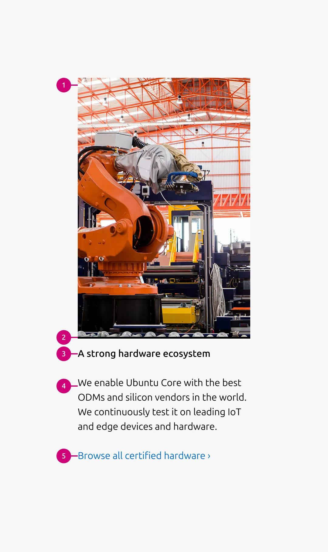
Anatomy
Usage
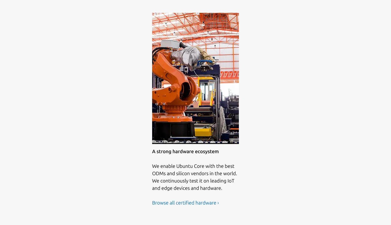
Use the equal heights block to present multiple items in a row where visual alignment and structural consistency are required. The block ensures that each item maintains the same height within the row, creating a balanced and orderly layout. All corresponding elements(Image, Heading, Body, and Link) are optional. However, a minimum of two elements is required. It is recommended that blocks within the same row use a same set of elements.
Each item follows a consistent internal structure to maintain clarity and alignment. The equal height behaviour is applied at the row level, ensuring that corresponding elements(Image, Heading, Body, and Link) align to consistent vertical positions across items. If a heading spans two lines in one item, the same vertical space is reserved for headings in the other items within the row, preserving structural alignment and visual balance.
Image container ratio
The image container ratio defines the aspect ratio applied to item images across responsive breakpoints. Different ratios can be specified for small, medium, and large screens to optimise layout and content visibility per viewport size.
The ratio can be set using predefined image container aspect ratio identifiers, or auto to preserve the image’s original aspect ratio. By default, a 2:3 ratio is used on large dimension, while a square ratio is applied on small and medium dimension to maintain balanced proportions and predictable vertical spacing across breakpoints.
- Large dimension (2:3 ratio)
- Medium, small dimension (square ratio)
Highlighted background
When using images with transparent backgrounds (e.g. illustrations or product images), use the highlighted image with the alt background. This visually separates the image container from the surrounding background and improves clarity within the layout.

Examples
Linked Heading
The Heading may function as a link. In this case, avoid including an additional Link at the bottom of the block.
Without Image

It can be used without Image. However, in such cases, consider using a text-based block such as the Tiered block instead.
Without description and link
A minimum of two elements is required.
Properties
| Name | Type | Required | Description | Constraint | Options | Default option |
|---|---|---|---|---|---|---|
| Linked heading | single select | No | The heading may function as a link when clearly indicated. | - | default, link | default |
| Body | string | No | 2-column width body text | Up to 300 characters (The content is recommended to be limited to a single sentence) | - | - |
| Image | object | No | The image at the top of the block. | - | - | - |
| Image ratio large | single select | No | The aspect ratio to apply to item images on large screens. | - | - square - 2:3 - 3:2 - 6:9 - cinematic - auto(to use the image's original aspect ratio) | 2:3 |
| Image ratio medium | single select | No | The aspect ratio to apply to item images on medium screens. | - | - square - 2:3 - 3:2 - 6:9 - cinematic - auto(to use the image's original aspect ratio) | square |
| Image ratio small | single select | No | The aspect ratio to apply to item images on small screens. | - | - square - 2:3 - 3:2 - 6:9 - cinematic - auto(to use the image's original aspect ratio) | square |
| Highlighted image | boolean | No | Whether to highlight image with the alt background. | - | true, false | false |
| Heading | string | No | 2-column width H5 heading | Up to 60 characters | - | - |
Change log
| Who | When | What |
|---|---|---|
| Isaac Kim | 02.03.2026 | Initial commit |