
Content
Composition model:
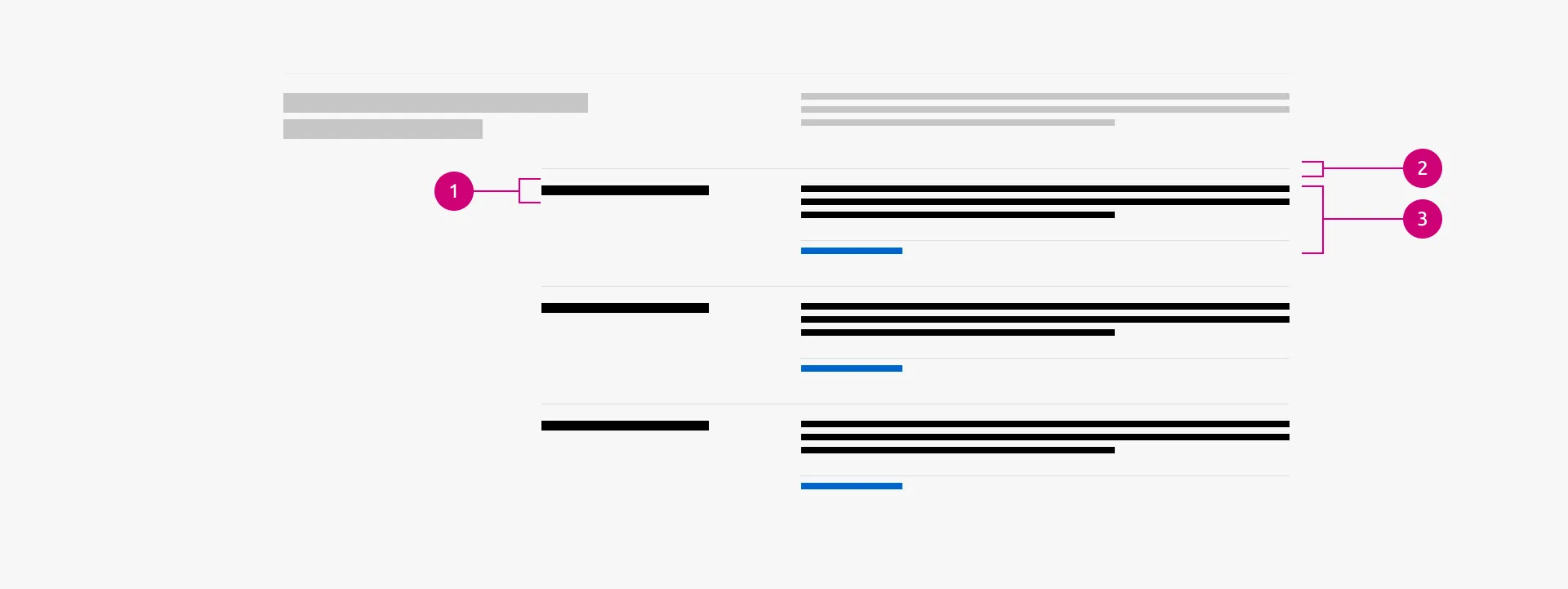
A block is composed of a defined set of elements (typically two to five) that form a repeatable layout, which can be aligned horizontally (1) or stacked vertically (2)within a section. Built from a combination of UI components, blocks establish a consistent visual structure. This consistency allows users to easily scan lists of similar items and provides the visual cues necessary to draw parallels or make comparisons between grouped information.
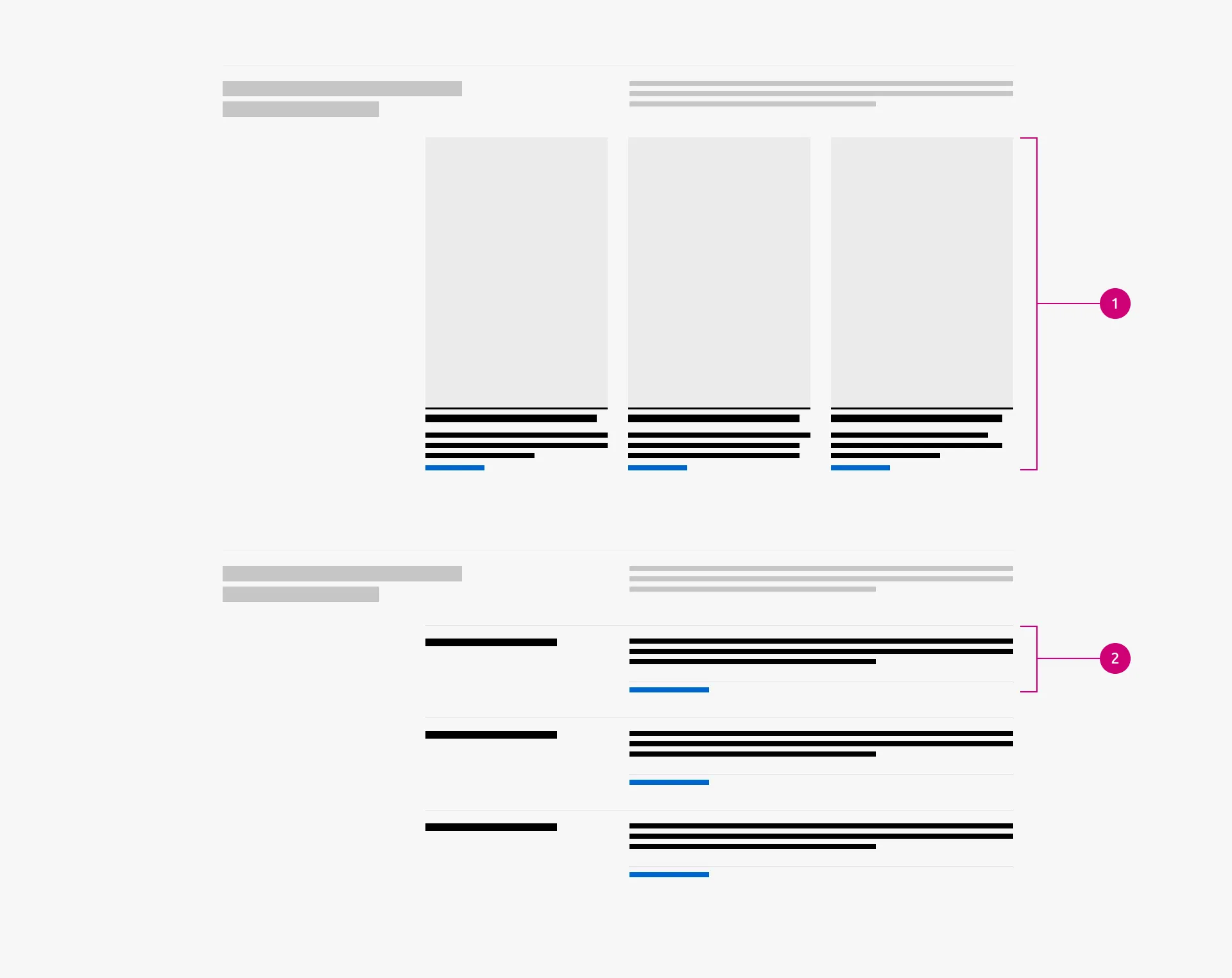
Blocks are constructed from specific building elements arranged in a consistent composition:
- Block Title: Text acting as an introduction. It uses H4, H5, and less often H3 text styling.
- Divider (Rule): A horizontal line with regular style used to visually separate blocks when stacked.
- Content Body: The container for specific UI components (text, image, link, buttons, inputs).
Available blocks:
| BLOCK | STATUS | TITLE | CONTENT PRIMITIVES | VARIANTS |
| :---- | :---- | :---- | :---- | :---- |
| Article block | Stable | H5 | Block title, Description, Author and date, Linked title, Link, Image | 5 |
| Data spotlight block | Stable | H3 | Block title, Number, Description, Link | 1 |
| Divided block | Stable | H5 | Block title, Description, Code block | 1 |
| Equal height block | Stable | H5 | Block title, Description, Image, Link | 1 |
| Linked logo block | Stable | Not applicable | Image, Link | 1 |
| Logo block | Stable | Not applicable | Image (logo) | 3 |
| Pricing option | Stable | H4 | Block title, Label, Description, List, Link | 2 |
| Quote block | Stable | Not applicable | Quote, Name an title, Image (logo), Link | 1 |
| Text spotlight block | Stable | Not applicable | List, Linked title | 1 |
| Tiered block | Stable | H5 | Block title, Description | 1 |
Content guidance:
Block content should be written with the grid in mind. Because blocks sit side-by-side or stack systematically, authors should ensure text lengths are relatively uniform to prevent visual imbalance (e.g., one exceptionally long block adjacent to a very short one). Content across adjacent blocks within the same section must follow a parallel structure. If one block features a title, a two-line description, and a link, its sibling blocks should aim for the exact same content footprint. Keep descriptions concise and try to ensure users can parse the information quickly.