
Tiered block
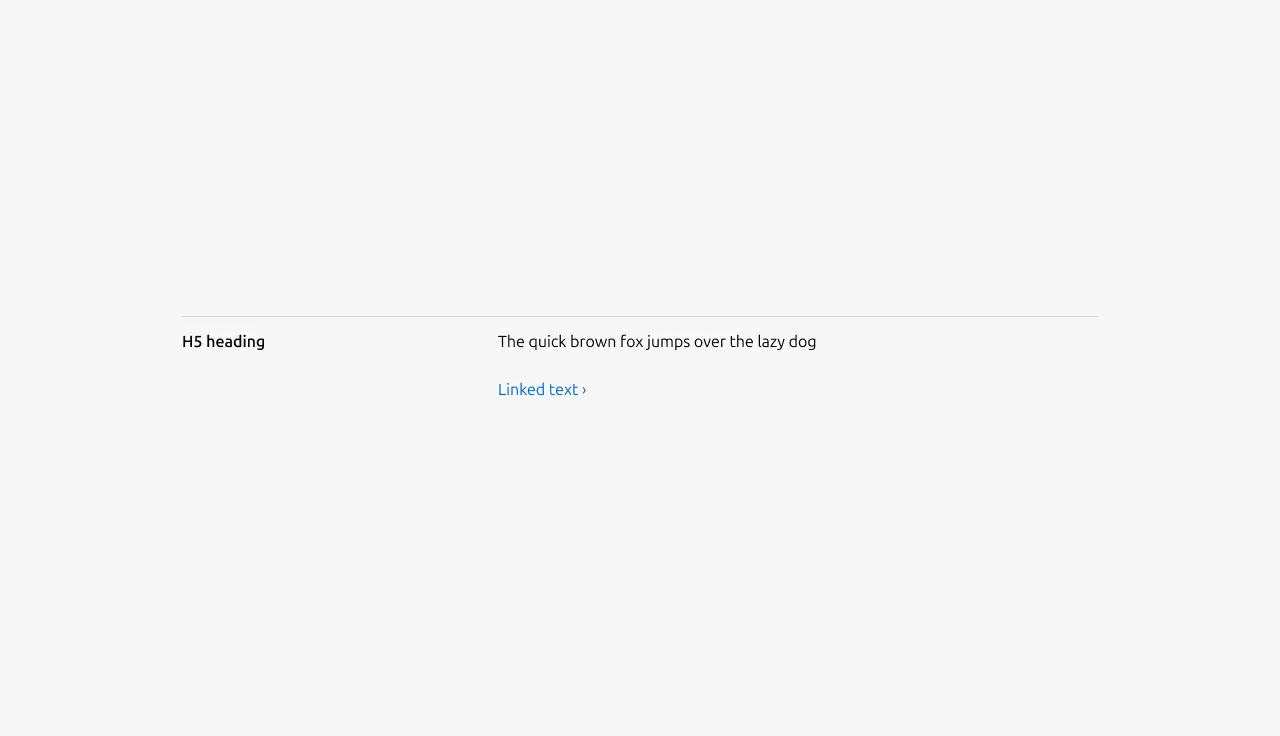
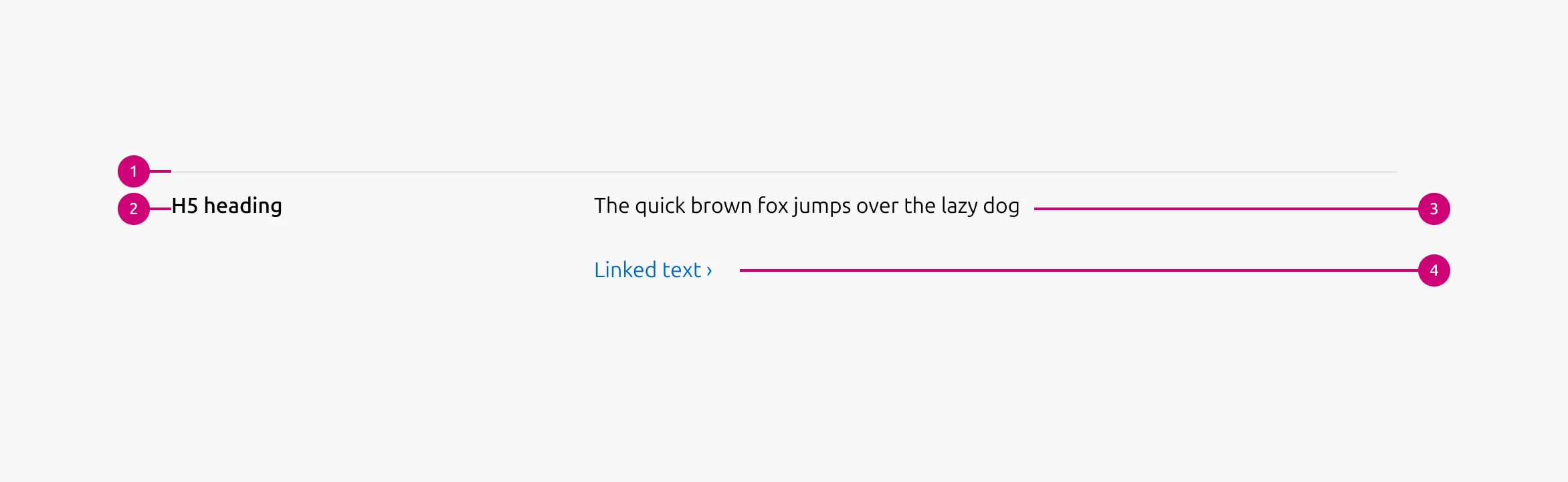
The tiered block is a content unit that pairs a heading with a body to present a single item in a structured, scannable format. An optional CTA link can appear beneath the body. This block is used as the primary content unit in the Tiered list.
Anatomy
Usage
Use Tiered block to present a list of related items that follow a clear hierarchy. It works best for text-heavy content where each item consists of a short heading and supporting body text. An optional CTA link can appear beneath the body.
Tiered block is well-suited for items that represent steps, stages, levels, or grouped concepts. It creates a clear reading flow from top to bottom while keeping each item visually separated within a single sequence.
Layout
The block adapts across screen sizes. On large screens, it uses a 6-column layout — 2 columns for the heading and 4 for the body, arranged in a single row. On medium screens, the layout is configurable: content can split(50/50) or stack vertically(full-width). On small screens, content always stacks.
When to use
- Content is primarily text-based with a short, simple heading and supporting body
- Items represent steps, stages, levels, or grouped concepts
- The page needs a clear top-to-bottom reading flow
- Each item should feel visually separated but part of a single sequence
When not to use
- Content needs a longer heading or rich elements such as code blocks, images, or lists — use Divided section instead
- Overall content is brief, similar in volume across items, and the image is the main focus — use Equal height block instead
Examples
Large dimension
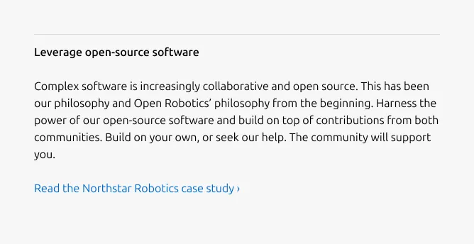
With the CTA link
Linked heading
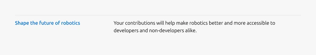
Image heading

Medium dimension (50/50)
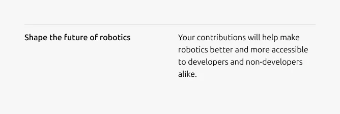
Medium dimension (Full-width)
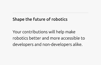
Small dimension
Properties
| Name | Type | Required | Description | Constraint | Options | Default option |
|---|---|---|---|---|---|---|
| Linked heading | single select | No | The heading may function as a link when clearly indicated. | - | default, link | default |
| Block rule | object | Yes | The muted rule component indicates the beginning of a new block | It is not used for the first block and appears from the second block onward. | none, muted | - |
| Heading | string | Yes | 2-column width H5 heading | Up to 60 characters | - | - |
| Image heading | object | No | Image used in place of heading | If an image is used as the heading, it cannot function as a link. | - | - |
| Body | string | Yes | 4-column width body text | Up to 600 characters | - | - |
| Link CTA | string | No | The text link used for contextual actions or pathways to more information. It uses a chevron (›) to indicate navigation to additional content or pages. | Up to 60 characters | - | - |
| Bottom padding | single select | Yes | The type of padding applied to the bottom of the pattern | - | - | deep |
Change log
| Who | When | What |
|---|---|---|
| Isaac Kim | 16.03.2026 | Initial commit |