
Divided section
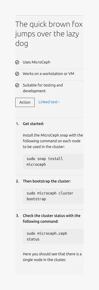
The divided section pattern is used to separate related content into distinct steps or items within a single section. Each item is visually divided using a muted Rule and shallow padding, helping users distinguish between content blocks while maintaining a cohesive layout.
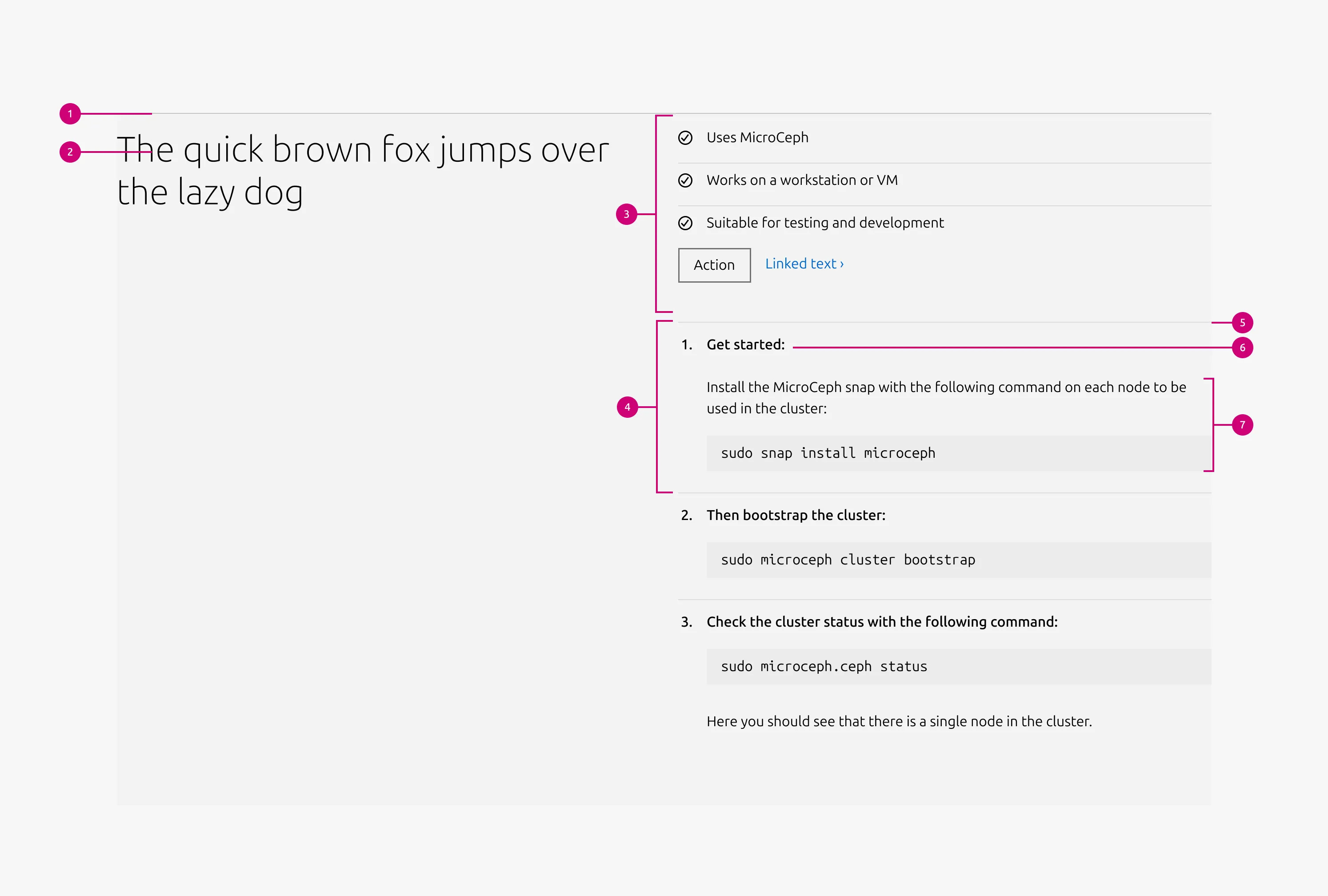
Anatomy
Usage
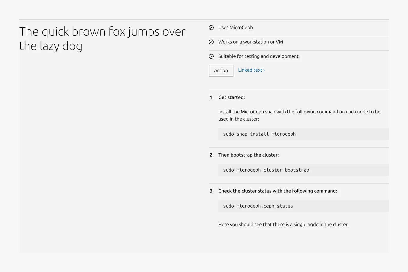
The divided section pattern provides a flexible layout for presenting grouped content that needs clear internal separation, such as steps, stages, or sequential elements. Each Divided block is separated by a muted Rule and shallow padding, creating visual structure without introducing strong section breaks.
The pattern can accommodate a wide range of content types, including text, images, videos, lists, code blocks, logos, and call-to-action elements. Both the section description area and the Divided blocks themselves support these content types.
Internally, the divided section reuses content blocks from the Basic section pattern. As a result, most layout configurations and content options behave identically to those in Basic section, ensuring consistency and reducing the need for additional configuration or learning.
Layout
Divided section adapts across screen sizes. On medium screens, the layout is configurable: content can split(50/50) or stack vertically(full-width). On small screens, content always stacks.
Supported UI blocks for the Content area
- Description / body text - Use for long-form descriptions or explanations, when full sentences and paragraphs work best.
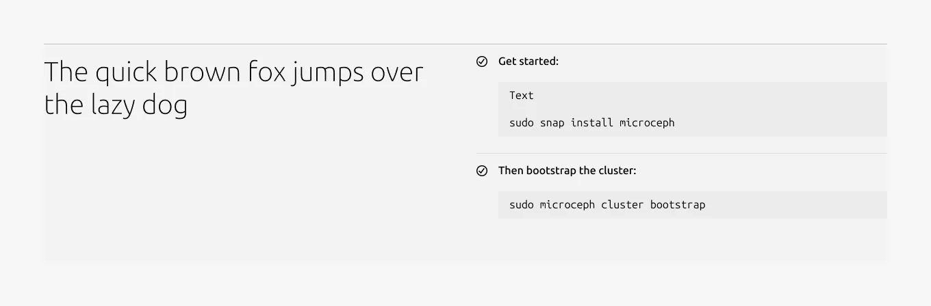
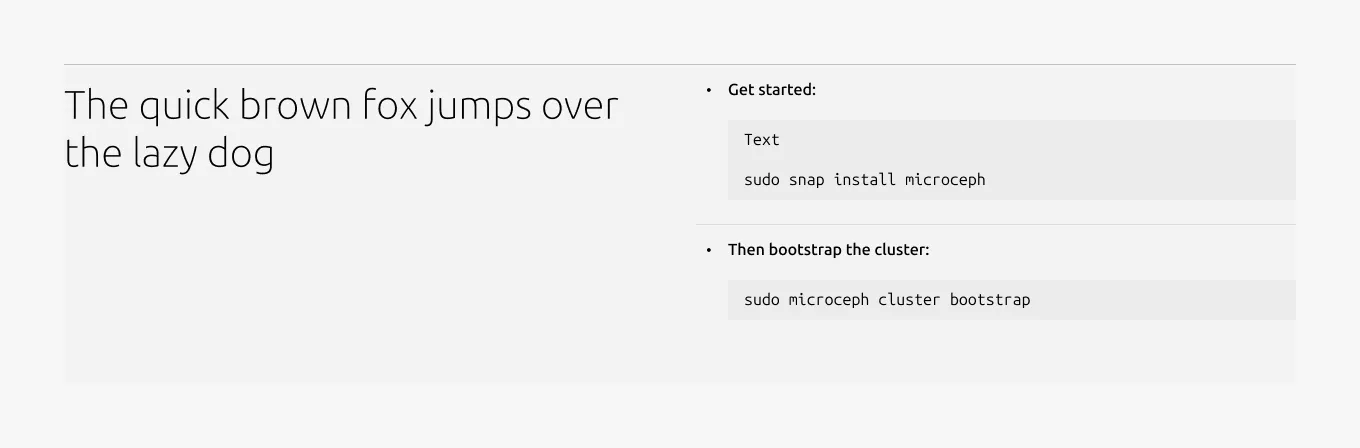
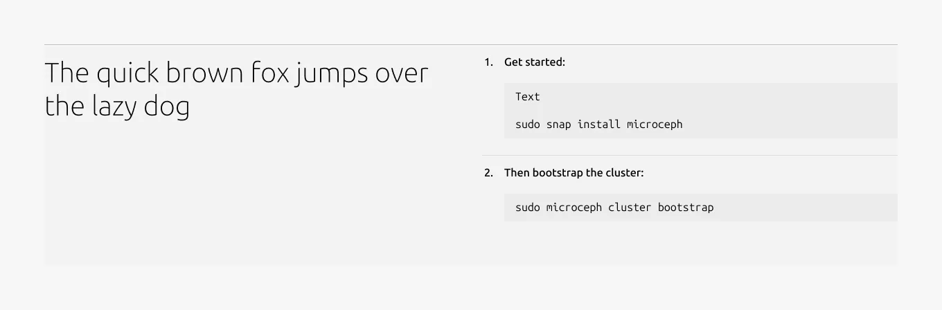
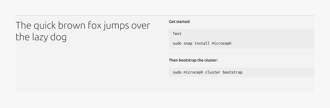
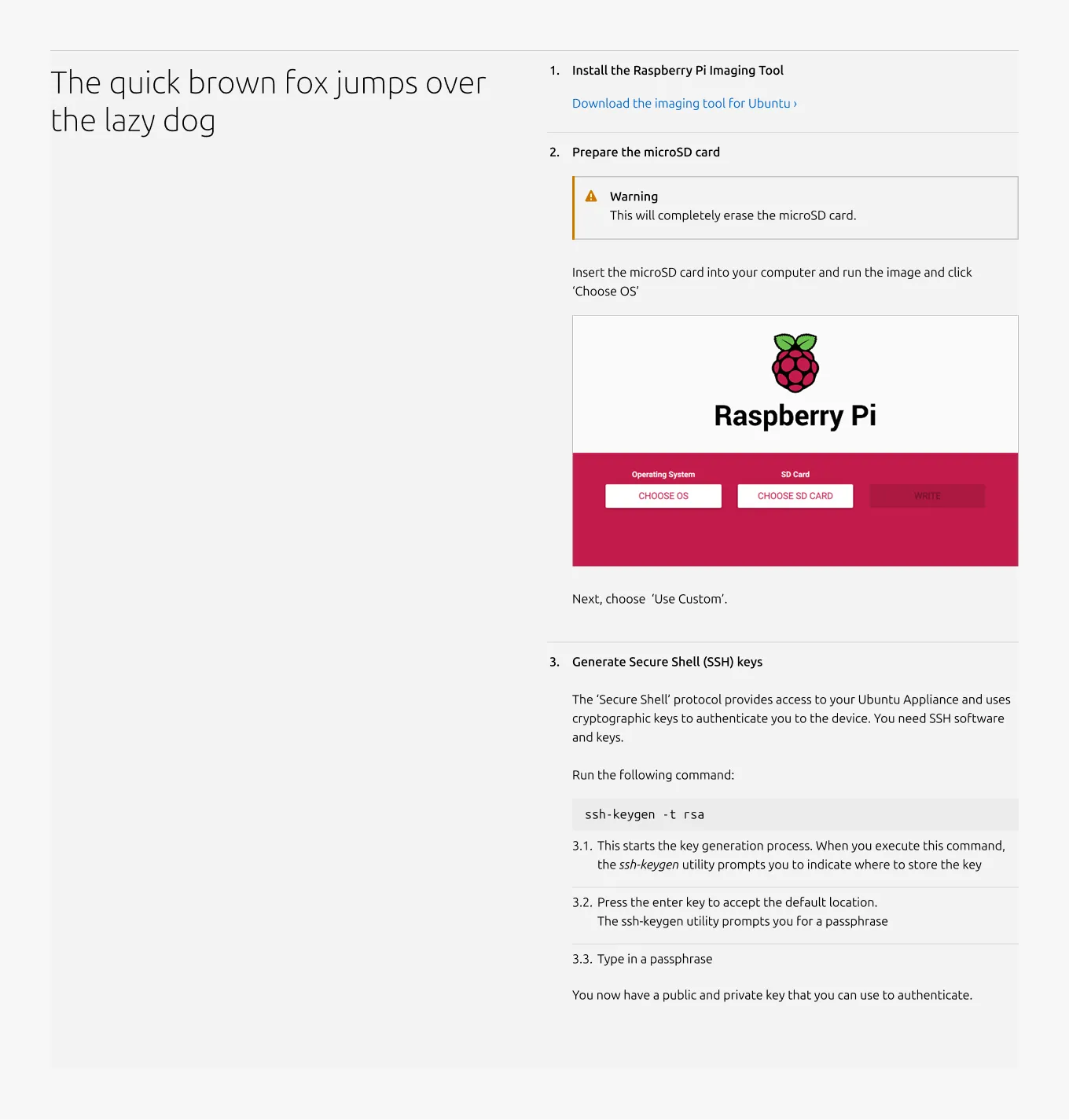
- Image - Include a 3:2 or 16:9 ratio image to illustrate or enhance the content including: photography, isometric illustrations, diagrams, and similar visuals. The image can include an optional caption.
- Video - Embed and link video content in 16:9 ratio.
- List - List up to 10 items, with bullet type options including: none, bullet, status, or number.
- Code block - Display preformatted code.
- Logo block - Display related logos such as customers or partners.
- Linked logo block - Display logos that link to additional resources.
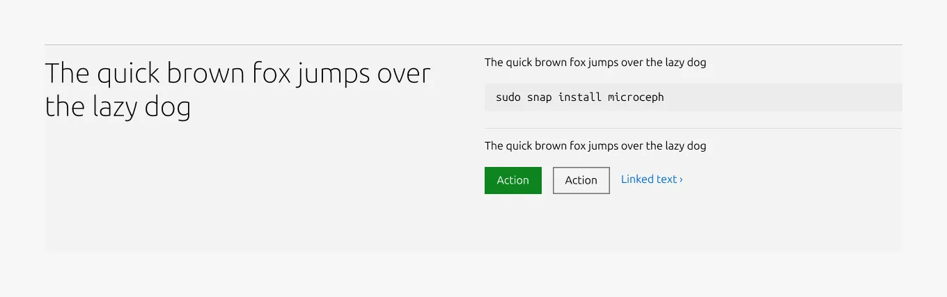
- CTA block - Share one or more call-to-action elements, including a primary button, secondary button, and link.
- Notification - Highlight alerts, updates, or contextual messages within the section.
When to use
- When content needs to be broken into clear steps or distinct items within a single section
- When a subtle visual separation is needed without creating fully independent sections
When not to use
- When images, lists, or other content need to stand alone without internal dividers, use Basic section instead
- When the content consists of text only, use a Tiered list instead
- When the content is made up of short text and a single representative image, consider using Equal heights instead
Examples
Responsive
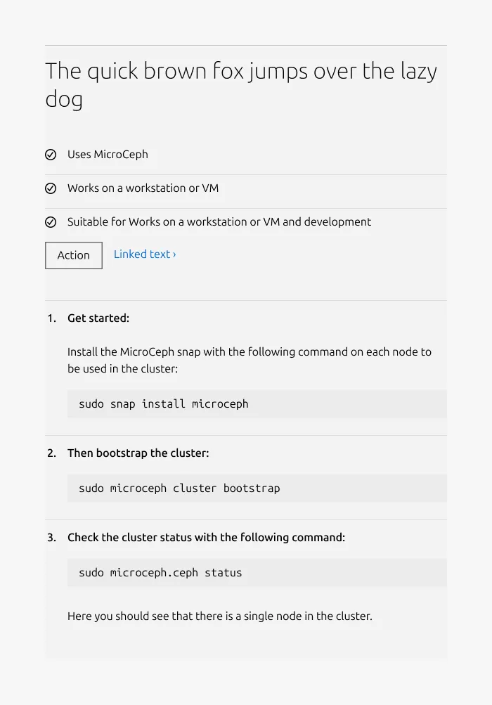
Medium dimension (full-width)
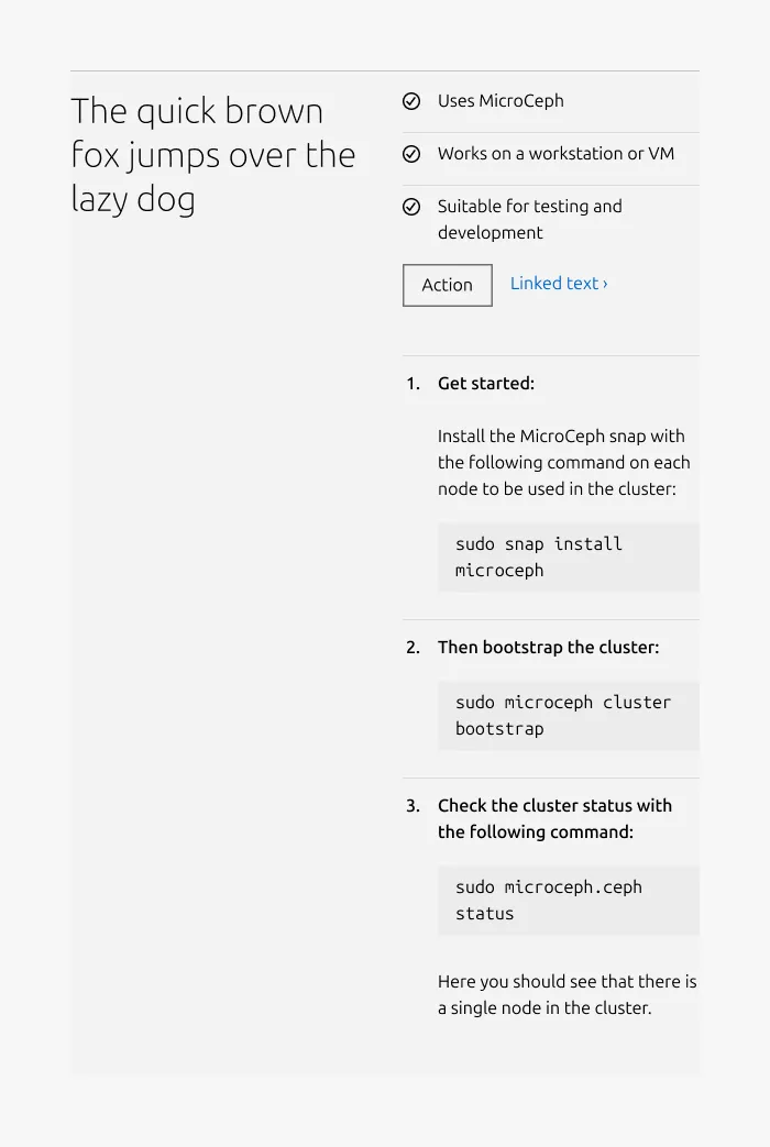
Medium dimension (50/50)
Small dimension
Heading type
With icon
With bullet
With number
Without bullet
Without heading
Contents type
Mix of various content types
Properties
| Name | Type | Required | Description | Constraint | Options | Default option |
|---|---|---|---|---|---|---|
| Section rule | object | Yes | The rule component indicates the beginning of a new pattern | Only use the default style for the section-level rule | default | default |
| Heading | string | Yes | 4-column width heading using H2 | Up to 60 characters | - | - |
| Linked heading | single select | No | The heading may function as a link when clearly indicated. | - | default, link | default |
| Medium layout | single select | No | Indicate layout for the medium dimension | - | 50/50, full-width | full-width |
| Bottom padding | single select | Yes | The type of padding applied to the bottom of the pattern | - | default, deep, shallow, none | default |
| Body | string | No | 4-column width body text | Up to 600 characters | - | - |
Child properties
Divided block
| Name | Type | Required | Description | Constraint | Options | Default option |
|---|---|---|---|---|---|---|
| Block rule | object | Yes | The rule component to separate each block | - | mute | mute |
| Heading | string | No | 4-column width H5 heading for divided block | Up to 160 characters | true, false | true |
| Bullet style | single select | No | The bullet style defines how the block heading is visually presented within each divided block. When the bullet option is used, an additional 32px indent is applied to the content area below the heading to align the content visually with the bullet marker. | - | number, bullet, status, none | number |
| Block item bottom padding | single select | No | The type of padding applied to the block item | The last block item of the pattern/block must not have bottom padding. | none, shallow | none |
Change log
| Who | When | What |
|---|---|---|
| Maximilian Blazek | 13.02.2026 | Added links |
| Isaac Kim | 19.01.2026 | Initial commit |