
Linked logo block
The linked logo block is a content unit that displays a logo with a link to additional pages or resources. This block is used as the primary content unit in the Linked logo section.
Anatomy
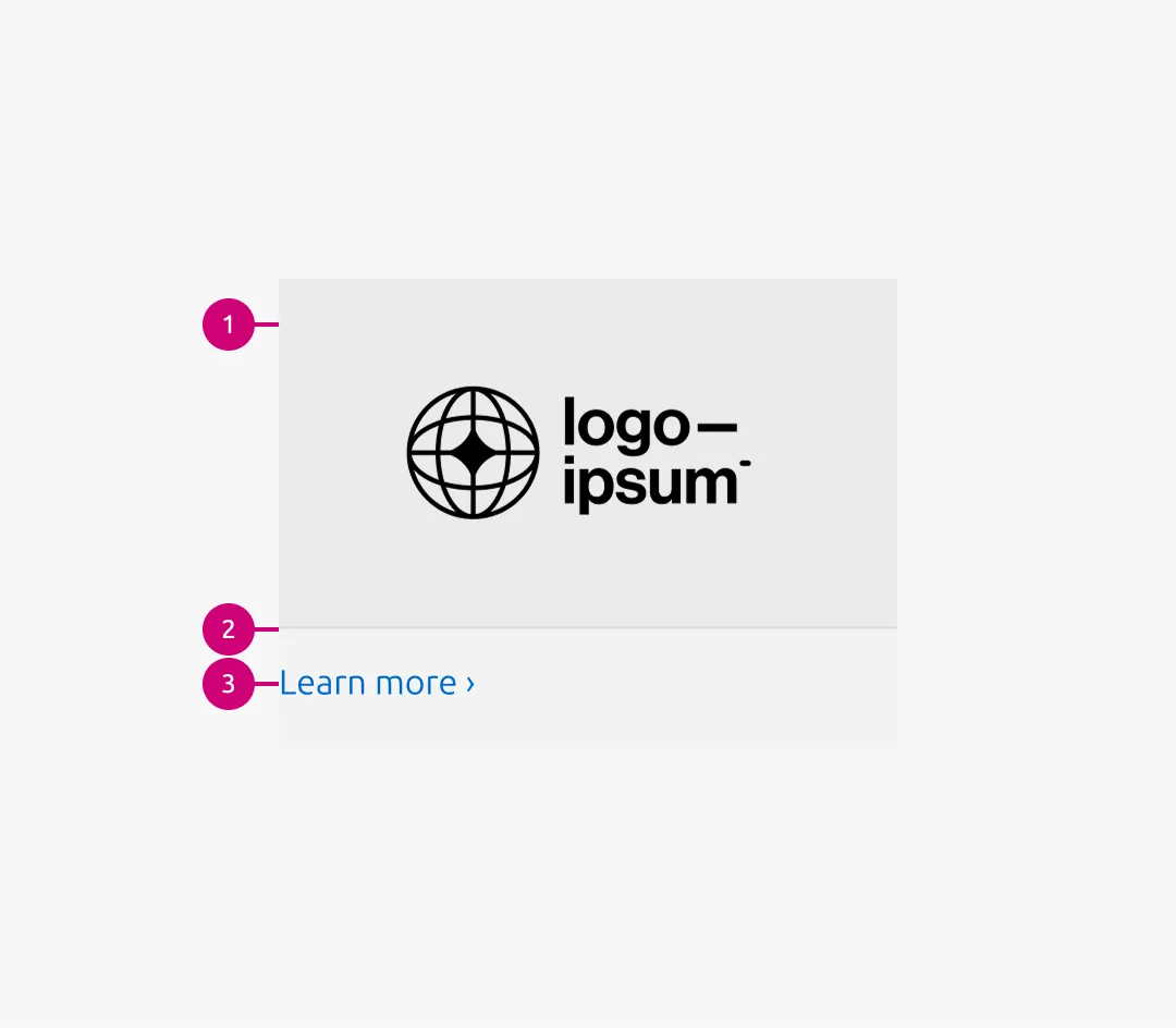
1
Logo container
The logo container wraps each logo image, uses a 16:9 aspect ratio, and includes an alt background
2
Rule
The muted rule appears below the logo container
3
Link
The link directs users to more detailed or related information
Usage
The Logo block is the primary content element of the Linked logo section. It can also be used as a block item within the Basic section , Divided section , and Tab section.
While the Logo block is a non-interactive visual listing of images, the Linked logo block introduces interaction by adding a Link below the Logo container.
The block width follows the content container of its parent pattern, with options of 50, 75, and full-width.
When to use
- Each logo needs to link to additional pages or resources
- Logos function as navigational elements
When not to use
- If logos are purely decorative or editorial and do not require interaction, use the Logo block instead
Properties
| Name | Type | Required | Description | Constraint | Options | Default option |
|---|---|---|---|---|---|---|
| Linked logo image | object | Yes | 16:9 image container with the logo image inside | - | - | - |
| Link text | string | Yes | The link text for the logo | Up to 60 characters | - | - |
Change log
| Who | When | What |
|---|---|---|
| Isaac Kim | 02.03.2026 | Initial commit |