
Linked logo section
The linked logo section is used to display a list of logos which explicitly link to additional pages or resources.
Anatomy
Usage
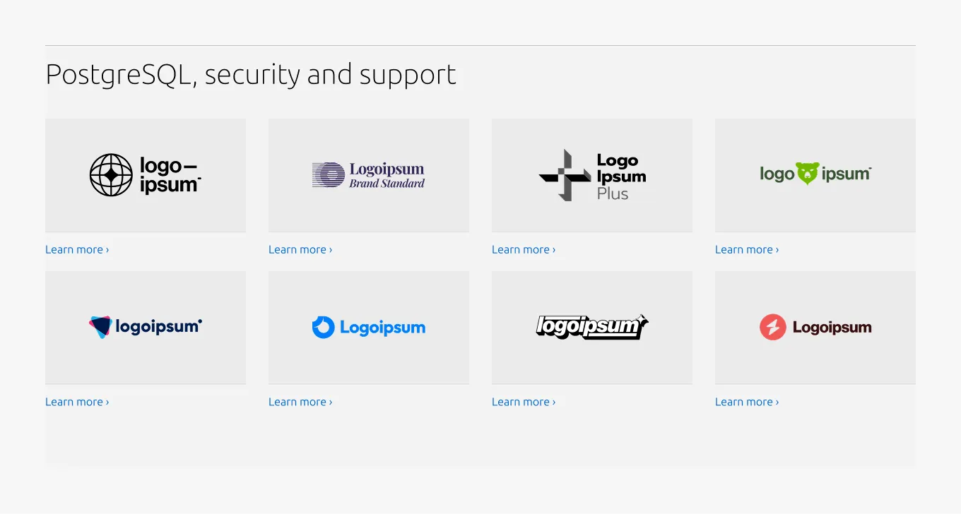
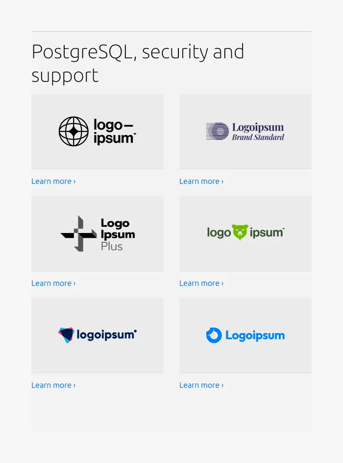
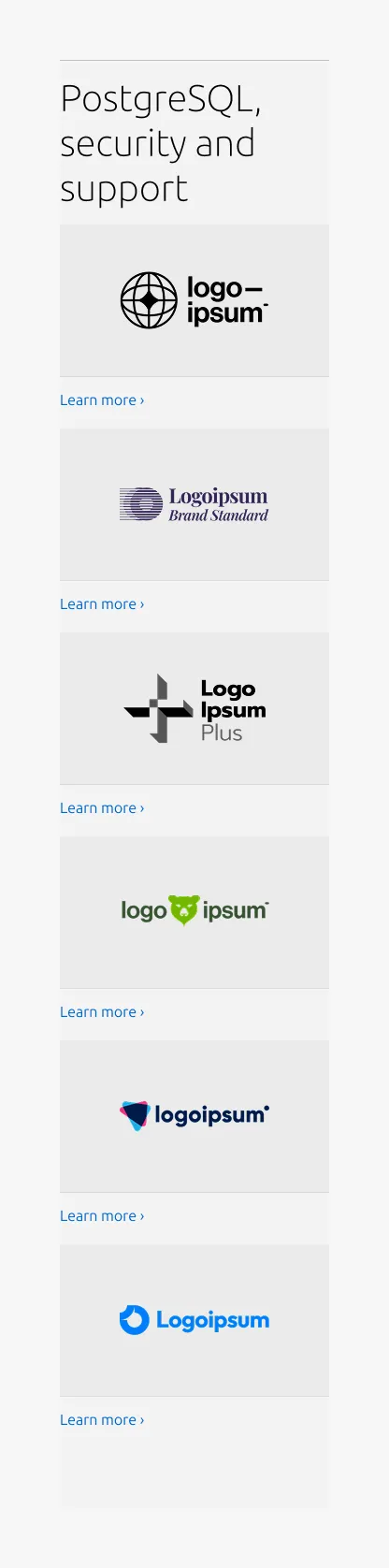
The Linked logo section highlights a collection of logos as interactive navigational elements, building on the Linked logo section by pairing each logo with a link to additional pages or resources.
Placing additional contextual elements
This pattern does not include a description slot.
For the 25/75 and 100 layouts, when a description or CTA block is required, use the Basic section and place the Linked logo section (without the Rule and Heading) below it, rather than extending this pattern.
For the 50/50 layout, the Linked logo block is supported within the Basic section. Therefore use the Basic section alone instead of introducing a separate Linked logo section.
When to use
- Each logo needs to link to an additional page or resource
- Logos act as primary navigational elements rather than decorative assets
When not to use
- If logos are purely decorative or editorial and do not require interaction, use the Logo section instead
- When items require rich structured content (e.g., detailed descriptions, lists, CTAs), use the Basic section or Divided section instead
- If multiple groups or categories need to be displayed, separate them into multiple sections or use the Tab section
Examples
Large dimension (50/50 layout)
Large dimension (25/75 layout)
Medium dimension
Small dimension
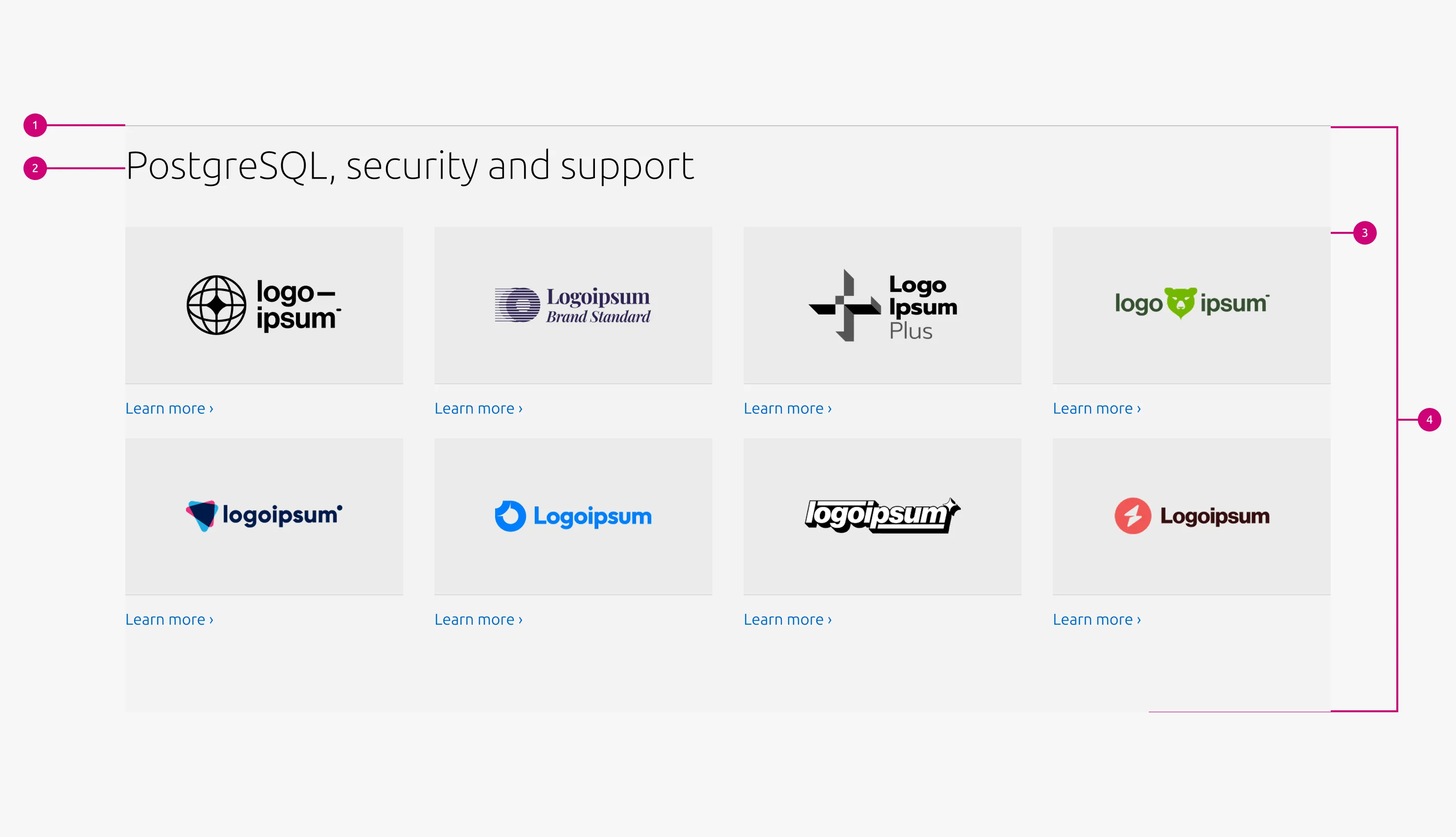
Properties
| Name | Type | Required | Description | Constraint | Options | Default option |
|---|---|---|---|---|---|---|
| Section rule | object | Yes | The rule component indicates the beginning of a new pattern | Only use the default style for the section-level rule | default | default |
| Heading | string | Yes | 4-column width heading using H2 | Up to 60 characters | - | - |
| Linked heading | single select | No | The heading may function as a link when clearly indicated. | - | default, link | default |
| Bottom padding | single select | Yes | The type of padding applied to the bottom of the pattern | - | default, deep, shallow, none | default |
| Large layout | single select | Yes | The intended grid layout for the section. | - | full-width, 50/50, 25/75 | full-width |
Child properties
Linked logo block
| Name | Type | Required | Description | Constraint | Options | Default option |
|---|---|---|---|---|---|---|
| Linked logo image | object | Yes | 16:9 image container with the logo image inside | - | - | - |
| Link text | string | Yes | The link text for the logo | Up to 60 characters | - | - |
Change log
| Who | When | What |
|---|---|---|
| Isaac Kim | 02.03.2026 | initial commit |