
Logo section
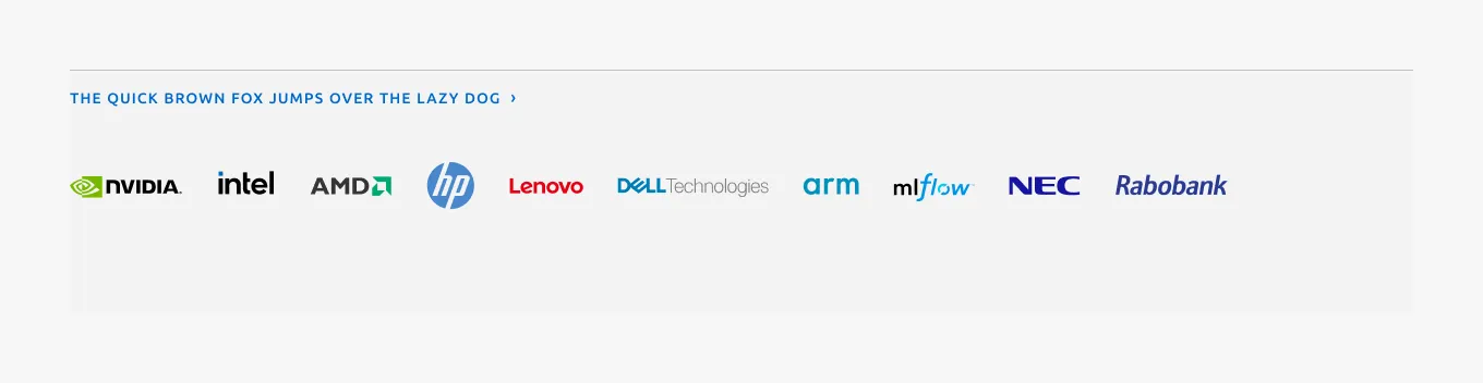
The logo section showcases a group of related images, such as a group of customer or partner logos. For best results, ensure that the images have identical dimensions.
Anatomy
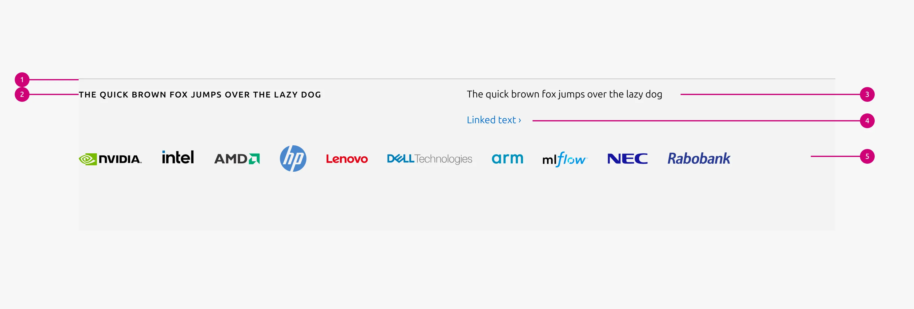
1
Rule
The rule component indicates the beginning of a new section.
2
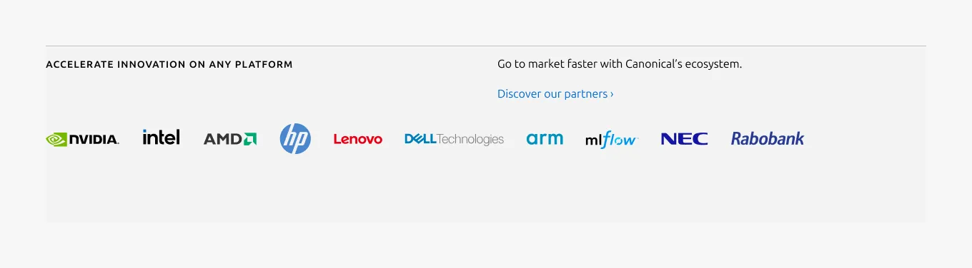
Heading
The section heading communicates the primary subject or theme of the section.
3
Body
A description that provides introductory context for the section. It appears at the top of the section and helps users understand the purpose or scope of the content before engaging with the logo block.
4
CTA block
CTA block presents one or more related actions that guide the user toward the next step within a section
5
Logo block
Logo block is the array of related images, such as customer or partner logos.
Usage
The logo section highlights the array of logos as the primary content, building on on the Logo block. It is typically paired with a muted heading, an optional description, and a CTA block. This pattern is used to emphasize brand identity or partner associations within a page.
When to use
- In cases where the Logo block functions as the main content, with all other elements acting as supporting content
When not to use
- When images, lists, or other content need to be included, use the Basic section instead
- If logos need to be linked, use the Linked logo section instead
Examples
Medium dimension
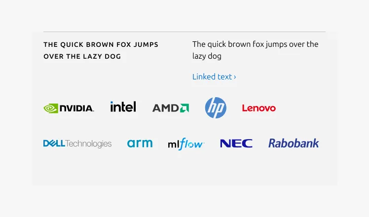
Small dimension
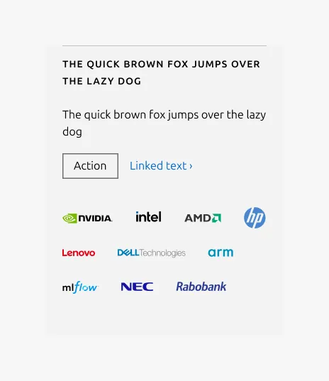
Linked heading
Properties
| Name | Type | Required | Description | Constraint | Options | Default option |
|---|---|---|---|---|---|---|
| Section rule | object | Yes | The rule component indicates the beginning of a new pattern | Only use the default style for the section-level rule | default | default |
| Heading | string | Yes | 4-column width H2 heading using muted heading style | Up to 60 characters | - | - |
| Linked heading | single select | No | The heading may function as a link when clearly indicated. | - | default, link | default |
| Bottom padding | single select | Yes | The type of padding applied to the bottom of the pattern | - | default, deep, shallow, none | default |
Child properties
CTA block
| Name | Type | Required | Description | Constraint | Options | Default option |
|---|---|---|---|---|---|---|
| Primary CTA | string | No | The CTA used with the positive button style. It indicates a high-priority, positive action and is reserved for hero areas or other key call-to-action sections. | Up to 20 characters | - | - |
| Secondary CTA | string | No | The CTA using the default button style. It is used for most actions that are positive but not primary, and may serve as the main CTA in non-hero sections. | Up to 20 characters | - | - |
| Link CTA | string | No | The text link used for contextual actions or pathways to more information. It uses a chevron (›) to indicate navigation to additional content or pages. | Up to 60 characters | - | - |
Logo block
| Name | Type | Required | Description | Constraint | Options | Default option |
|---|---|---|---|---|---|---|
| Logo block | object | Yes | The logo block showcases a group of related images, such as a group of customer or partner logos. | - Avoid exceeding 10 logos - Linking individual logos is not allowed | - | - |
Change log
| Who | When | What |
|---|---|---|
| Isaac Kim | 08.12.2025 | Initial commit |