
List
A list displays related pieces of information where each item represents only one attribute. It helps organize static content and create visual rhythm, making information easier to scan and understand. Lists are not interactive, so users cannot modify, filter, or otherwise change their contents. If an item needs to show more than one attribute, use a table instead.
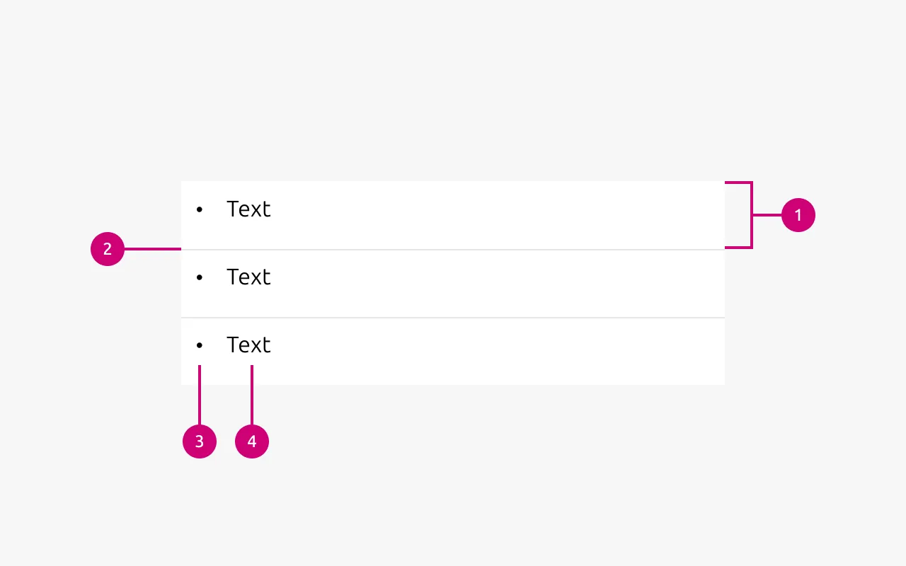
Anatomy
1
List item
Individual element of the list.
2
Separator
Optional line between two list items.
3
Marker
Optional decoration or indicator for the list item.
4
Text
The content of the list
Properties
| Name | Type | Required | Description | Constraint | Options | Default option |
|---|---|---|---|---|---|---|
| List | slot | Yes | The grouping of multiple list items. | Minimum 2. Maximum 10 items. | - | - |
| Orientation | single select | Yes | Whether the list is displayed horizontally or vertically. | - | Vertical, horizontal. | Vertical |
| Text | string | Yes | Sets the content of the list | Up to 250 characters | - | - |
| Marker | single select | No | Decorator for a single list item. | All items in the same level of nesting must have the same marker type. No marker allowed when using dots to separate horizontal lists. | None, bullet, roman number, arabic number, alphabet letter, icon | Bullet |
| Divider (vertical list) | boolean | No | Whether has muted rule between list items | - | true, false | true |
| Divider (horizontal list) | single select | No | Whether the list has vertical line as a separator or a dot. | Dot-separated lists can’t have markers. | None, line, dot | line |
| Nesting level | number | No | Hierarchical list structures | Only vertical lists. | 1-3 | 1 |
Decision log
| Where | Decision made | Link |
|---|---|---|
| Documentation project | The list only displays static text. Links are their own component, so in that case list would be used as a spacing component more than just a simple way to group items. This also opens the door to use the list for any other component, in which rules should probably be considered (groups of cards, buttons, etc). | - |