
Equal heights
The Equal heights pattern arranges content blocks in a horizontal row where each block maintains the same height regardless of the amount of content inside. This creates a visually balanced layout that allows items to be easily compared and scanned. An optional CTA block can appear at the section level, beneath blocks list.
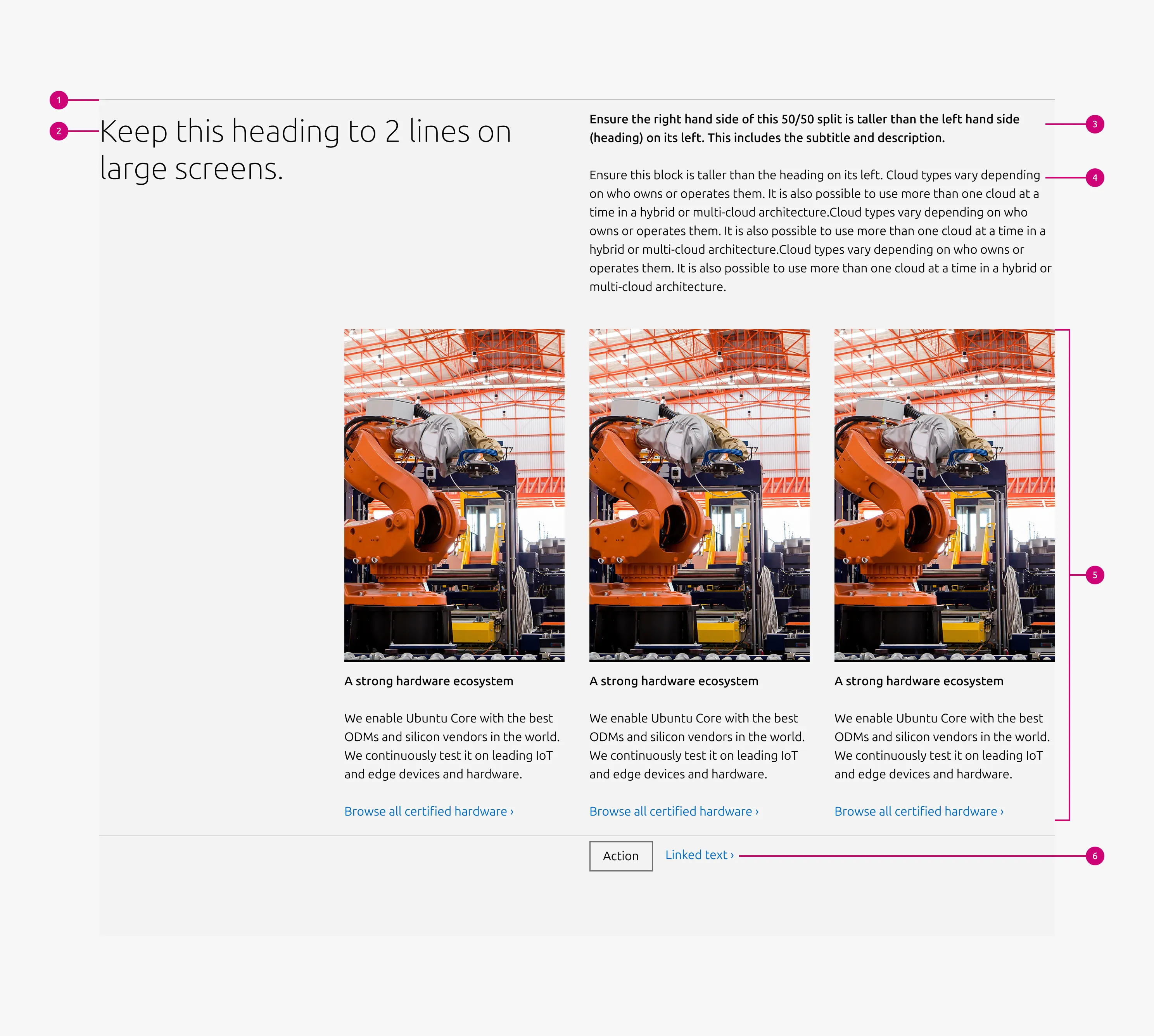
Anatomy
Usage
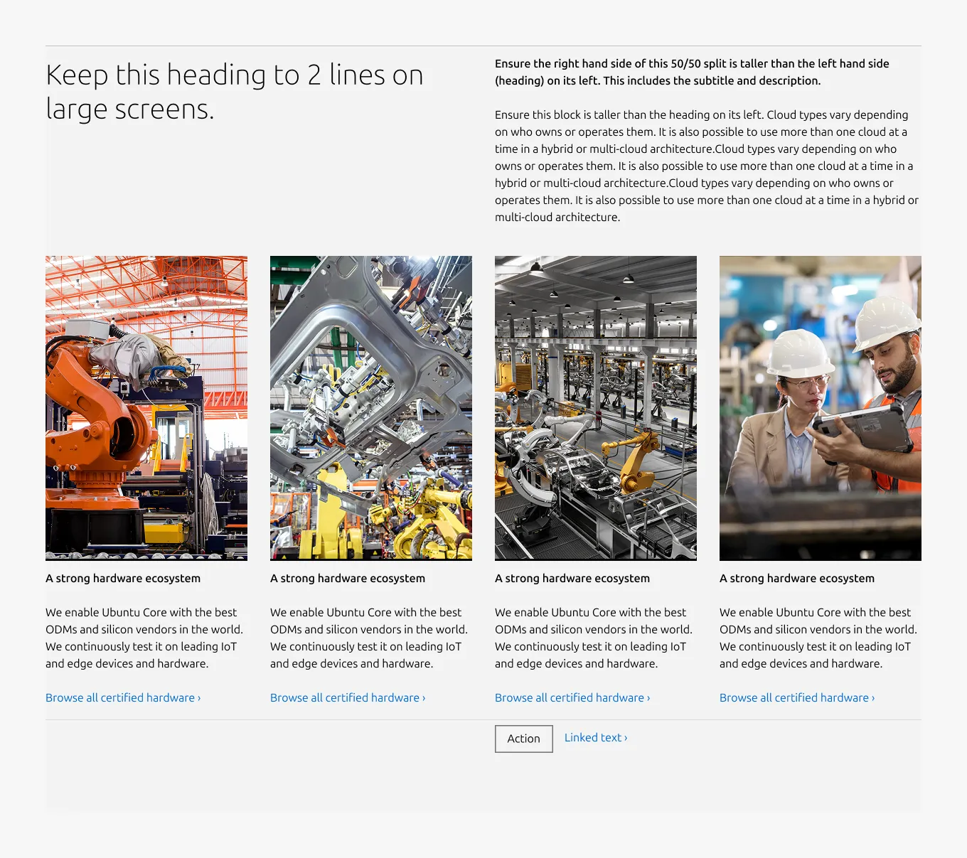
The Equal heights pattern presents related content in a horizontal layout using Equal height block, ensuring that each item maintains the same height. This creates consistent alignment across the row and supports a balanced, easy-to-scan layout.
Use this pattern to break down information into columns. It is commonly used to present comparable items such as features, benefits, product options, or key resources.
A minimum of three columns is recommended. Equalising the height of each block prevents uneven layouts when content lengths vary while maintaining consistent spacing across the row.
Best practice: Keep the content volume similar across columns to maintain visual balance.
When to use
- Content consists of comparable items that benefit from side-by-side presentation, such as features, benefits, product options, or key resources
- Items share a consistent structure and a similar volume of content
- Users need to scan and compare multiple items quickly
When not to use
- Each item requires rich or varied content such as images, videos, code blocks, or lists — use Divided section instead
- The content covers a single topic with supporting material — use Basic section instead
- The content consists of paired titles and descriptions in a text-heavy list format — use Tiered list instead
Examples
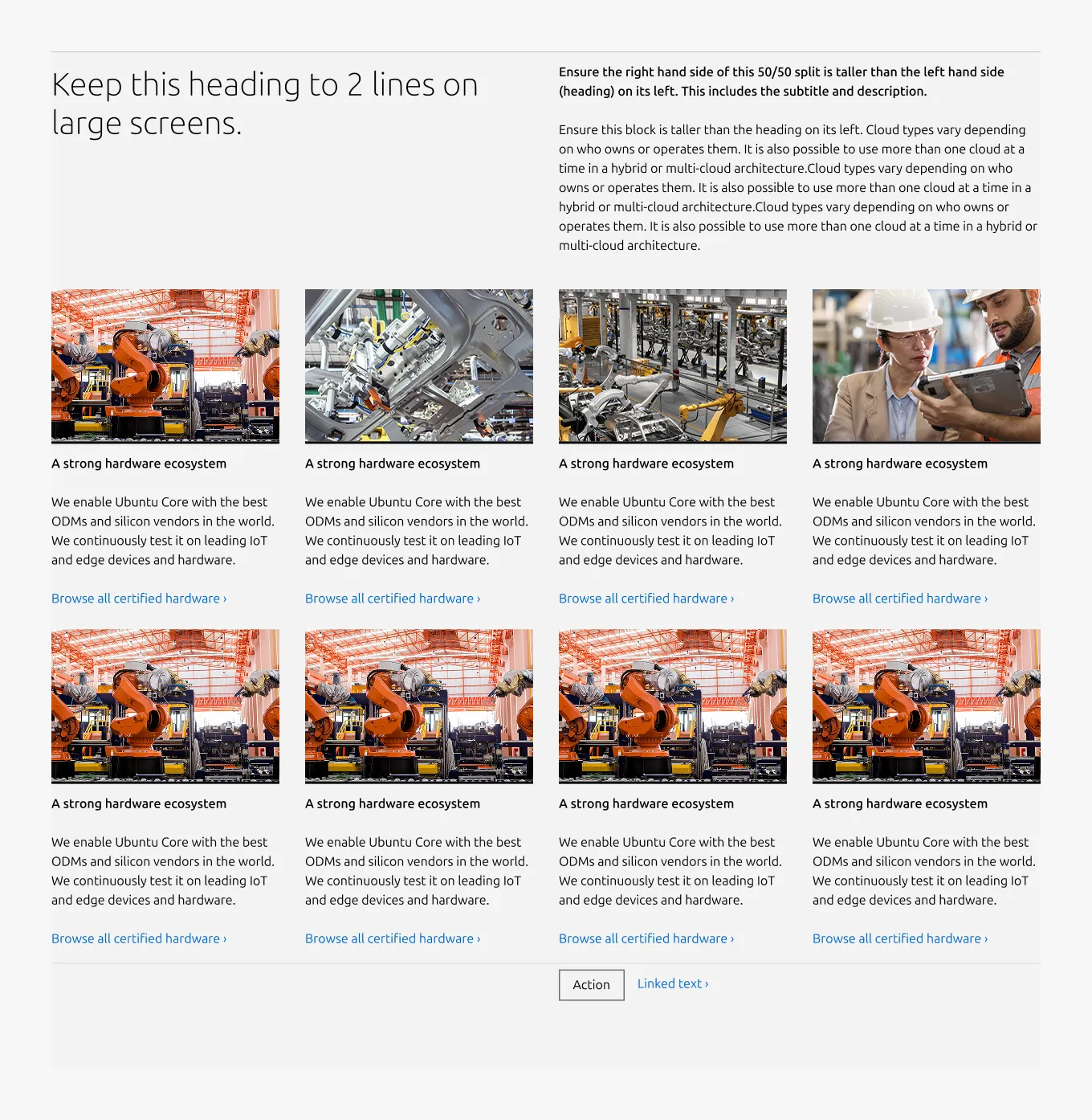
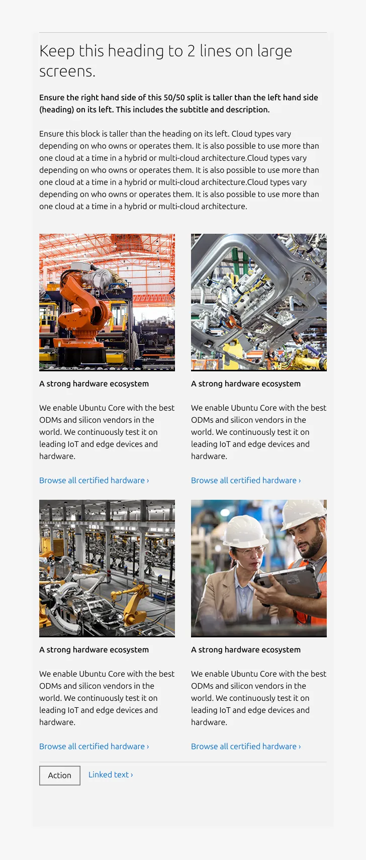
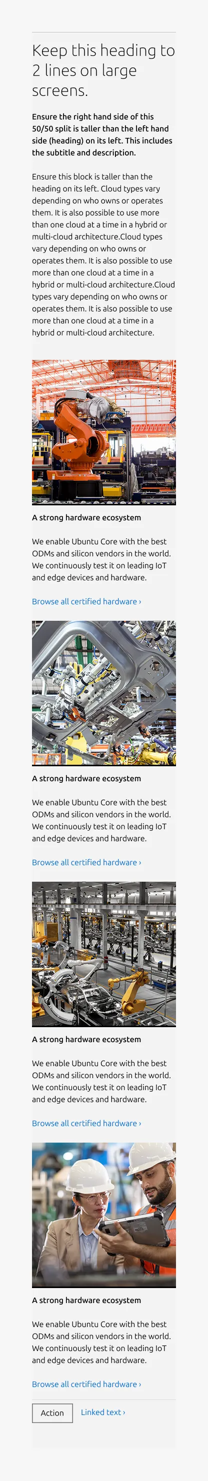
Large dimension (50/50)
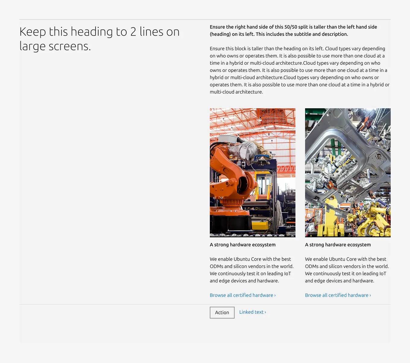
Large dimension (25/75)
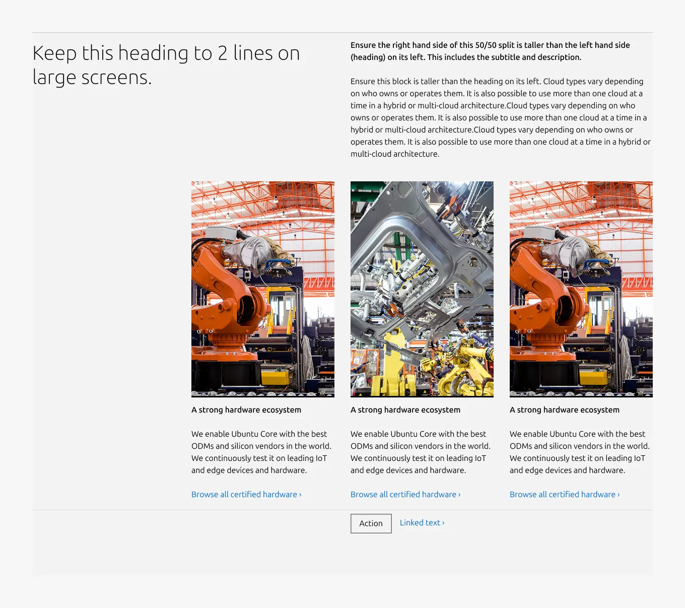
Large dimension (full-width)
Large dimension (full-width, apply predefined image ratio)
Medium dimension
Small dimension
Properties
| Name | Type | Required | Description | Constraint | Options | Default option |
|---|---|---|---|---|---|---|
| Section rule | object | Yes | The rule component indicates the beginning of a new pattern | Only use the default style for the section-level rule | default | default |
| Heading | string | Yes | 4-column width heading using H2 | Up to 60 characters | - | - |
| Linked heading | single select | No | The heading may function as a link when clearly indicated. | - | default, link | default |
| Subheading | string | No | The subheading provides additional hierarchy beneath the main title | h4: up to 100 characters h5: up to 160 characters | h4, h5 | h5 |
| Bottom padding | single select | Yes | The type of padding applied to the bottom of the pattern | - | default, deep, shallow, none | default |
| Large layout | single select | Yes | The intended grid layout for the section. | - | full-width, 50/50, 25/75 | full-width |
Child properties
Equal height block
| Name | Type | Required | Description | Constraint | Options | Default option |
|---|---|---|---|---|---|---|
| Linked heading | single select | No | The heading may function as a link when clearly indicated. | - | default, link | default |
| Body | string | No | 2-column width body text | Up to 300 characters (The content is recommended to be limited to a single sentence) | - | - |
| Image | object | No | The image at the top of the block. | - | - | - |
| Image ratio large | single select | No | The aspect ratio to apply to item images on large screens. | - | - square - 2:3 - 3:2 - 6:9 - cinematic - auto(to use the image's original aspect ratio) | 2:3 |
| Image ratio medium | single select | No | The aspect ratio to apply to item images on medium screens. | - | - square - 2:3 - 3:2 - 6:9 - cinematic - auto(to use the image's original aspect ratio) | square |
| Image ratio small | single select | No | The aspect ratio to apply to item images on small screens. | - | - square - 2:3 - 3:2 - 6:9 - cinematic - auto(to use the image's original aspect ratio) | square |
| Highlighted image | boolean | No | Whether to highlight image with the alt background. | - | true, false | false |
| Heading | string | No | 2-column width H5 heading | Up to 60 characters | - | - |
CTA block
| Name | Type | Required | Description | Constraint | Options | Default option |
|---|---|---|---|---|---|---|
| Primary CTA | string | No | The CTA used with the positive button style. It indicates a high-priority, positive action and is reserved for hero areas or other key call-to-action sections. | Up to 20 characters | - | - |
| Secondary CTA | string | No | The CTA using the default button style. It is used for most actions that are positive but not primary, and may serve as the main CTA in non-hero sections. | Up to 20 characters | - | - |
| Link CTA | string | No | The text link used for contextual actions or pathways to more information. It uses a chevron (›) to indicate navigation to additional content or pages. | Up to 60 characters | - | - |
Change log
| Who | When | What |
|---|---|---|
| Isaac Kim | 16.03.2026 | Initial commit |