
Tiered list
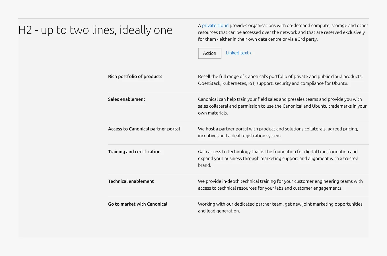
Tiered list is a pattern for presenting a list of paired titles and descriptions underneath a top-level title and description. It organises related items into a structured, scannable format using Tiered blocks as its primary content units. An optional CTA block can appear at the section level, below the top-level description.
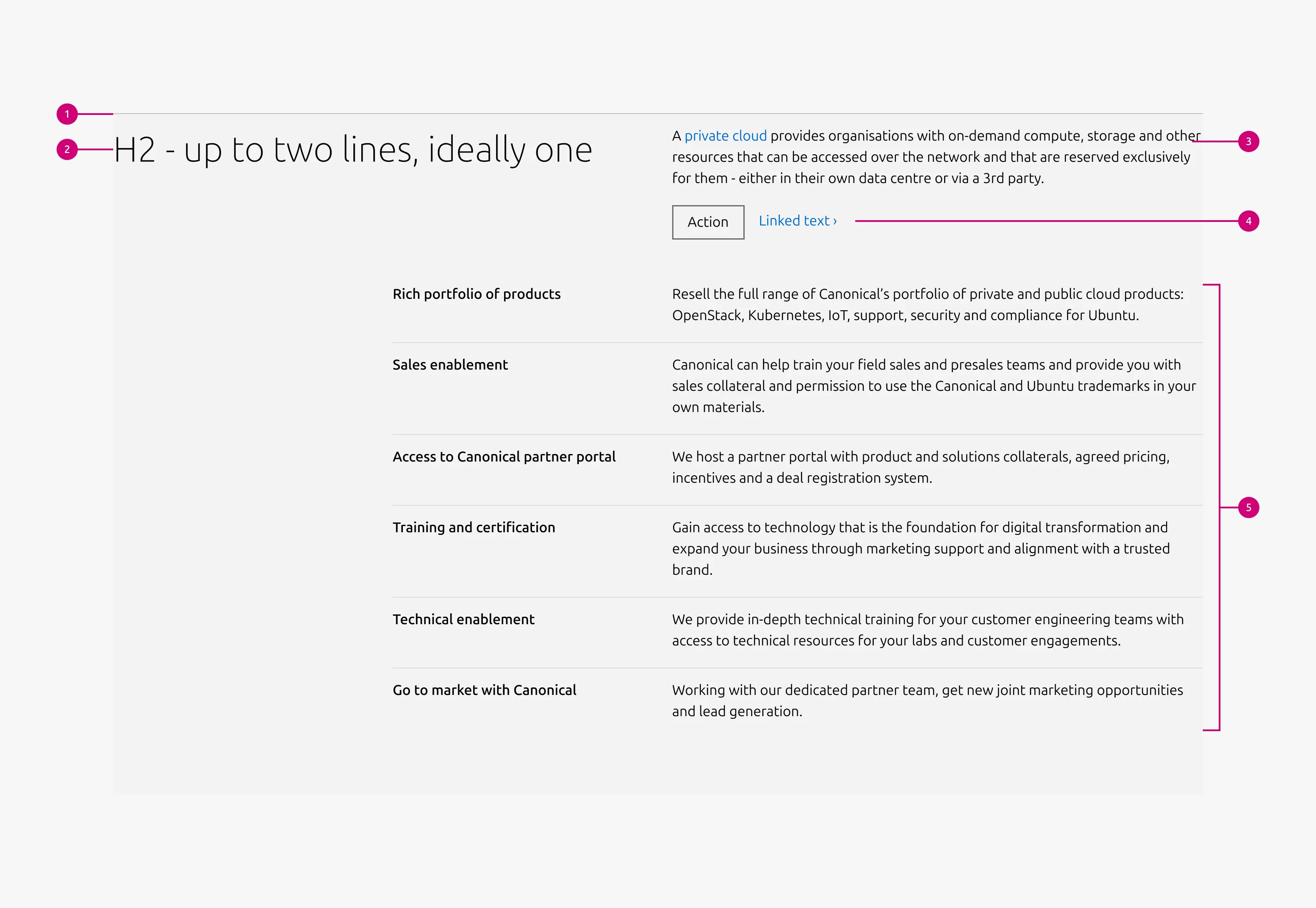
Anatomy
Usage
Use Tiered list to present multiple related items that share a consistent structure of paired titles and descriptions. It works best for text-heavy content where each item is concise and parallel in nature.
Layout
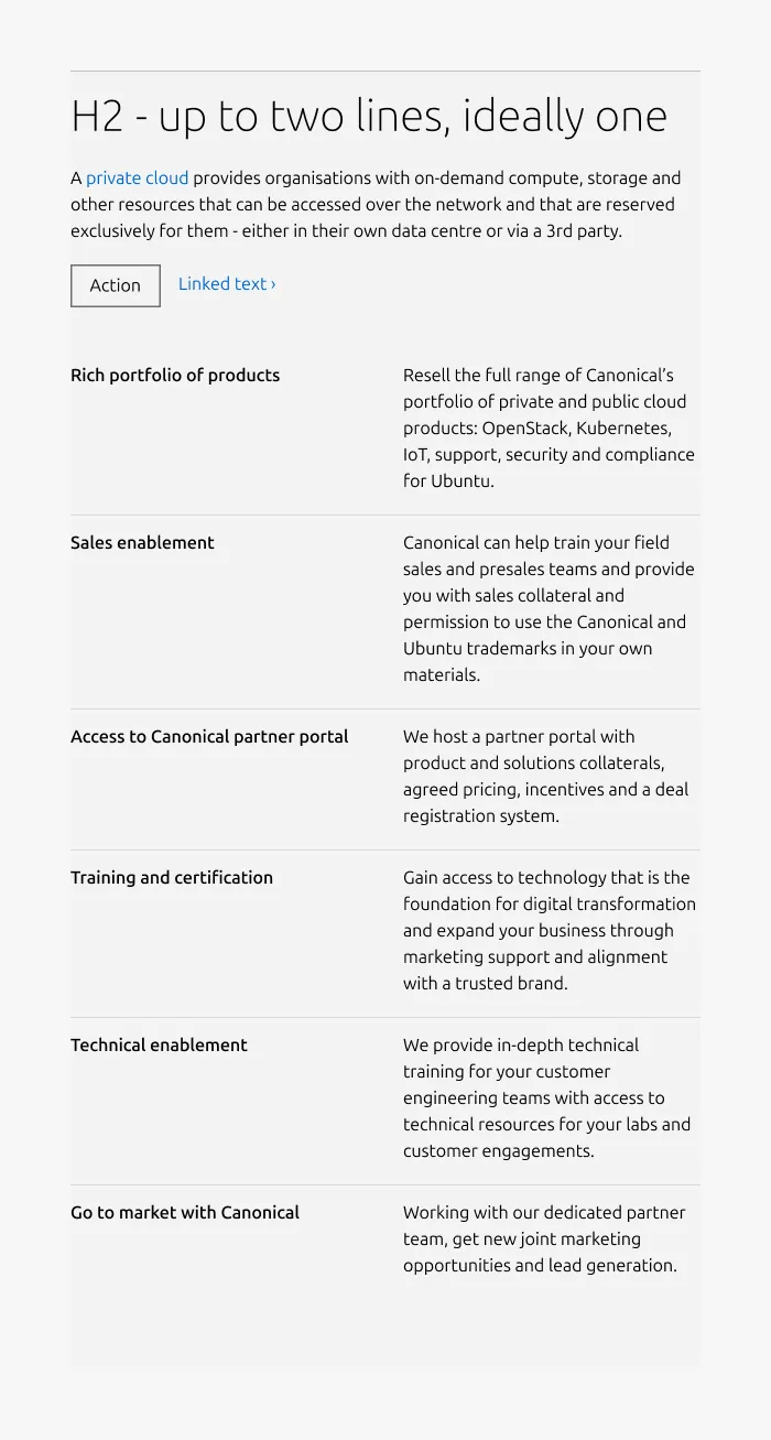
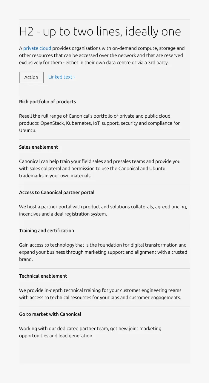
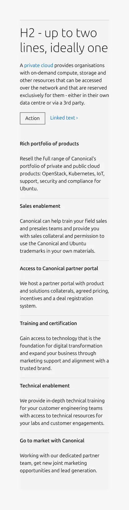
Tiered list adapts across screen sizes. On large screens, it uses a 6-column layout — 2 columns for the heading and 4 for the body, arranged in a single row. On medium screens, the layout is configurable: content can split(50/50) or stack vertically(full-width). On small screens, content always stacks.
When to use
- Content consists of paired titles and descriptions organised under a single top-level heading
- Items are primarily text-based with short, parallel headings
- Users need to scan a structured list quickly
- Content represents steps, stages, features, or grouped concepts
When not to use
- Each item requires rich content such as images, videos, or code blocks — use Divided section instead
- Content is brief with an image as the primary focus — use Equal heights instead
- The list contains only one or two items within a single topic — use a Basic section instead
Examples
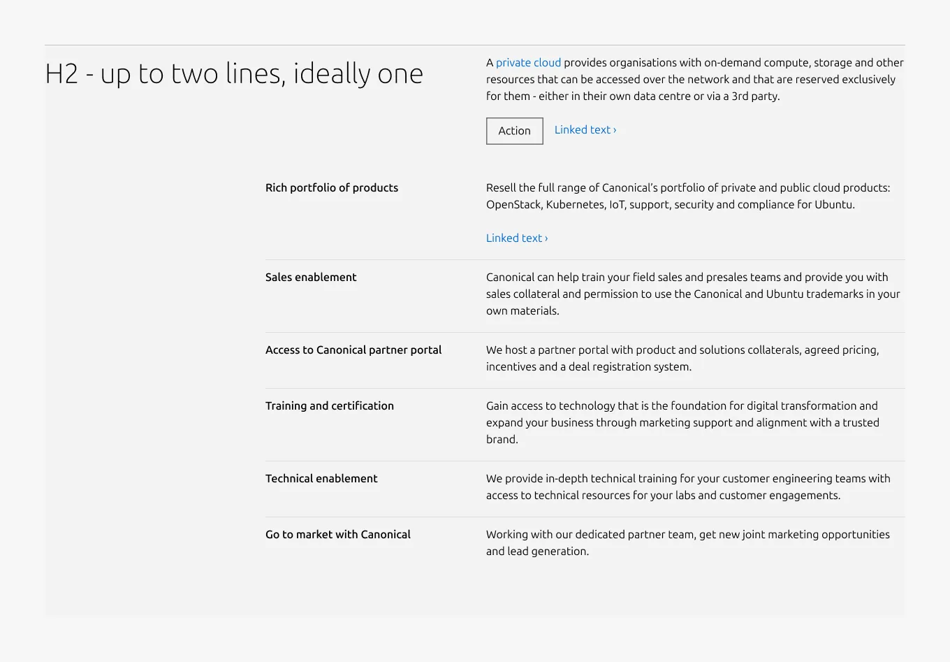
Large dimension with section level CTA and block level CTA
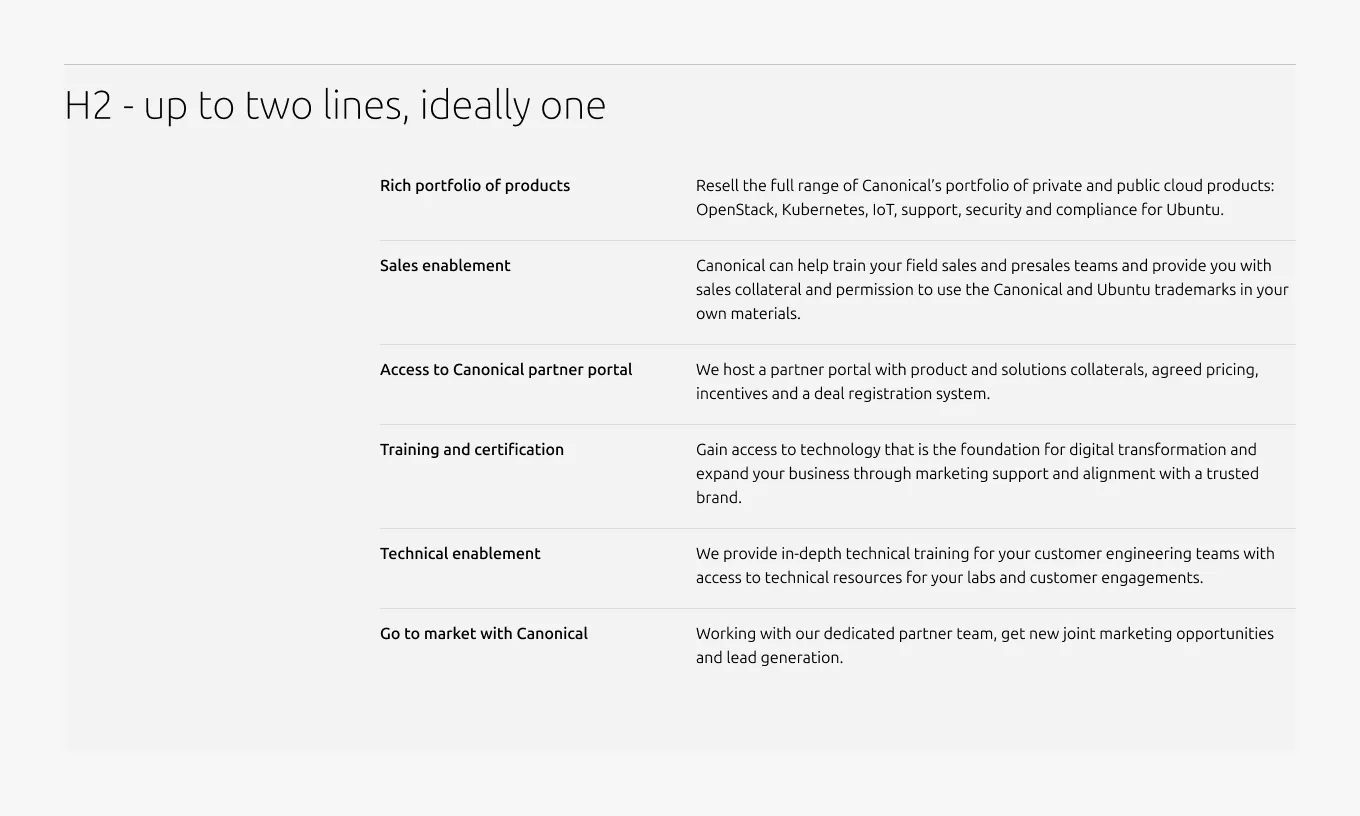
Large dimension without description
Medium dimension (50/50)
Medium dimension (full-width)
Small dimension
Properties
| Name | Type | Required | Description | Constraint | Options | Default option |
|---|---|---|---|---|---|---|
| Section rule | object | Yes | The rule component indicates the beginning of a new pattern | Only use the default style for the section-level rule | default | default |
| Heading | string | Yes | 4-column width heading using H2 | Up to 60 characters | - | - |
| Linked heading | single select | No | The heading may function as a link when clearly indicated. | - | default, link | default |
| Medium layout | single select | No | Indicate layout for the medium dimension | - | 50/50, full-width | full-width |
| Bottom padding | single select | Yes | The type of padding applied to the bottom of the pattern | - | default, deep, shallow, none | default |
Child properties
Tiered block
| Name | Type | Required | Description | Constraint | Options | Default option |
|---|---|---|---|---|---|---|
| Linked heading | single select | No | The heading may function as a link when clearly indicated. | - | default, link | default |
| Block rule | object | Yes | The muted rule component indicates the beginning of a new block | It is not used for the first block and appears from the second block onward. | none, muted | - |
| Heading | string | Yes | 2-column width H5 heading | Up to 60 characters | - | - |
| Image heading | object | No | Image used in place of heading | If an image is used as the heading, it cannot function as a link. | - | - |
| Body | string | Yes | 4-column width body text | Up to 600 characters | - | - |
| Link CTA | string | No | The text link used for contextual actions or pathways to more information. It uses a chevron (›) to indicate navigation to additional content or pages. | Up to 60 characters | - | - |
| Bottom padding | single select | Yes | The type of padding applied to the bottom of the pattern | - | - | deep |
CTA block
| Name | Type | Required | Description | Constraint | Options | Default option |
|---|---|---|---|---|---|---|
| Primary CTA | string | No | The CTA used with the positive button style. It indicates a high-priority, positive action and is reserved for hero areas or other key call-to-action sections. | Up to 20 characters | - | - |
| Secondary CTA | string | No | The CTA using the default button style. It is used for most actions that are positive but not primary, and may serve as the main CTA in non-hero sections. | Up to 20 characters | - | - |
| Link CTA | string | No | The text link used for contextual actions or pathways to more information. It uses a chevron (›) to indicate navigation to additional content or pages. | Up to 60 characters | - | - |
Change log
| Who | When | What |
|---|---|---|
| Isaac Kim | 16.03.2026 | Initial commit |