
CTA section
The CTA section is a prominent and visually engaging section designed to encourage users to take a clear next step. It combines a concise copy and one or more call-to-action elements into a focused layout that stands out from surrounding content. This pattern is typically used mid-page or near the end of a page to re-engage users and guide them toward a specific action such as downloading resources, contacting sales, or exploring key documentation. The CTA section helps reduce decision friction by clearly communicating what the action is and why it matters now.

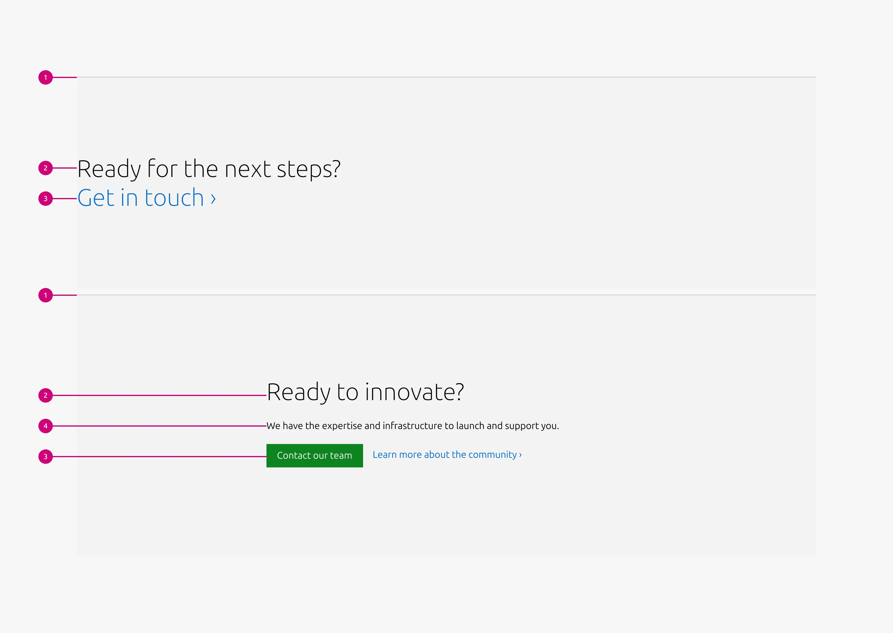
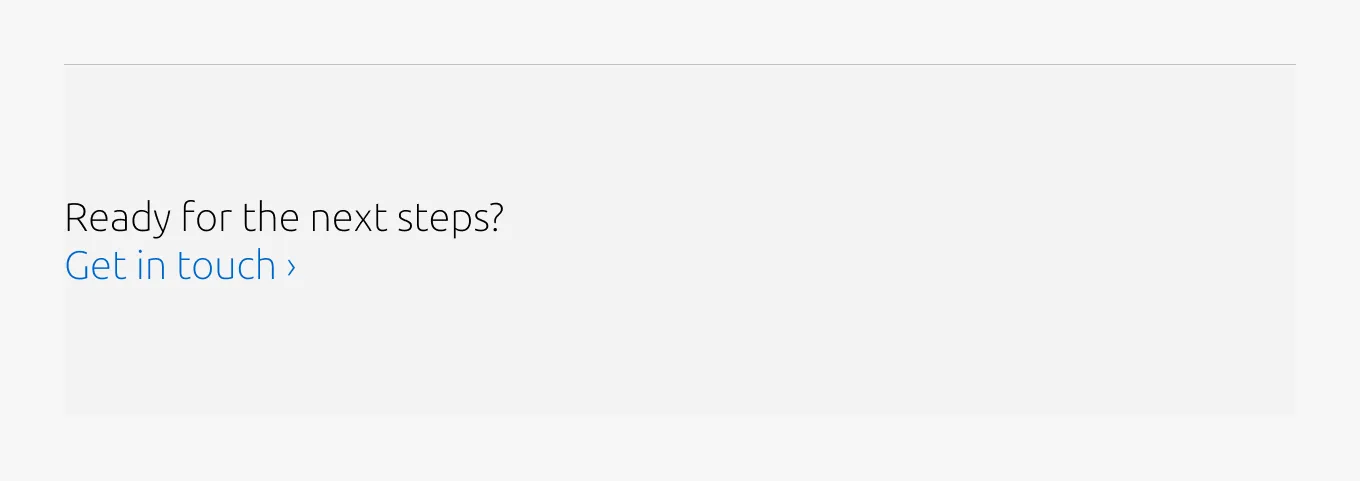
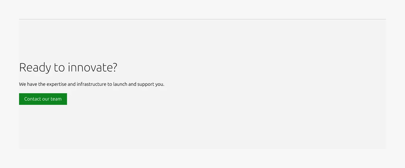
Anatomy
This element is available only in the block variant and appears directly beneath the heading.
Usage
Use the CTA section to highlight a clear, intentional next step within the page flow. This pattern is designed to create a moment of focus, helping users transition from consuming information to taking action.
CTA sections are typically placed mid-page or near the end of a page, where users have enough context to understand the value of the action being proposed.
The CTA section should represent a single primary intent. Any supporting text or additional elements should reinforce this intent rather than introduce new topics.
When to use
- A specific user action is the primary purpose of the section, not a secondary affordance.
- You need to visually separate a call to action from surrounding content to increase emphasis.
When not to use
- If long-form explanatory content is needed, use a Basic section with the CTA block instead.
- The CTA appears too early in the page flow, before users have sufficient context to understand its value.
Examples
Layout
Full-width(Default)
Full-width(CTA block)
25/75(Default)
25/75(CTA block)
Responsive
Medium dimension (Default)
Medium dimension (CTA block)
Small dimension (Default)

Small dimension (CTA block)

Properties
| Name | Type | Required | Description | Constraint | Options | Default option |
|---|---|---|---|---|---|---|
| Section rule | object | Yes | The rule component indicates the beginning of a new pattern | Only use the default style for the section-level rule | default | default |
| Top padding | single select | Yes | The type of padding applied to the top of the pattern after the section rule | - | - | deep |
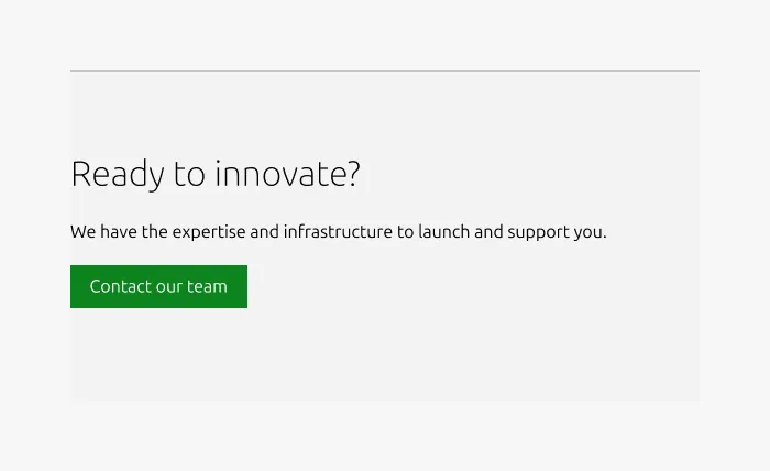
| Heading | string | No | 8-column width heading using H2 | Up to 60 characters | - | - |
| Body | string | No | 4-column width body text | 300 (As part of a highlighted section, the content should be limited to a single sentence.) | - | - |
| Large layout | single select | Yes | Indicate layout for the large dimension | - | 25/75, full-width | full-width |
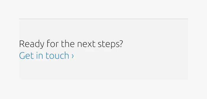
| Link CTA | string | No | The text link used for contextual actions or pathways to more information. It uses a chevron (›) to indicate navigation to additional content or pages. | Up to 60 characters | - | - |
| Bottom padding | single select | Yes | The type of padding applied to the bottom of the pattern | - | - | deep |
Child properties
CTA block
| Name | Type | Required | Description | Constraint | Options | Default option |
|---|---|---|---|---|---|---|
| Primary CTA | string | No | The CTA used with the positive button style. It indicates a high-priority, positive action and is reserved for hero areas or other key call-to-action sections. | Up to 20 characters | - | - |
| Secondary CTA | string | No | The CTA using the default button style. It is used for most actions that are positive but not primary, and may serve as the main CTA in non-hero sections. | Up to 20 characters | - | - |
| Link CTA | string | No | The text link used for contextual actions or pathways to more information. It uses a chevron (›) to indicate navigation to additional content or pages. | Up to 60 characters | - | - |
Change log
| Who | When | What |
|---|---|---|
| Maximilian Blazek | 13.02.2026 | Added links |