
Hero
Hero is a prominent banner pattern used at the top of a page to make a strong statement about a product or service. It communicates the core value proposition and gives users an immediate reason to engage.
The pattern supports several layout variants. All variants share a required heading. Other content elements ( subheading, body text, CTA, and image) are optional, with one exception: when an image appears in the same row as text content, it is required for that layout to function correctly.
Anatomy
Usage
Use Hero to open a page with a strong statement about a product, service, or topic. It communicates the core value proposition and gives users an immediate reason to engage with the page content.
Hero is the mandatory first section of every page. Only one Hero can appear per page, and it must always be the first section.
Any layout variant can be used. On templatized pages — such as Case study or Article page — the Hero must follow the template's defined style.
When to use
- At the top of any page to introduce the page's purpose and value
- To make a strong, immediate statement about a product, service, or topic
When not to use
- On Thank you page and Error page : these do not use a Hero
- Within a page section: placing a hero mid-page breaks the visual and structural hierarchy. The hero is a page-level entry point, not a section header. Use a section heading or a text spotlight instead.
- As a repeated element: using more than one hero per page splits the user’s attention and dilutes the primary message. If a page covers multiple topics, restructure the content or break it into separate pages.
Examples
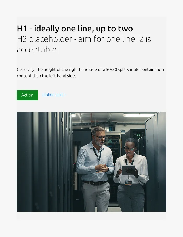
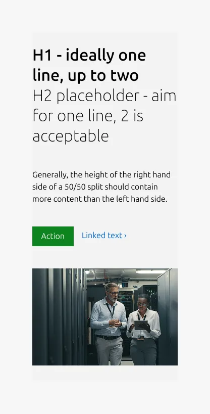
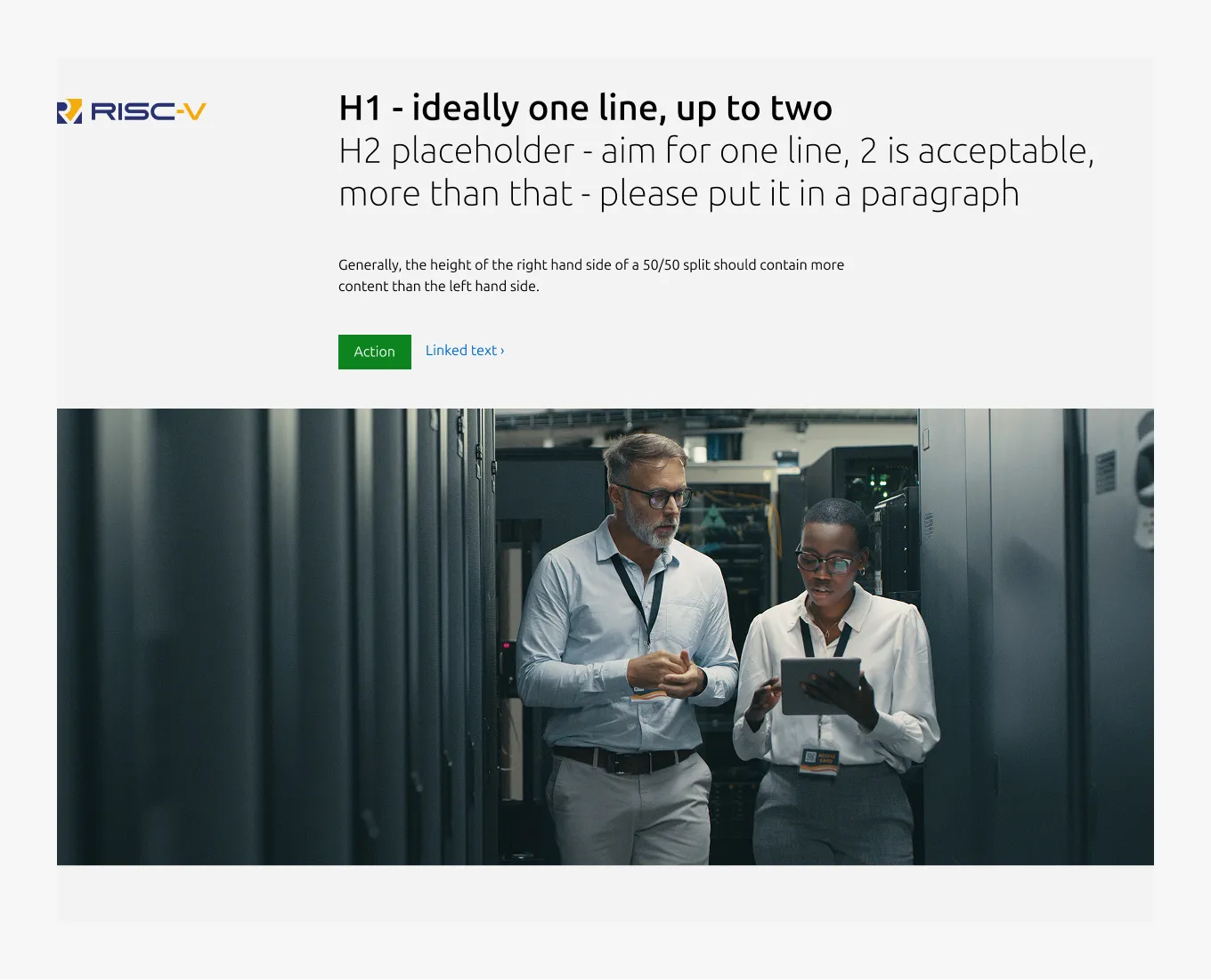
Full width image
This variant places the heading on the right, with the subheading, body, and CTA block on the left in a 50/50 layout, and positions a cinematic image at the bottom.
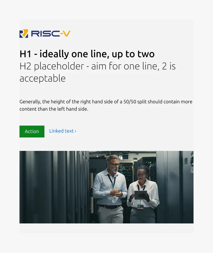
Large dimension
Medium dimension
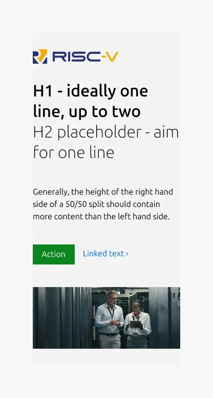
Small dimension
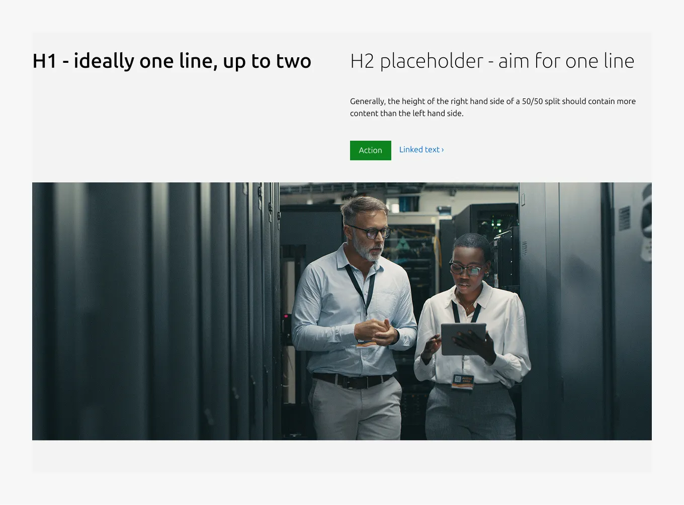
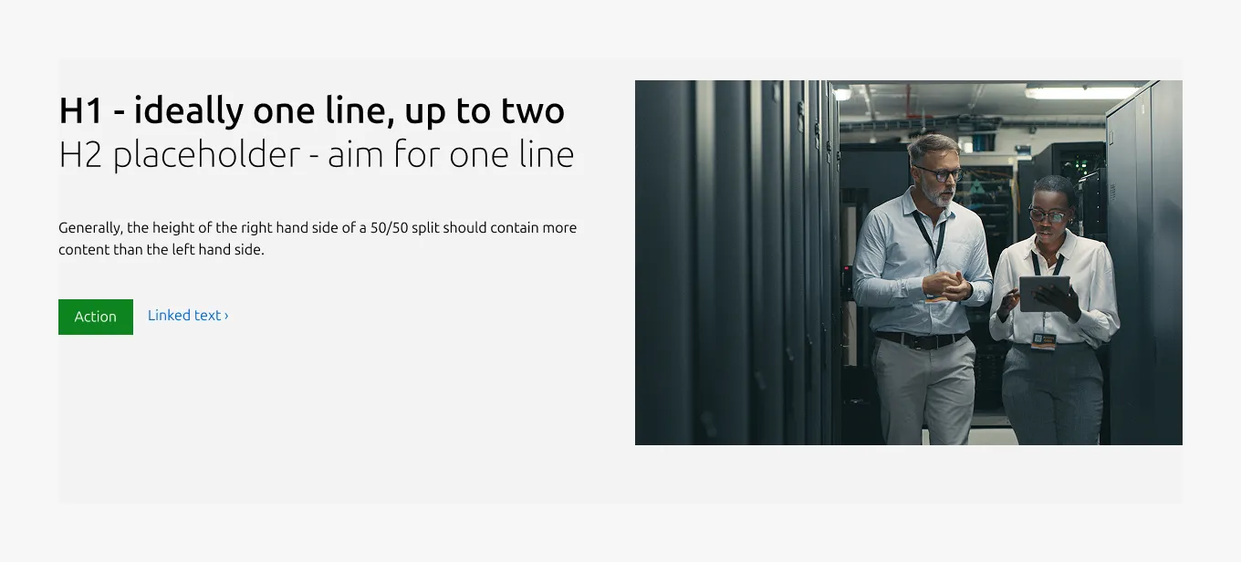
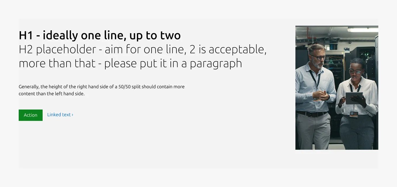
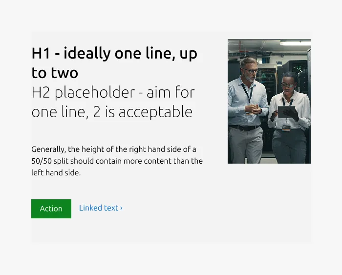
50/50
This variant places content on the right, with a 3:2 or 16:9 image on the left. In this layout, the image is required and may be used as an embedded video.
Large dimension
Medium dimension
This variant supports two layout options on medium screens: split (50/50) or stacked (full-width).
50/50
Full-width
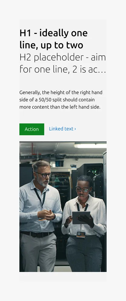
Small dimension
Signpost
If you have a small image that you want to associate with the hero title, you can use the "signpost" layout. This places the image in a small column beside the primary hero content.
Large dimension
Medium dimension
Small dimension
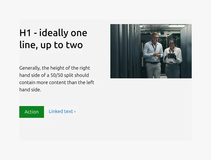
75/25
This variant relies on a deprecated grid and should be avoided until it is updated.
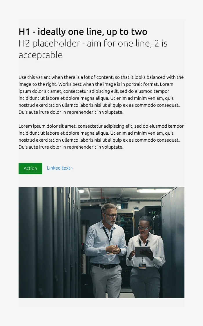
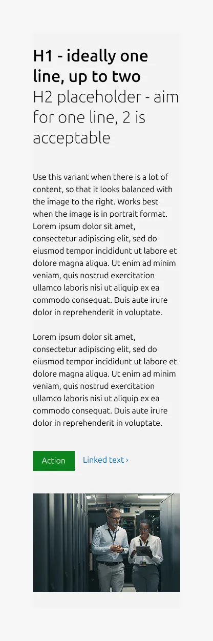
If you need to accommodate a large amount of body text and/or a portrait-oriented image, the 75/25 layout can be used, placing the image in a narrow column beside the hero content.
Large dimension
Medium dimension
The .row--75-25 class maintains the 75/25 split on medium screens.
Small dimension
If the image becomes too tall on small screens, use .u-hide--small to hide it.
Fallback
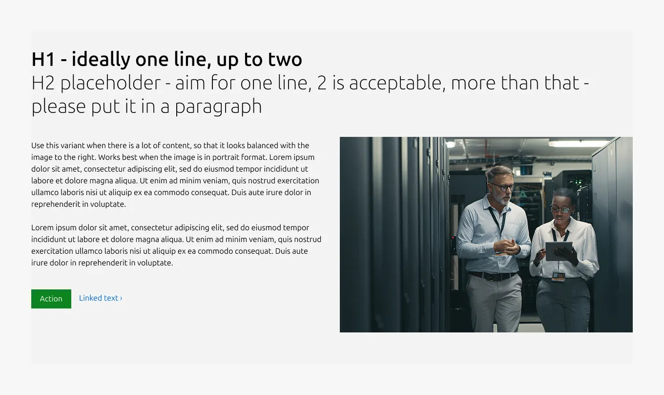
If you have a very large amount of text content that is difficult to balance with the hero image, you can use the fallback layout. This places the title and subtitle in their own row above the rest of the hero content.
Large dimension
Medium dimension
Small dimension
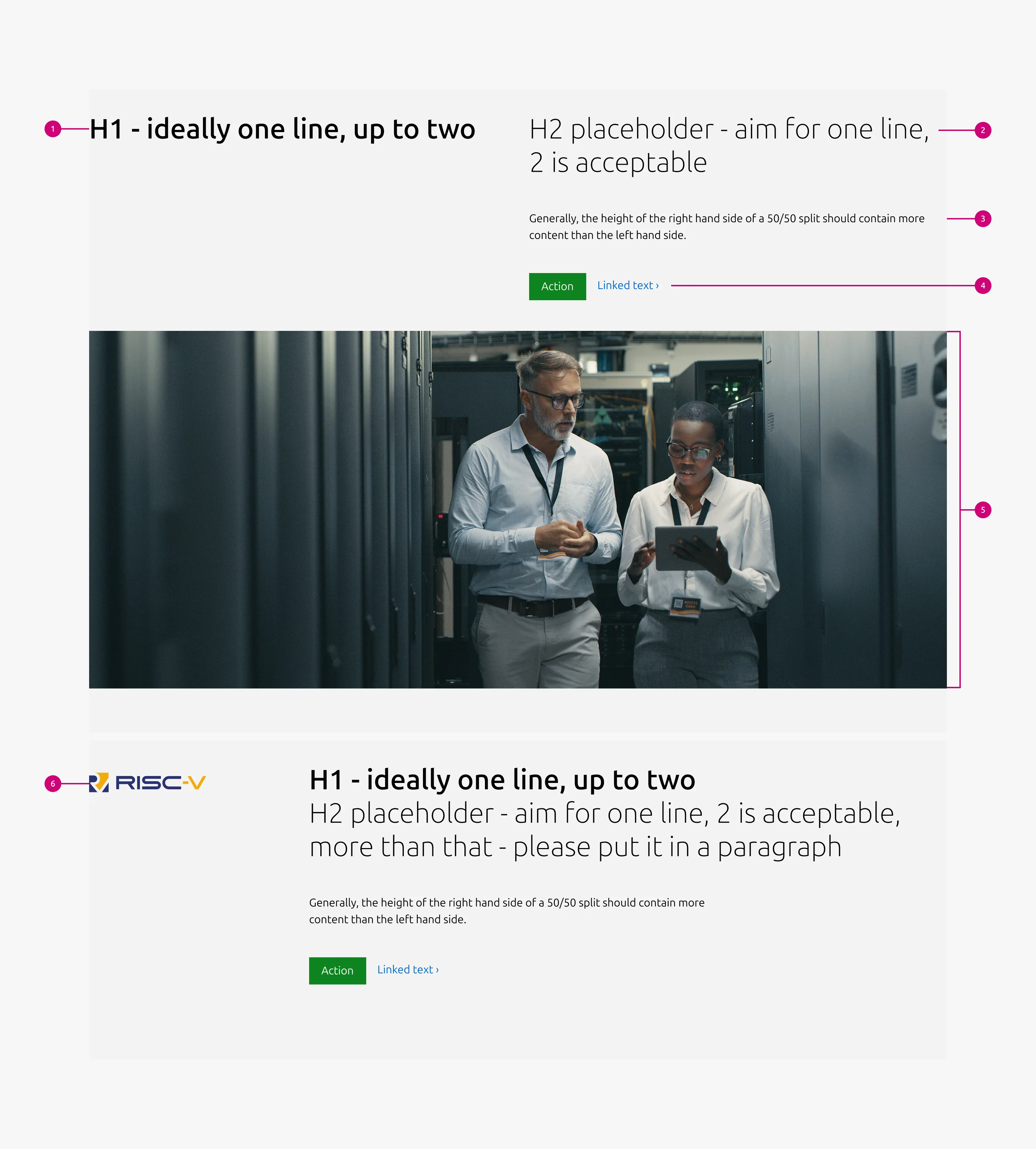
Properties
| Name | Type | Required | Description | Constraint | Options | Default option |
|---|---|---|---|---|---|---|
| Layout | single select | Yes | Determines the visual structure of the hero and the column spans of all content areas | - | full-width with iamge, 50/50, signpost, 75/25, fallback | fallback |
| Medium layout | single select | No | Indicate layout for the medium dimension | - | 50/50, full-width | full-width |
| Heading | string | Yes | Primary title, rendered as H1. Column span is determined by the layout variant | Up to 60 characters | - | - |
| Bottom padding | single select | Yes | The type of padding applied to the bottom of the pattern | - | default, deep, shallow, none | default |
| Subheading | string | No | Secondary title, rendered as H2. Column span is determined by the layout variant | Up to 60 characters | - | - |
| Body | string | No | Supporting description. Spans 4 or 6 columns depending on the layout variant; a max-width of 640px is applied at 6 columns | Up to 600 characters | - | - |
| Image | object | No | Required when layout is 75/25, 50/50, or fallback. | - | - | - |
| Video | string | No | In the 50/50 and fallback variants, an embedded video can be used in place of the image. | - | - | - |
| Signpost image | object | No | In the signpost variant, an image can be placed in the left two columns and may be left empty if needed. | - | with image, without image | with image |
Child properties
CTA block
| Name | Type | Required | Description | Constraint | Options | Default option |
|---|---|---|---|---|---|---|
| Primary CTA | string | No | The CTA used with the positive button style. It indicates a high-priority, positive action and is reserved for hero areas or other key call-to-action sections. | Up to 20 characters | - | - |
| Secondary CTA | string | No | The CTA using the default button style. It is used for most actions that are positive but not primary, and may serve as the main CTA in non-hero sections. | Up to 20 characters | - | - |
| Link CTA | string | No | The text link used for contextual actions or pathways to more information. It uses a chevron (›) to indicate navigation to additional content or pages. | Up to 60 characters | - | - |
Change log
| Who | When | What |
|---|---|---|
| Isaac Kim | 23.03.2026 | Initial commit |
Decision log
| Where | Decision made | Link |
|---|---|---|
| Design Systems Contributions | Decision: Add option to stack H1 and H2 in the full-width image variant. Rationale: Some layouts require more vertical space for headings, and stacking is already supported in the 50/50 hero pattern. Condition: This should only be used when the right-side content is taller than the left, and requires designer judgment. Next step: Update the pattern and add guidance to the documentation. | View |
| Design Systems Contributions | Decision: Proceed with updating the 75/25 hero to align with the new 4/4/8 grid (75/25 split). Rationale: The updated grid changes the medium breakpoint layout from 66/33 to 75/25 Impact: Potential visual changes in text wrapping and image proportion should be considered during design implementation. Next step: Update the pattern and add guidance to the documentation. | View |