
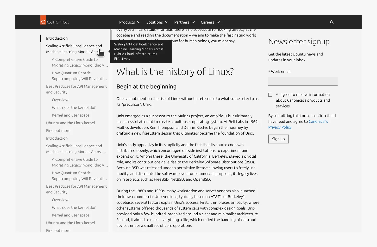
In-page navigation
In-page navigation is a navigational component for exploring content within a single page. Users can scan the page structure, jump directly to sections, and understand their current position as they scroll.
Anatomy
Usage
In-page navigation is intended for pages with structured, section-based content where users benefit from an overview of the page and quick access to specific sections.
The in-page navigation can either apply to a full page after the Hero or be manually scoped to specific sections.
When used at a full-page scope, only one instance is allowed per page. When manually scoped, multiple instances may be used as long as their scopes do not overlap.
Full-page and manually scoped instances cannot be used together.
Component structure
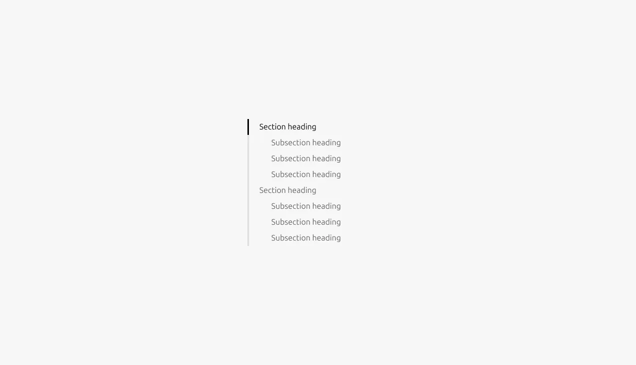
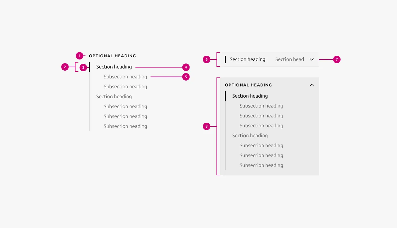
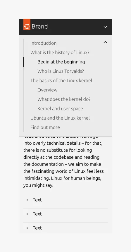
- The component is structured around section headings within the page.
- Headings in the Hero section are excluded from the in-page navigation.
Usage scope
- The component can be used for an entire page or manually applied to specific sections or groups of content.
- When a full-page scope is used, only one component is allowed per page.
- When scoped to specific sections, multiple components may be used.
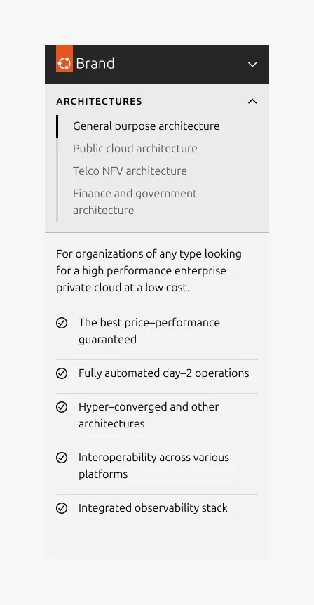
- There is an option to add a Heading on top of the in-page navigation component, which can be helpful in cases where the in-page navigation targets specific sections
- When multiple manually scoped components are used, their scopes must not overlap.
Component placement
- It is placed after the Hero section and applies only to content that follows the Hero.
- On initial load, the component position is fixed.
- As the user scrolls, the component transitions to sticky positioning once its container reaches the domain/bubble navigation boundary (24px below on desktop).
- When scoped to specific sections, it starts with the first section and remains sticky until the last section scrolls out of view.
- Large dimension: The in-page navigation is positioned in the left two-column rail.
- Small and medium dimension: The component spans the full screen width.
Anchor scroll offset
The scroll anchor offset ensures that the target section heading remains fully visible after in-page navigation interactions. It is determined by whether the domain/bubble navigation is sticky and by the screen size.
Sticky domain/bubble navigation
- Large dimension: 80px
- Small and medium dimension: 120px
Fixed domain/bubble navigation
- Large dimension: 24px
- Small and medium dimension: 72px
When to use
- The page has structured, section-based content and users benefit from an overview and quick access to specific sections
- The page is long-form or content-heavy with clearly defined thematic sections
- Users need to understand their current position while scrolling
- Scanning the page structure and navigation between sections improves usability
When not to use
- Short pages where all the content is visible without scrolling
- Pages with few sections or no clear heading structure
- Highly modular or card-like layouts with no clear hierarchy
- When in-page navigation would add unnecessary complexity without improving usability
Examples
Large dimension, full-page, before scrolling (fixed position)

Large dimension, full-page, after scrolling (sticky position)
Large dimension, manual scope with the optional Heading
Large dimension with independent scrolling by overflow
Small dimension in the collapsed variant, full-page, before scrolling (fixed position)

Small dimension in the collapsed variant, full-page, after scrolling (sticky position)

Small dimension in the expanded variant, full-page, after scrolling (sticky position)
Small dimension in expanded variant, manual scope with the optional Heading
Properties
| Name | Type | Required | Description | Constraint | Options | Default option |
|---|---|---|---|---|---|---|
| Heading | string | No | The heading of the in-page navigation in muted heading style | Up to 60 characters | - | - |
| Item | object | Yes | The navigation item represented as an object. The hierachy and order of the navigation should be reflected in the object to a maximum of 2 levels deep. | - | - | - |
| Primary level | single select | Yes | Defines how primary-level navigation items are generated. | - | - H2 - H3 - only used when the in-page navigation is scoped to specific sections or content group. | H2 |
| Secondary level | single select | No | Defines how secondary-level navigation items are generated under the primary level. | - | - H3 (when primary is H2) - H4 (when primary is H3) | H3 |
| Item heading | string | Yes | The item heading as it will appear in the navigation item | - | - | - |
| Item ID | string | Yes | The ID of the target heading | - | - | - |
| Scope | string | No | Defines whether the in-page navigation applies to the entire page or is manually limited to a specific sections or content group. | - | - Full-page - Manual | Full page |
Change log
| Who | When | What |
|---|---|---|
| Maximilian Blazek | 13.02.2026 | Added links |
| Isaac Kim | 23.02.2026 | Add description, usage guidelines, examples and properties. |
| Isaac Kim | 09.02.2026 | Initial commit |