
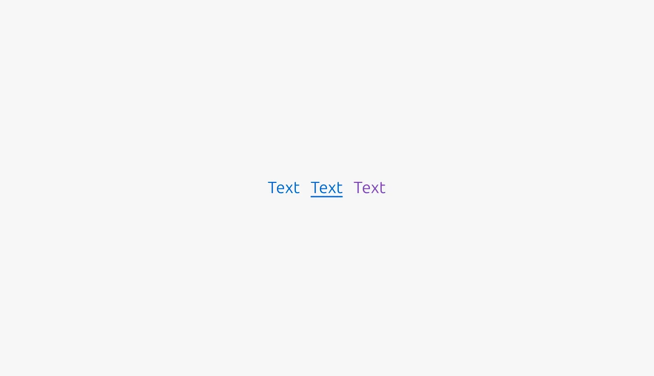
Link
Links are usually used for navigation. They connect users to different pages or sections in an interface. Navigational links can be embedded in body text, listed in footers, or integrated into Breadcrumbs and other wayfinding components.
Links can also prompt actions. They work best for actions that support but do not define the main user flow. Command links should clearly state that they lead to an action.
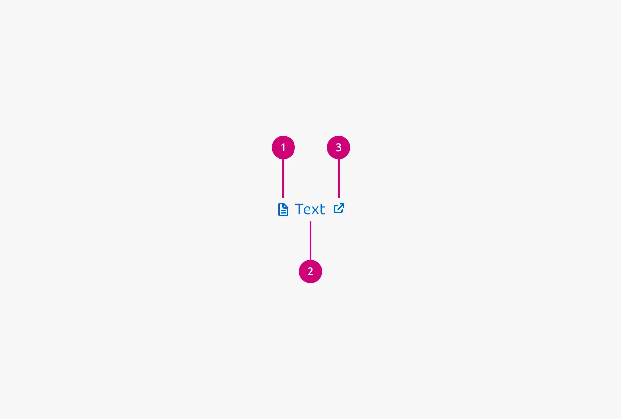
Anatomy
Usage
Links can navigate within your application (internal navigation) or direct users to external websites and resources (external navigation). They can also prompt system-level actions through protocols, such as mailto: for composing emails, tel: for initiating phone calls, or even open other applications as part of workflows such as authentication.
When to use
- To navigate between pages or sections within your application
- To direct users to external websites or resources
- Embedded within content to provide related information or sources
- For secondary, low-consequence actions that support the user flow
- To prompt system-level actions (starting an email or phone call, opening applications)
When not to use
- For primary actions or those with significant consequences (use Button instead)
- For actions that transform, submit, or manipulate data (use Button instead)
- When the interaction represents a meaningful state change in the application (use Button instead)
- At high-priority conversion points where visual prominence is needed (use Button instead)
Command links
Nielsen Norman Group research on command links shows they have more room for descriptive text than Buttons. Use action-oriented language and start with a verb. For example, ‘expand for more options’ or ‘show more details’.
Use command links for secondary actions with minor consequences, such as revealing content. Use action-oriented language and try to start with a verb to distinguish command links from navigational links. You can use Buttons for primary actions with significant consequences.
Users often expect links to act as navigational links, so command links should only prompt actions with minor consequences, where unexpected behavior won't frustrate users or cause errors.
Differentiating links from Buttons
Links and Buttons are both interactive components, but they have different purposes:
- Links navigate between pages or sections and should be used for secondary actions with minimal consequences. They do not alter the application state.
- **Button**s are for actions that represent state changes in the applications. They have significant consequences such as to transform, submit, or manipulate data.
Use Buttons when the interaction has significant consequences, such as saving forms, deleting items, processing payments, or updating settings. While you may use Buttons for some navigation tasks, such as in a Hero section, never use links for primary actions with significant consequences.
Link text
Keep Link text concise, descriptive, and meaningful out of context. Users often scan pages specifically looking for links, so the text should clearly indicate the destination or action.
- Avoid generic phrases with no context, such as "click here" or "read more"
- Do not use the word "link" in the Link text itself
- Be specific about the destination, for example "View our privacy policy" instead of "Learn more"
- Use sentence-style capitalization for standalone links with multiple words
- Start with verbs for command links
Use with intention
Like all interactive elements, links should be used deliberately. Too many links in close proximity create cognitive overload and make it difficult for users to determine which action to take. Be selective about what you link to, prioritize the most relevant and valuable destinations for your users' context.
External link icon
An optional External link icon can appear after the Link text to indicate that the destination is outside the current application or site. The icon also reassures the user that opening the link will not interrupt their task, for example when they are completing a form, because the page will open in a new tab. Links that use the External link icon must always open in a new tab.
Soft links
Soft links use default text styling instead of traditional link styling. The link styling only appears on hover, functioning otherwise like a normal link. Use soft links when it's not critical for users to immediately recognize text as a link, or when the context already makes this clear. They're particularly useful when displaying multiple consecutive links, such as in download sections with lists of assets, where excessive link styling would be visually overwhelming.
Properties
| Name | Type | Required | Description | Constraint | Options | Default option |
|---|---|---|---|---|---|---|
| Link text | string | Yes | The text that should be shown for this link. | - | - | - |
| Target | string | No | Where the user should be linked to (if it is a navigational link). | - | - | - |
| Action | callback | No | The action that should be performed if this command link is used. | - | - | - |
| Show external link icon | boolean | No | Wether to show the external link icon (if it is an external link). | - | - | false |
| Soft | boolean | No | Wether the icon is soft or not. The soft version makes the link be styled in the same way as default text. Only on hover does it have the default link styling. | - | - | false |
Change log
| Who | When | What |
|---|---|---|
| Maximilian Blazek | 21.11.2025 | Initial commit |
| Maximilian Blazek | 13.02.2026 | Added links |
| Maximilian Blazek | 10.12.2025 | Added soft link property and usage guidelines. Added external link icon usage guidelines. Added leading icon to anatomy |
| Maximilian Blazek | 01.12.2025 | Add description, anatomy description, usage guidelines and properties. |