
Button
Buttons trigger actions within an interface, typically involving data transformation or manipulation. They provide clear visual indicators of the primary actions users can perform on a page or section.
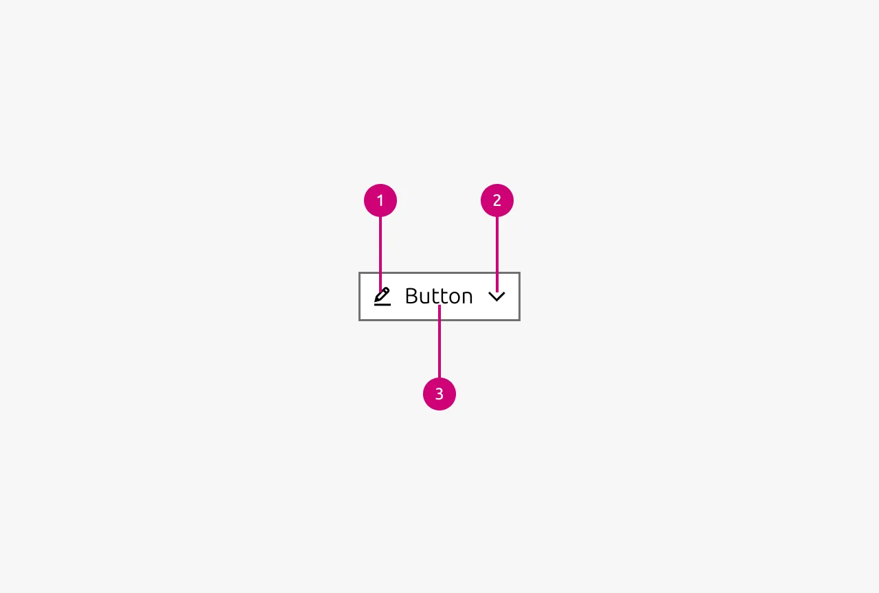
Anatomy
Usage
Use buttons for meaningful interactions that transform, submit, or manipulate data, such as:
- Submitting forms
- Deleting items
- Processing payments
- Updating settings.
Actions represent state changes in the application rather than simple navigation.
Buttons help establish clear visual hierarchy by signaling the most important actions available to users at any given moment. This hierarchy is critical to effective interface design. Users should immediately understand what action they're expected to take.
While buttons should primarily trigger actions, they can occasionally be used for navigation when the context demands it. This is most appropriate for high-priority conversion points, such as call-to-action buttons in hero sections that direct users to, for example, sign-up flows or landing pages. In these cases, the button represents a key user journey rather than standard navigation.
When to use
- For actions that transform, submit, or manipulate data
- To draw attention to the most important action on a page or section
- For high-priority conversion points or key user journeys
- When the interaction represents a meaningful state change in the application
When not to use
- For simple navigation between pages (use Link instead)
- When you already have a primary button visible in the current viewport (consider using secondary or tertiary button styles instead)
- For multiple competing actions of equal importance (reconsider your information architecture and prioritize one clear primary action)
Call to actions
Almost always, there is an action that the user needs to perform on a page. Guide users toward the main action within the user flow that you have designed. This means being opinionated about what action the user should be performing and using that as the primary call to action. Rather than presenting users with an overwhelming array of choices, you should clearly signal the intended path forward. As a result, the main action on any given page should, in most cases, be represented by a primary button.
Be deliberate about the number of calls-to-action you present. Each additional CTA dilutes the user's focus and makes it harder for them to decide what to do. Ideally, limit pages to as few CTAs as possible so users clearly understand their intended path forward. As a rule of thumb, there should almost never be more than one primary button visible in the user's viewport at a time.
When multiple primary buttons compete for attention simultaneously, the hierarchy collapses and users face decision paralysis. If you find yourself needing multiple primary actions in view, reconsider whether they're all truly primary and whether some could be deprioritized or removed entirely.
Button order and alignment
Right-aligned buttons when:
- The action moves the user forward in a flow (forms, wizards, checkout)
- In modal dialogs and confirmation windows
- Settings or configuration panels
- The button completes or submits something
- Following the natural "end of task" position after scanning content left-to-right
Left-aligned buttons when:
- The button is a direct continuation of left-aligned content (Hero, cards, marketing blocks)
- The action relates to specific content above it
- "Back" or "Cancel" actions that return users to a previous state
- Article pages or content-heavy contexts where buttons are secondary to the text
Icon buttons
In situations where space is limited and the actions have easily recognizable icons, buttons may use an icon without Text. These should be reserved for very common actions such as delete, edit, or close. Icon-only buttons must always include a Tooltip that clearly states the action the button performs. The Tooltip should include a delay so that it does not interrupt the user unnecessarily.
When to disable buttons
For form submissions, buttons should remain enabled even when mandatory fields are incomplete. Users often don't understand why a button is disabled, particularly in longer or more complex forms where they may have overlooked a required field. Allowing users to click the button and receive validation feedback makes it easier for them to discover and correct their mistakes.
Disabling is more appropriate when the system knows an action is genuinely unavailable, not due to incomplete input, but due to external constraints like permissions, plan limits, or missing prerequisites. In these cases, clearly communicate why the action is unavailable with a Tooltip.
If possible, provide an alternative that unblocks the user. For example, if an empty state requires a prerequisite to be fulfilled first, display the action to complete that prerequisite rather than showing a disabled button with no clear path forward.
Dual buttons
There are situations where opposing actions can be combined into a single button, for example play and pause in a video player. The icon or label should reflect the action that will occur when the user presses the button. If the media is playing, show the pause icon. If it is paused, show the play icon. This aligns with user intent because they select an action, not a status.
Properties
| Name | Type | Required | Description | Constraint | Options | Default option |
|---|---|---|---|---|---|---|
| Type | single select | No | Type controls the semantic type of the button. | - | default, base, brand, positive, negative | default |
| State | single select | No | The state the button is currently in. | - | default, hover, active, processing, disabled | default |
| Size | single select | No | Controls the size of the button. Smaller sizes can be used in places where space is at a premium. | - | default, small, dense | default |
| Text | string | No | Determines the Text that is being displayed in the button. Either text or an icon needs to be provided. If no text is provided but an icon is it is an icon only button | - | - | - |
| Icon left | single select | No | Determines the type of icon that is shown in the button on the left side. Either the text or this icon needs to be provided. If only this icon is provided then it is an icon only button. If no icon is provided the icon is not shown | - | Available icons in Vanilla | - |
| Icon right | single select | No | Determines the type of icon that is shown in the button on the right side. While there is no restriction which icon can be shown here be aware that semantic icons should be shown on the left. For the most part only chevrons are used on this side. | - | Available icons in Vanilla | - |
Change log
| Who | When | What |
|---|---|---|
| Maximilian Blazek | 21.11.2025 | Initial commit |
| Maximilian Blazek | 13.02.2026 | Add links |
| Maximilian Blazek | 01.12.2025 | Updated button usage guidelines around number of CTAs as discussed in the panel. |
Decision log
| Where | Decision made | Link |
|---|---|---|
| App Mafia | Question: Should buttons in the forms be disabled if not all mandatory fields have been filled? Decision: Buttons should be enabled even if mandatory fields are missing. Users might not know why a button is disabled (they might have missed that there is a mandatory field, especially in longer, complexer forms). Enabling the button and “allowing” the user to fail will make it easier for them to discover their mistake (as clicking the button should highlight to the user what is still missing). | View |
| App Mafia | Question: Should we allow a user to fail to do an action? Decisions: We should prevent the failure if the system knows the user won’t be able to perform the action. For example, if we know the user won’t be able to add a new item on a page, displaying a notification and disabling the button is preferable. However, when we have an alternative action that would unblock the user, we should provide that option. For example, in an empty state that has pre-requirements, we should display the action to fulfil the pre-requisite. | View |