
Chip
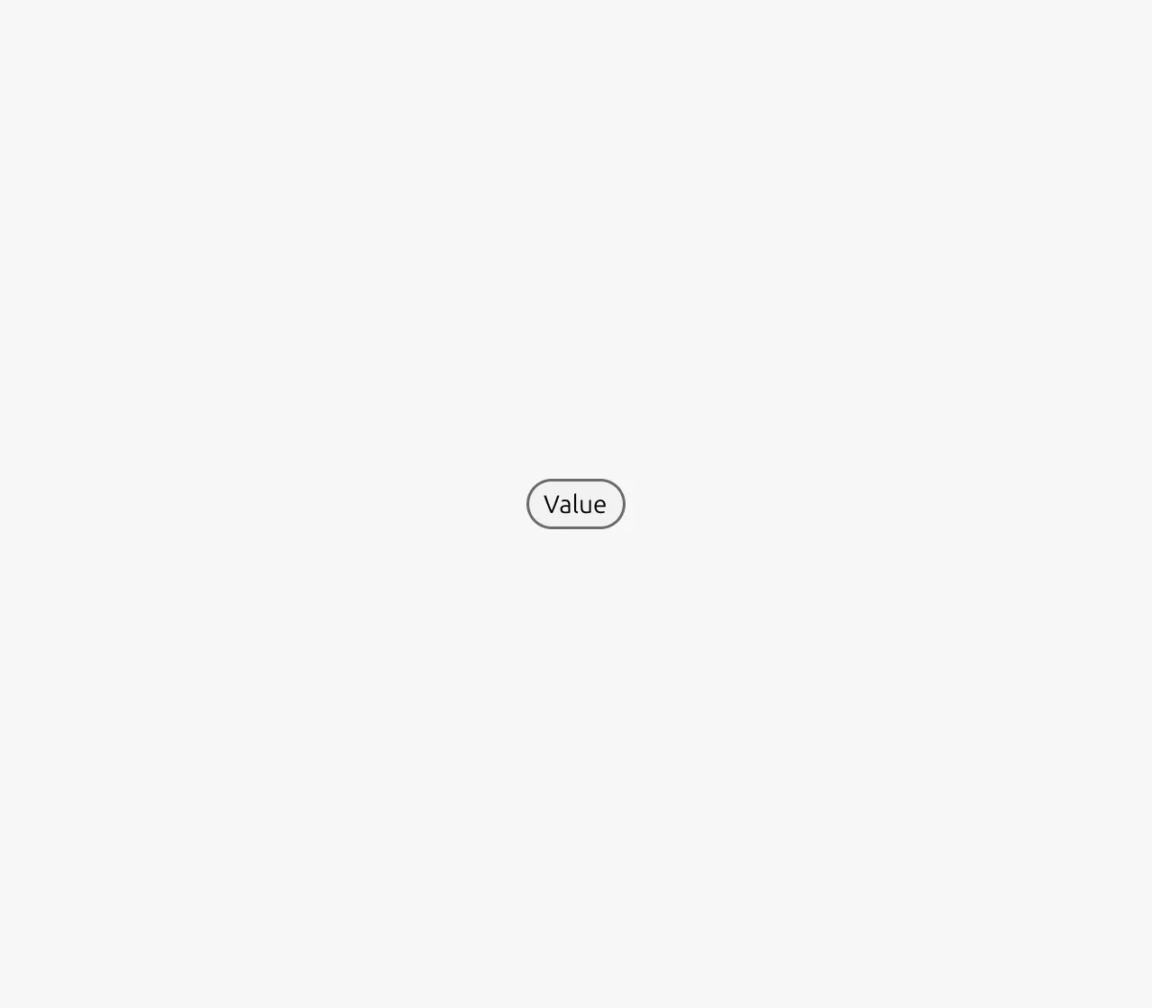
Chips are visual elements that display information about a specific entity on the page. This information can be status, categories, tags, etc.
They make this information more visually prominent and therefore elevate it in the information hierarchy.
In addition to displaying information, chips can also facilitate secondary actions such as content filtering, selection and highlighting. When interactive, chips maintain their primary function of displaying information - filter chips display applied filters while allowing dismissal, selection chips highlight selected options while allowing changes. Chips should not replace the primary call-to-action Button. They should be used for supporting actions that complement the main user flow rather than driving it.
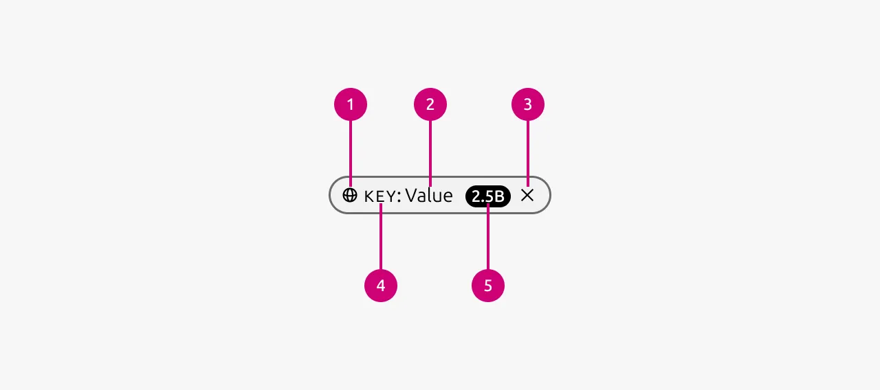
Anatomy
Usage
Chips are visual elements that display information about a specific entity on the page. This information can be status, categories, tags, etc. They make this information more visually prominent and therefore elevate it in the information hierarchy.
In addition to displaying information, chips can also facilitate secondary actions such as content filtering, selection and highlighting. When interactive, chips maintain their primary function of displaying information - filter chips display applied filters while allowing dismissal, selection chips highlight selected options while allowing changes. Chips should not replace the primary call-to-action Button - they should be used for supporting actions that complement the main user flow rather than driving it.
Properties
| Name | Type | Required | Description | Constraint | Options | Default option |
|---|---|---|---|---|---|---|
| Variant | single select | No | Wether the chip is interactive or not. Read-only should be used for chips where no secondary action is needed in the lifecycle of the chip. For example to show the status of an entity. | - | default, read-only | default |
| State | single select | No | The state the button is currently in. The read-only variant does not have states. | - | default, hover, active | default |
| Color | single select | No | The color the chip should have. Be aware that some of the colors might be interpreted in a semantic way by users. | - | gray, green, blue, red, yellow | gray |
| Size | single select | No | Determines the vertical spacing of the chip. Dense can be used in situations where space is limited | - | default, dense | default |
| Icon | single select | No | Controls the icon that is shown in the chip. | - | All icons available in Vanilla | - |
| Lead | string | No | Controls what the lead of the chip is. | - | - | - |
| Value | string | No | Controls what the value of the chips is | - | - | - |
| Badge | slot | No | Can be used to attach a badge to the chip | Can only contain Badge component | - | - |
| Dismissible | boolean | No | Determines wether the chip can be dismissed or not. The read-only variant can not be dismissible. | - | true, false | false |
Change log
| Who | When | What |
|---|---|---|
| Maximilian Blazek | 21.11.2025 | Initial commit |
| Maximilian Blazek | 13.02.2026 | Add links |