
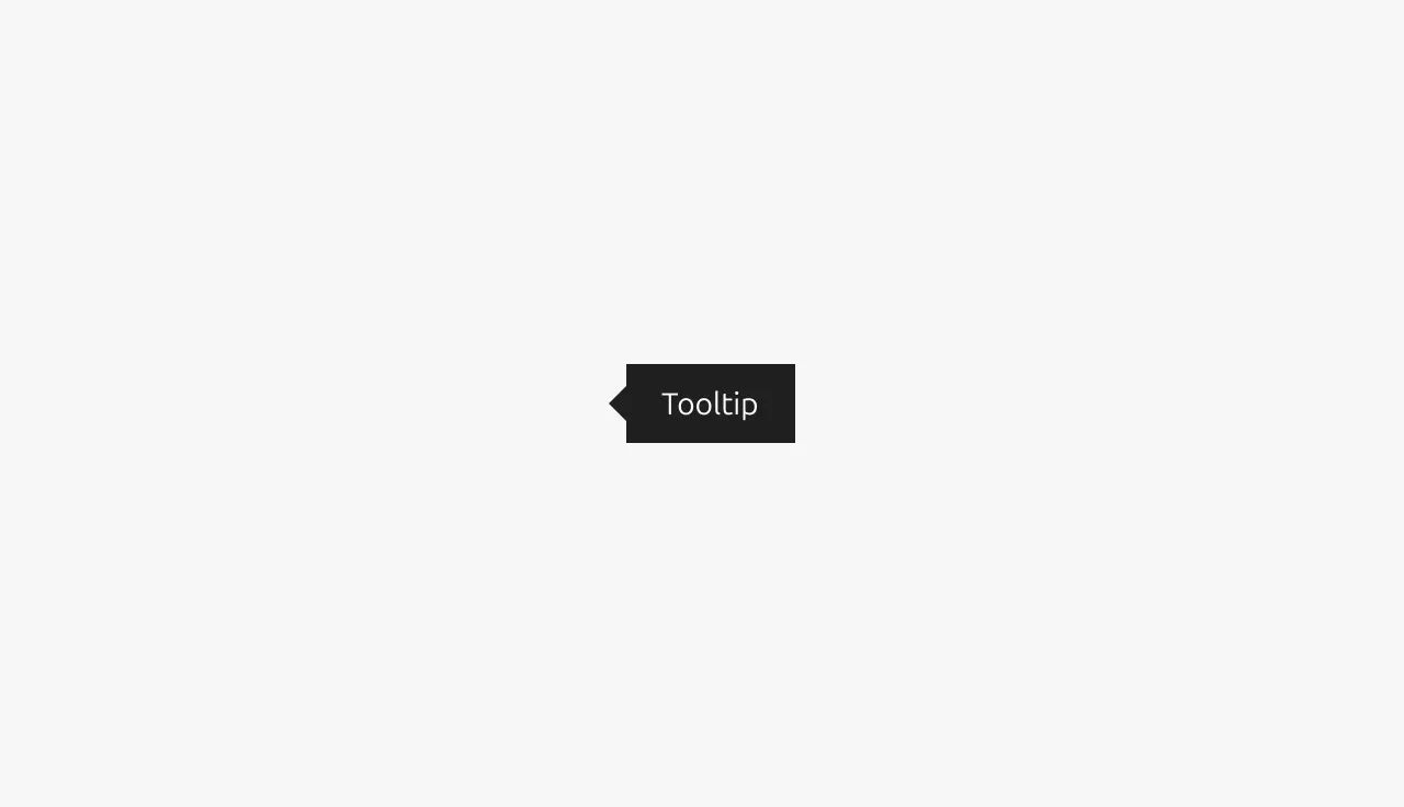
Tooltip
A tooltip is a small popup that displays helpful information or context when a user hovers over or focuses on an element, providing additional details without cluttering the interface.
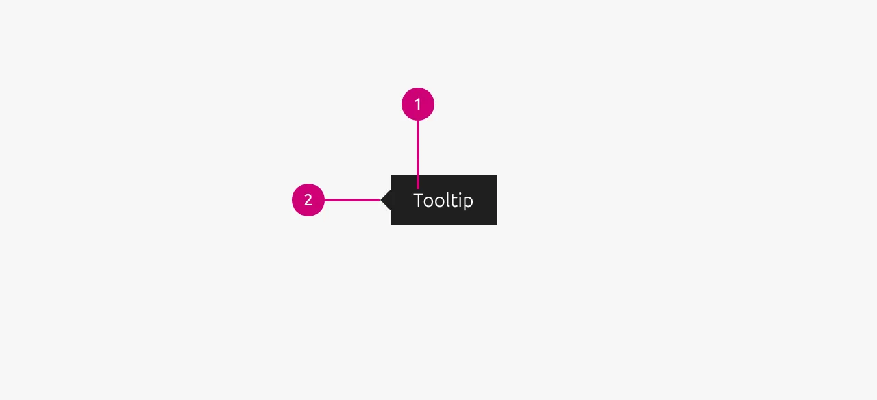
Anatomy
Usage
Tooltips are contextual overlays that provide supplementary information or clarification when users hover over or focus on an element. They serve as a lightweight way to enhance user understanding without cluttering the interface with permanent text. Tooltips typically appear on hover and disappear when the user moves away from the trigger element, though they must remain visible when users move their cursor from the trigger to the tooltip itself, allowing interaction with the tooltip content. This makes them ideal for progressive disclosure of non-critical information, but designers must consider that hover interactions don't exist on touch devices, making tooltips inaccessible to mobile users unless alternative access methods are provided. Designers should carefully evaluate whether information is truly supplementary. If the content is essential for task completion or understanding, it may warrant permanent placement in the interface rather than being hidden behind a tooltip interaction.
Positioning
Tooltip positioning is critical for usability and should be handled automatically by the component's code implementation. However, it's important to verify proper positioning behavior when implementing tooltips in your product, especially near viewport edges, scrollable containers, or dense interface areas. The tooltip should intelligently adjust its position to remain visible and avoid being cut off by screen boundaries. For detailed information about positioning strategie, refer to the styling documentation below.
Allowed elements in tooltips
Tooltips should contain only text elements.
Including Link or other interactive elements within tooltips is generally discouraged by most design systems, though not explicitly prohibited by WCAG accessibility guidelines.
If a Link is required in the tooltip then specific interaction patterns must be maintained to satisfy accessibility guidelines:
- The tooltip must remain visible when users move their cursor from the trigger element to the tooltip content
- For keyboard navigation, the tooltip must stay open when users tab into it to focus interactive elements within
When these conditions are met, interactive tooltip content can be considered accessible, though simpler alternatives like dedicated help sections or inline explanations often provide better user experiences.
When to use
- Show truncated text by displaying the full content when text has been cut off due to space constraints
- Explain disabled states by providing context for why a Button or action is currently unavailable
- Clarify icon meanings by adding descriptive text to icons or icon-only Buttons that may be ambiguous
- Pairing with dedicated help or information icons to provide detailed explanations
- Define abbreviations or technical terms by offering quick definitions without requiring navigation away from the current context
- Provide keyboard shortcuts by showing available hotkeys for interactive elements
When not to use
- Essential information should not be hidden behind tooltips if users need it to complete their primary task
- Complex content that would be better suited for dedicated help sections rather than brief tooltip text
- Mobile-first experiences where hover states don't exist on touch devices unless alternative access methods are provided
- Permanent reference information that users will need to reference repeatedly during their workflow
- Error messages should use dedicated error states instead of tooltips for validation feedback
- Primary navigation should not rely on tooltips as the sole method of explaining navigation options
Properties
| Name | Type | Required | Description | Constraint | Options | Default option |
|---|---|---|---|---|---|---|
| Arrow location | single select | No | Where the location of the arrow of the tooltip is. | - | left, right, top left, top middle, top right, bottom left, bottom middle, bottom right | left |
| Tooltip text | string | No | The text content of the tooltip. | - | - | - |
Change log
| Who | When | What |
|---|---|---|
| Maximilian Blazek | 21.11.2025 | Initial commit |