
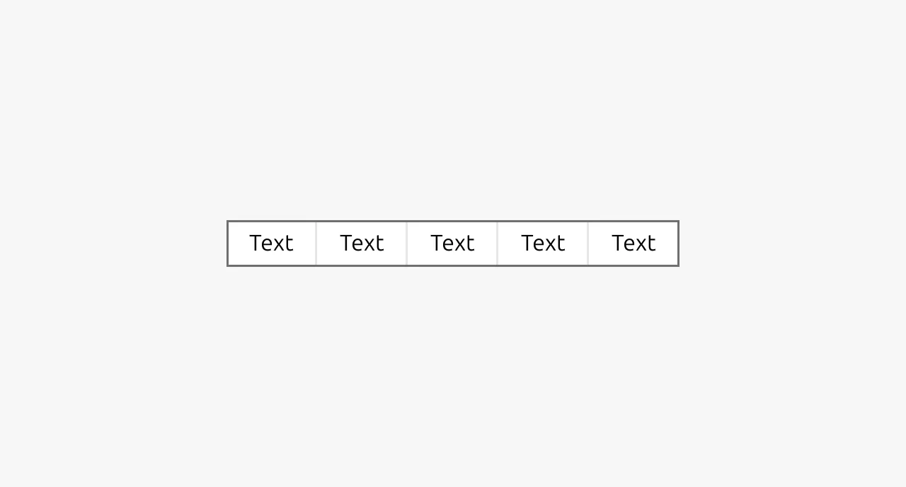
Segmented control
A segmented control allows users to toggle between alternate views of the same content, displaying only one view at a time. This component is commonly used to let users switch between different formats or representations of the same underlying data, such as viewing information as a table, a list, or a cards.
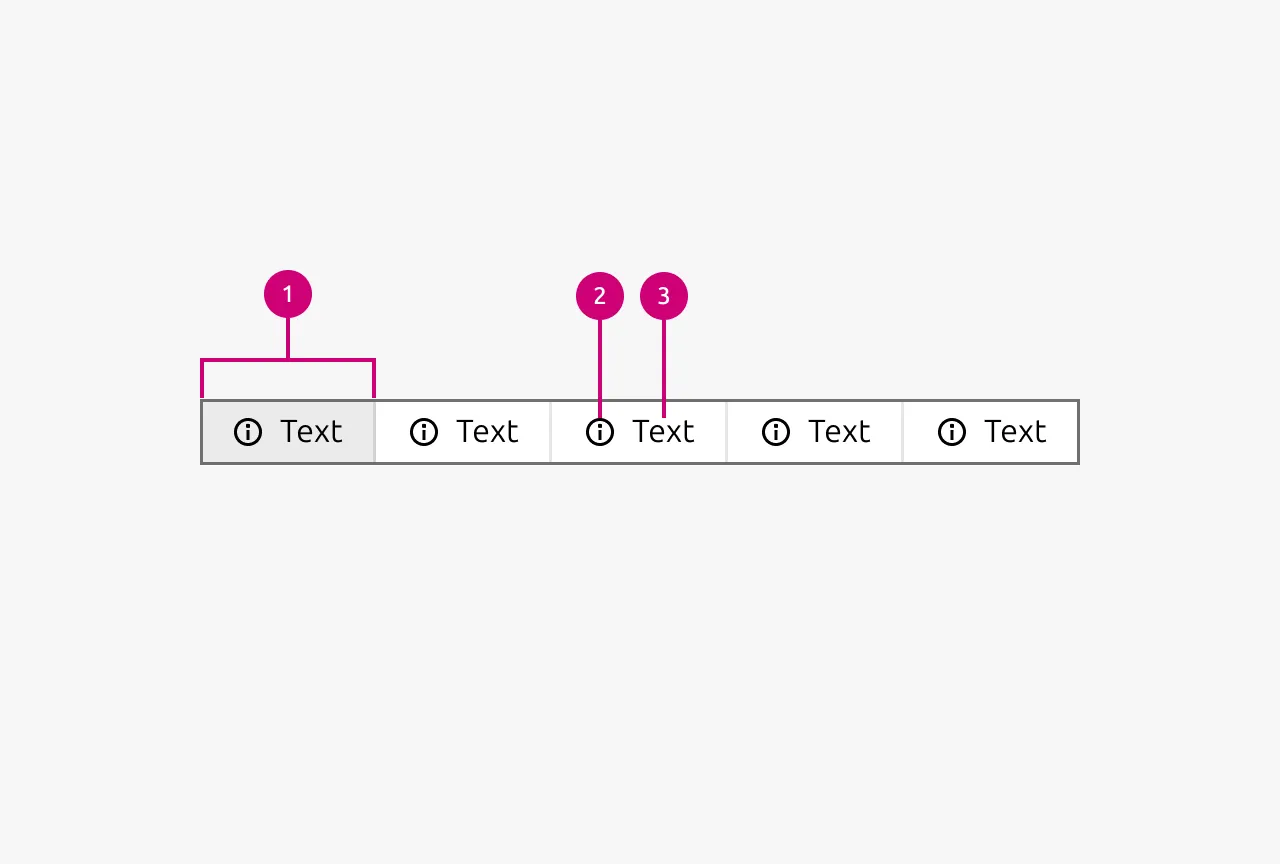
Anatomy
Usage
A segmented control allows users to toggle between alternate views of the same content, displaying only one view at a time. This component is commonly used to let users switch between different formats or representations of the same underlying data, such as viewing information as a table, a list, or a cards.
The key distinction of a segmented control is that it changes how content is displayed rather than what content is displayed. All Segments should present the same data, just rendered differently. For example, a dataset might be viewable as a spreadsheet-style table or as a visual map. The information remains identical, but the presentation changes based on user preference or task requirements.
Segmented controls are often used alongside Tabs but operate at a lower level in the information hierarchy. While Tabs separate distinct content areas, segmented controls sort or reformat related content within those areas. This hierarchical relationship means a segmented control might live inside a tab panel to offer view options for that specific section.
Segmented controls are not Button groups
A segmented control should never be used to group together different actions. Despite their visual similarity, segmented controls and Button groups serve fundamentally different purposes. Segmented controls toggle views while Button groups, on the other hand, trigger discrete actions that transform, submit, or manipulate data.
If your use case involves multiple related actions rather than view switching, use a group of Buttons instead.
Segmented controls are not Tabs
While both components involve switching between options, Tabs and segmented controls serve different roles. Tabs navigate between distinct content areas, like subpages or separate sections that contain fundamentally different information. Segmented controls, by contrast, show the same content in different ways. If users switching between options would see entirely different data or content panels, use Tabs instead. Segmented controls are appropriate when the underlying information stays constant but its visual representation changes.
Labels and icons
Labels should clearly describe the type of view each Segment represents. Use concise, descriptive terms that communicate the format or representation, such as "Table," "Map," "List," or "Grid." Users should immediately understand what they'll see when selecting each option.
Icons can help reinforce the meaning of labels and improve scannability, particularly when the view types have strong visual associations. However, maintain consistency across all Segments. Either all Segments should include icons alongside their labels, or none should. Mixing icons with text-only labels creates visual imbalance and inconsistency.
Keep options minimal
Limit segmented controls to a small number of views. As a general rule, more than five options is likely too many and risks overwhelming users rather than helping them.
If you find yourself needing many view options, reconsider whether all are truly necessary or whether some could be consolidated. A segmented control should offer a quick, simple choice between a handful of meaningful alternatives.
Placement and scope
A segmented control affects all content below it in the visual hierarchy. Position the control directly above the content area it governs, making the relationship between the control and its associated content clear. Users should understand at a glance which portion of the interface will change when they select a different Segment.
When to use
- To let users toggle between different visual formats of the same data (grid view, table view, list view)
- To filter or sort a content set into different views (all, read, unread)
- When all view options display the same underlying information, just presented differently
- As a secondary control within Tabs to offer view options for that tab's content
When not to use
- For navigation between distinct content areas or subpages (use Tabs instead)
- To group together different actions that transform or manipulate data (use a Button group instead)
- For binary input controls or on/off choices (use a Switch or Radio instead)
- When you have more than five view options (reconsider your information architecture)
- When each option would display fundamentally different data or content
Properties
| Name | Type | Required | Description | Constraint | Options | Default option |
|---|---|---|---|---|---|---|
| Segment text | string | No | The text that is displayed for a segment | - | - | - |
| Segment icon | single select | No | The icon that is being shown as a part of a segment | - | All icons in Vanilla | - |
| Segment state | single select | No | The states a Segment can be in | - | Default, hover, active | default |
Change log
| Who | When | What |
|---|---|---|
| Maximilian Blazek | 21.11.2025 | Initial commit |
| Maximilian Blazek | 13.02.2026 | Added links |
| Daniel Mutis | 12.01.2026 | Added description, usage guidelines, properties table, anatomy and anatomy description |