
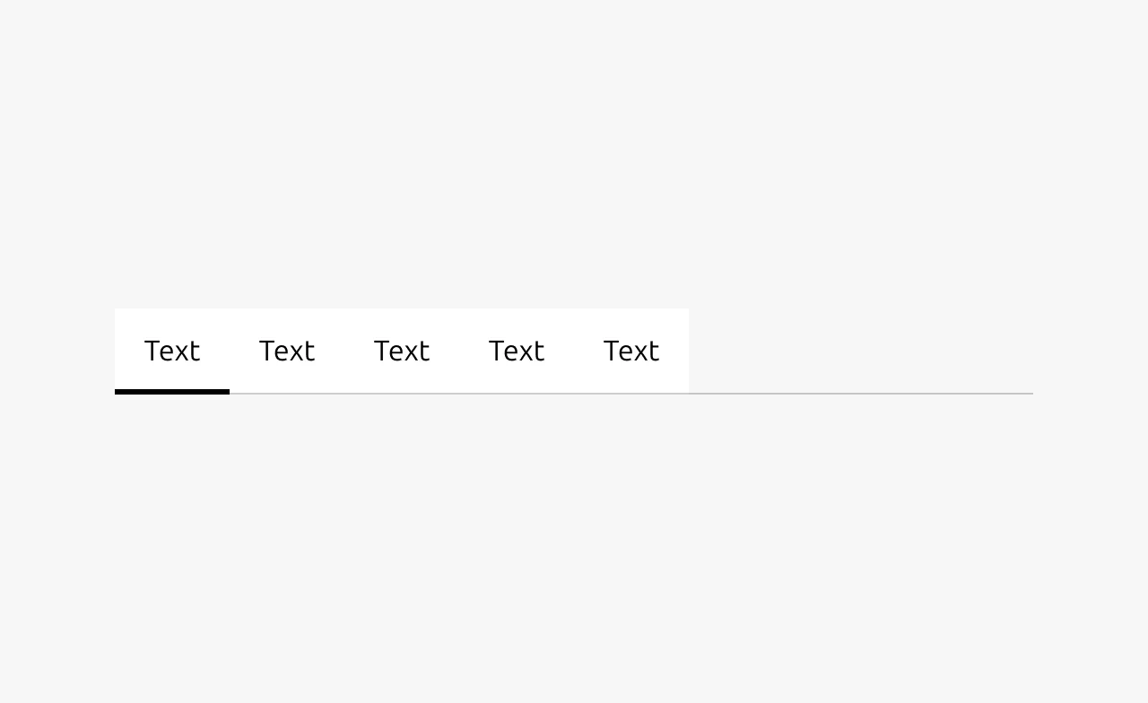
Tabs
A tabs component organizes related content into separate sections, allowing users to switch between different content panels within the same context by clicking on labeled tab headers. It helps reduce visual clutter by displaying only one content panel at a time while keeping all options easily accessible.
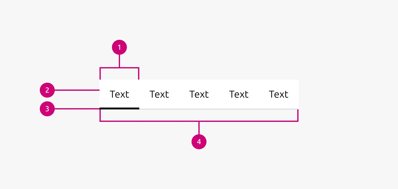
Anatomy
Usage
Tabs are used to organize related content at the same level of hierarchy, allowing users to focus on one section at a time without leaving the current context. They work best when content sections are closely related but mutually exclusive (when users typically need to see only one section to complete their task).
Unlike navigation, which moves users between different pages or sections of an application, tabs keep users in the same place while switching between different aspects of the same topic or dataset. This distinction is important: tabs are a content organization pattern, not a navigation pattern. The tab labels should be predictable and not overlap in content, giving users a clear mental model of what content lives under each tab. For example, tabs labeled "Overview," "Specifications," and "Reviews" for a product page set clear expectations about what each section contains.
Unlike Accordion, which stack vertically and can display multiple sections simultaneously, tabs enforce a single-focus model where only one content panel is ever visible. Choose Accordion when users may need to compare information across sections or reference multiple sections at once. Choose tabs when the content is mutually exclusive and users benefit from focusing on one thing at a time.
Placement and context
Tabs should not appear at the very top of a page. Placing them there essentially creates another layer of navigation, which confuses users about where they are in the application hierarchy. If you find yourself wanting top-level tabs, consider whether those sections belong in the primary navigation instead.
There should always be content above the tabs that establishes context. This could be a page title, a description, or information about the item the tabs relate to. The tabs then organize the detailed content that follows. This placement reinforces that tabs are subdividing content within a page, not defining the page itself.
URL structure
Consider whether users will want to reference a specific tab in the future, either for themselves or to share with others. If so, each tab should have its own URL. In marketing websites or informational pages, users rarely need to link directly to a specific tab. However, in applications where users collaborate or need to bookmark specific views, such as machine details, customer records, or project settings, deep linking to individual tabs becomes valuable. A technician sending a colleague to the "Networking" tab of a specific machine should be able to share a direct link.
Scope of effect
Tabs affect all content below them. This is the expected behavior and requires no additional visual treatment. However, there are cases where tabs appear in the middle of a page and only control a specific section rather than everything beneath them. In these situations, the affected area must be clearly distinguishable through visual boundaries, background colors, or contained card layouts, so users understand exactly what will change when they switch tabs.
Tabs cannot be nested. If you find yourself wanting tabs within tabs, reconsider your information architecture. This usually indicates that the content structure is too complex and would benefit from a different approach, such as separate pages or a combination of navigation and tabs.
When to use
- To organize related content that doesn't need to be viewed simultaneously
- When you have 2–7 sections of content that are at the same level of hierarchy
- To reduce cognitive load by breaking up content into digestible chunks
- For switching between different aspects or properties of a single item (e.g., Overview, Specifications, Reviews for a product)
- When space is limited and you need to display multiple categories of information in the same area
- To group related settings or configuration options that are independent of each other
When not to use
- As primary navigation. Tabs are for content organization, not for moving between pages
- Within forms where submission scope is unclear. Users won't know if all tabs or just the visible tab will be submitted
- For sequential or step-by-step processes. Use a stepper or wizard pattern instead
- When users need to compare content across sections. Consider an Accordion that allows multiple expanded sections
- For a single section of content. Tabs require at least two sections to be meaningful
- When you have many sections (8+). Consider separate pages with navigation instead
- To show different views of the same data/content. Use Segmented control (aka view switcher) instead
Properties
| Name | Type | Required | Description | Constraint | Options | Default option |
|---|---|---|---|---|---|---|
| Tabs | slot | Yes | The tab text and a reference to its associated content (content or link) | Only tab item components are allowed | tab text, content | - |
| Tab state | single select | No | The state of a tab. Only one tab can be active at a time. | - | default, hover, active | default |
Change log
| Who | When | What |
|---|---|---|
| Maximilian Blazek | 21.11.2025 | Initial commit |
| Maximilian Blazek | 13.02.2026 | Added links |