
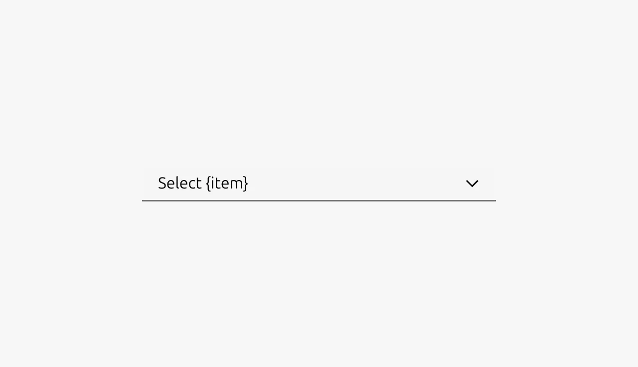
Select
Select components allow users to choose a single option from a list of choices, mostly in forms. Selects are ideal when users need to pick from a predefined set of options where displaying all choices at once would consume too much screen space.
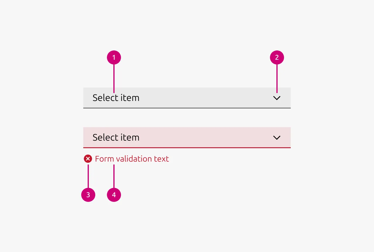
Anatomy
Usage
Select allows users to choose a single option from a list of mutually exclusive choices. They're particularly effective for saving screen space when presenting 4 or more options, as they collapse choices behind a single control until activated.
The selected value should always be visible in the collapsed state, providing clear feedback about the current selection. When no selection has been made, use descriptive placeholder text that guides users on what to choose (e.g., "Select a country" or "Choose payment method").
Selects work best for selections that require deliberate choice, such as form inputs where changes are confirmed through a submit action. They should not be used for anything that will have an immediate effect. For example actions that filter or manipulate the current view. In those cases, use a Button with a dropdown menu instead.
Organizing options
For longer lists, reduce cognitive load by grouping related items. This helps users scan and find options more efficiently. In HTML this could for example be achieved by using so called optgroup elements. This HTML element can be used by developers to group related items. You can also add visual separators between groups by including disabled items with separator characters. When in doubt ask a developer friend how this can be achieved.
When to use
- Selecting from 4 or more mutually exclusive options
- Form inputs requiring a single choice from a predefined list
- When screen space is limited and options don't need to be visible at all times
- For selections that require deliberate commitment and confirmation
When not to use
Properties
| Name | Type | Required | Description | Constraint | Options | Default option |
|---|---|---|---|---|---|---|
| Select options | object | Yes | The list of options a user can select from. | - | - | - |
| Validation state | single select | No | Wether the component is in a validation state and if provided in which validation state the component is. | - | warning, error, success | - |
| Validation text | string | No | The text that is shown if the select is in a validation describing the reason for the validation state. | - | - | - |
Change log
| Who | When | What |
|---|---|---|
| Maximilian Blazek | 21.11.2025 | Initial commit |
| Maximilian Blazek | 13.02.2026 | Added links |
| Daniel Mutis | 03.12.2025 | Reviewed. Approved with comments. |
| Maximilian Blazek | 01.12.2025 | Added description, anatomy description, usage guidelines and properties |