
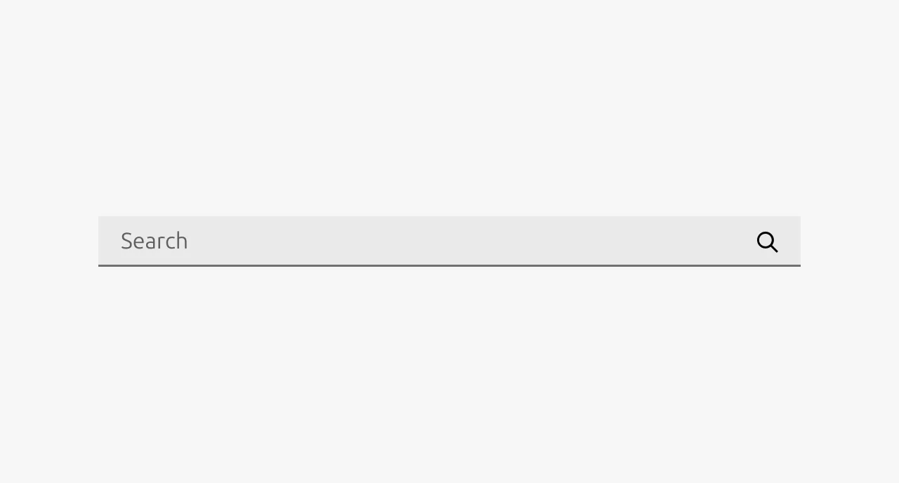
Search
The search component serves as the entry point to a search experience, allowing users to quickly find and access content by specifying a word or phrase rather than manually navigating through an interface. It is almost always used in conjunction with other components that enrich the search experience and display results. Search is well-suited for documentation sites, dashboards, and marketing websites where users need to locate specific items efficiently. Use this component when users would benefit from a faster alternative to manually browsing and scrolling through content.
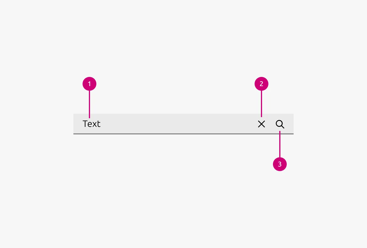
Anatomy
Usage
The Search component provides users with a text input field to query and locate content within an application. It consists of an input field, a Search icon for visual affordance, and a Clear icon to reset the query. This component is well-suited for applications with substantial content where users benefit from quickly finding specific items, such as documentation sites, marketing sites and data-heavy dashboards.
Instant search vs submit-based search
The choice between instant search and submit-based search should be driven primarily by performance considerations. If the expected time for a search to execute exceeds one second, submit-based search is the appropriate choice. When search results can be returned in under one second, instant search may be considered.
Instant search provides an improved user experience by making the application feel more responsive and real-time. This approach works best when searching small, well-defined domains such as settings menus, available actions, or filtered lists. Implementing a debounce on the input is optional but can help reduce unnecessary requests during rapid typing.
Submit-based search is appropriate when search performance cannot meet the responsiveness threshold required for instant search, or when the search domain is large and not well-defined. Examples include searching across an entire website, application, or external database where query execution inherently requires more time.
Suggested searches drawer
Suggested search queries are presented in a drawer. They are only compatible with submit-based search. This feature displays possible queries to help users compose their search terms and understand available syntax. As the user types, the component can prefetch results based on the current partial query and display a summary of potential matches. This approach bridges the gap between the immediacy of instant search and the intentionality of submit-based search by providing feedback without committing to a full search execution.
Results display
Search results can be presented in several locations depending on context:
- Current page: Displaying results on the current page is appropriate when searching within content that is already visible, such as filtering rows in a Table or narrowing items on a listing page. This approach is also the standard for instant search implementations where results update in place.
- New page: Results should be displayed on a new page when the content being searched is not currently visible in the interface, such as a global site search that spans multiple sections or content types.
- Drawer: Presenting results in a drawer is suitable for instant search scenarios where an overlay provides quick access to matches without navigating away from the current context. In all display modes, highlighting matched strings within results helps users quickly identify why each result was returned.
Clear icon behavior
The Clear icon resets the search query, but its broader effect depends on the search type in use. With instant search, clicking the Clear icon also clears the displayed results, returning the interface to its pre-search state. With submit-based search, the clear button removes the query text but does not affect previously submitted results, as those results represent a completed action. When submit-based search is combined with a suggested searches drawer, the Clear icon dismisses the suggestions and returns the drawer to its default state.
Keyboard navigation
A well-designed search experience must be centered around keyboard interaction. Users should be able to complete their entire search workflow, including composing queries, reviewing suggestions, and selecting results, without reaching for a mouse. Click-dependent search interfaces introduce unnecessary friction and slow users down.
Placement
The placement of a search component should reflect the scope of content it searches:
- Global: When search spans an entire application or website, the component belongs in the global navigation where it remains persistently accessible regardless of the current page.
- Page: For search that applies to the content of a single page, position the component at the top of that page above the searchable content.
- Subsection: When search targets a specific subsection, such as a panel or module within a larger page, place the search input directly above that subsection to clearly communicate its scope.
When to Use
- The application contains substantial content that users need to locate quickly
- Users have a specific item or piece of information in mind and need to find it efficiently
- Content is distributed across multiple pages, sections, or categories
- The interface includes filterable lists, Tables, or collections that benefit from query-based narrowing
- Users are likely to repeat searches or refine queries during a session
When Not to Use
- The content set is small enough that users can scan it without assistance
- If filters better serves the use case
- The application lacks sufficient content to warrant a dedicated search function
- Users are engaged in a guided flow where search would interrupt the intended progression
- The data structure does not support meaningful text-based querying
Properties
| Name | Type | Required | Description | Constraint | Options | Default option |
|---|---|---|---|---|---|---|
| Placeholder text | string | No | The placeholder text should specify what the scope of the search is. It should always include the word e.g. “Search machines”. | Include “Search” at the beginning of the placeholder string. | - | Search |
| State | single select | No | - | - | default, hover, active, disabled | default |
Change log
| Who | When | What |
|---|---|---|
| Maximilian Blazek | 21.11.2025 | Initial commit |
| Maximilian Blazek | 13.02.2026 | Added links |
| Maximilian Blazek | 05.01.2026 | Added description, anatomy, usage guidelines and properties |