
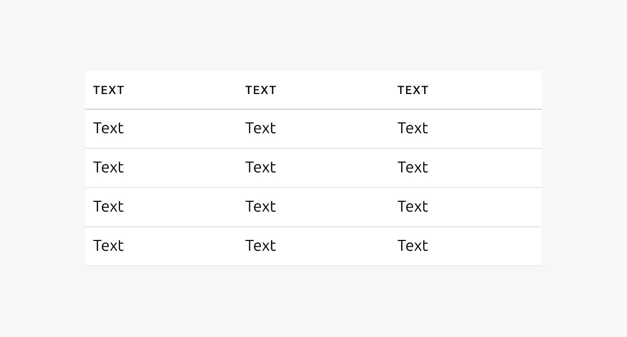
Table
A table displays data in rows and columns. This structured format helps users review and compare large data sets efficiently. The table is a static component suited to presenting data without complex interactions. For advanced needs – pagination, selection, bulk actions, filtering, sorting, and grouping – use the data table (Apps tier) instead. Sites tier products typically use this table. However, if a use case requires richer functionality, refer to the data table documentation.
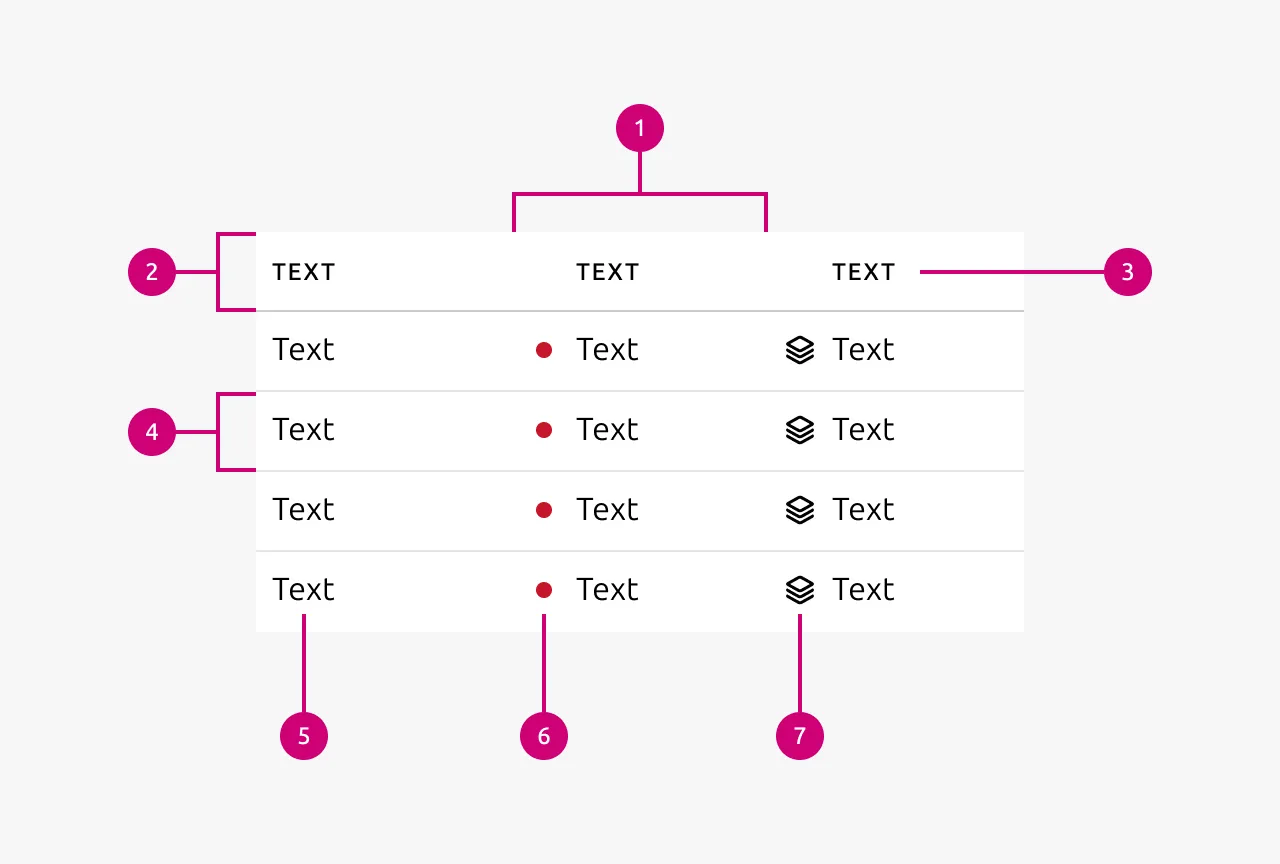
Anatomy
Usage
Use a table to display data where items share two or more characteristics and belong together as a group. Rows represent items, and columns represent their characteristics. Tables work best when all items share the same set of characteristics, allowing users to compare across rows.
When to use
- Entities share multiple characteristics and group together under a common category
- Cross-row comparison is meaningful to the user
- The user needs to locate or compare specific data points within a known dataset
When not to use
- Two datasets have different structures. Do not force them into a single table.
- The user needs to browse or explore content without a specific goal. Consider cards for exploratory content, or a list for smaller volumes of data.
- The use case involves complex interactions such as bulk selection, filtering, multi-column sorting, or pagination. Use the data table (Apps tier) instead.
Columns
Align columns to the grid where possible. If that is not feasible, size columns to fit their content. Consider the available space when deciding how many columns to include. Display only the information the user needs at that moment. Keep column headings short, typically one to two words, and ensure they describe the column content.
Cell content
Chips, icons, and linked text are permitted within table cells. Use linked text for navigation only, not as calls to action. Right-align numbers when users need to compare values across rows. Left-align numbers when comparison is not the intent. Do not apply semantic color to cell text. Use icons or status indicators to convey semantic meaning instead.
Sorting
Tables support sorting on a per-column basis. Designers decide which columns should be sortable. Do not enable sorting on every column. Apply sorting where the data has a meaningful order, such as status categories, dates, or alphabetically significant values. Columns with unordered data do not warrant sorting.
Pagination
Combine a table with simple pagination when the number of rows would overwhelm the user. Pagination is particularly useful when content appears below the table. Without it, a large number of rows can push that content out of the viewport. Paginating the table reduces its vertical size and keeps the surrounding content visible.
Mobile
On mobile, consider converting a table into cards if doing so improves usability. Do not convert tables to cards if it reduces the ability to compare items.
Properties
| Name | Type | Required | Description | Constraint | Options | Default option |
|---|---|---|---|---|---|---|
| Rows | number | Yes | The number of rows of the table | - | - | - |
| Columns | number | Yes | The number of columns of the table | - | - | - |
| Column type | single select | Yes | The type of data displayed in the column | - | Default, icon, status | Default |
| Header cell text | string | Yes | The text that indicates what type of data the column displays | - | - | - |
| Body cell text | string | Yes | The text inside an individual cell | - | - | - |
| Cell status color | single select | No | The color of the status indicator on status columns | - | Default, negative, positive, warning, information | Default |
| Cell icon | single select | No | The icon accompanying the text of a cell | - | Vanilla icons | - |
Change log
| Who | When | What |
|---|---|---|
| Maximilian Blazek | 21.11.2025 | Initial commit |