
Table of contents
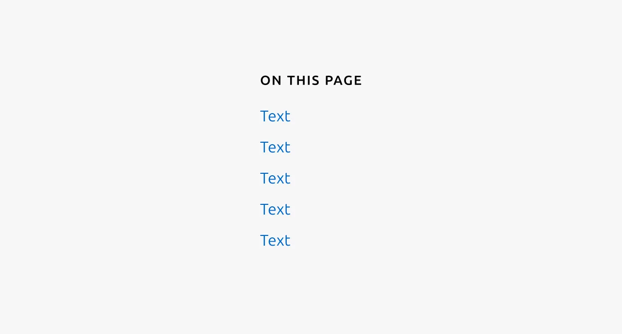
The table of contents is a navigational component consisting of a series of anchor links that correspond to sections within a page. When clicked, each link scrolls the user to the relevant section of content. This component is typically used on pages with substantial content, such as documentation or long-form articles, where users benefit from being able to quickly locate and jump to specific information without manually scrolling through the entire page.
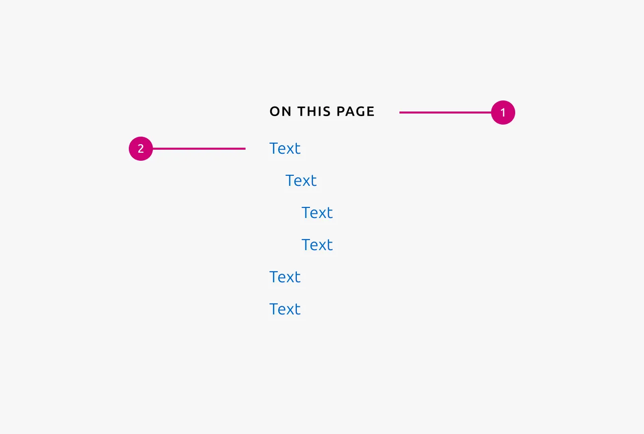
Anatomy
Usage
The table of contents is a navigational component consisting of Anchor links that allow users to navigate lengthy page content. When a link is selected, the page scrolls to the corresponding section. This component is intended to support users on content-heavy pages by enabling them to discover the page structure at a glance and quickly identify which sections are most relevant to their needs.
The table of contents is predominantly suited to text-based pages such as marketing sites and documentation. It is designed to represent the contents of an entire page, not a subsection of it.
This component is not intended for use within applications. If you find yourself considering a table of contents within an app because the page contains numerous sections, this is typically an indication that the information architecture should be reconsidered.
Heading levels
The table of contents should represent only higher-level headings, not every heading present on the page. The component supports headings from h2 to h4, allowing for up to three levels of indentation.
The number of heading levels displayed must be configured at the site or documentation set level, not on a page-by-page basis. Be mindful of which Anchor links genuinely aid navigation. Excessive levels can introduce noise and diminish the component's usefulness rather than enhance it.
Scroll behaviour
When an Anchor link is activated, the scrolling action should be animated to provide visual feedback and a sense of transition. The target heading should have 2.5rem of space above it once scrolled into view, preventing the heading from appearing awkwardly flush against the top of the viewport.
When to use
- On pages with substantial content where users benefit from an overview of the page structure
- When users are likely searching for specific information and need to identify the relevant section quickly
- On documentation pages, long-form articles, or similar text-heavy content
When not to use
- On pages with minimal content where navigation is unnecessary
- Within applications. Consider revising the information architecture instead
- On pages primarily composed of non-textual content such as data Table or media galleries
- To represent only a portion of a page's content
Properties
| Name | Type | Required | Description | Constraint | Options | Default option |
|---|---|---|---|---|---|---|
| Levels | single select | No | How many levels of anchor links to show. | - | 1, 2, 3 | 1 |
Change log
| Who | When | What |
|---|---|---|
| Maximilian Blazek | 21.11.2025 | Initial commit |
| Maximilian Blazek | 13.02.2026 | Added links |
| Daniel Mutis | 15.12.2025 | Add description, usage guidelines, properties and anatomy description |