
Notification
Notifications display brief, contextual messages to inform users about system status, user actions, or important updates. They typically appear temporarily and can convey success, error, warning, or informational states to provide immediate feedback without disrupting the user's workflow.
Anatomy
Usage
Notifications should be used sparingly and strategically to communicate important information that requires immediate user attention. Use notifications carefully because they catch the user's attention and disrupt their workflow.
Avoid using notifications for information that doesn't require interrupting the user or isn't relevant to their current task. When notifications with irrelevant information are sent too frequently, users become distracted and annoyed, causing notifications to lose their impact.
Keep messages concise and actionable, ensure proper timing and placement, and provide clear next steps when user action is required.
Where to position a notification
Historically a lot of our applications and sites have placed notifications in the same container as the main content. Often times this is not desirable as this causes unwanted layout shifts and pushes the content that the user is interested in (the main content of the page) outside of the viewport. Ideally the notification would be floating in the bottom right of an application where it does not disrupt the normal content flow.
When to use
- Provide immediate feedback after user actions that aren't immediately visible on the interface
- Communicate changes in system or application state that affect the user's workflow
- Alert users to information that requires their attention or response within a specific timeframe
- Confirm completion of background processes or long-running operations
When not to use
- Information is already clearly displayed and accessible elsewhere on the current page
- Content is promotional, marketing-focused, or not directly related to the user's current task
- The information can wait until the user's next natural interaction with the relevant feature
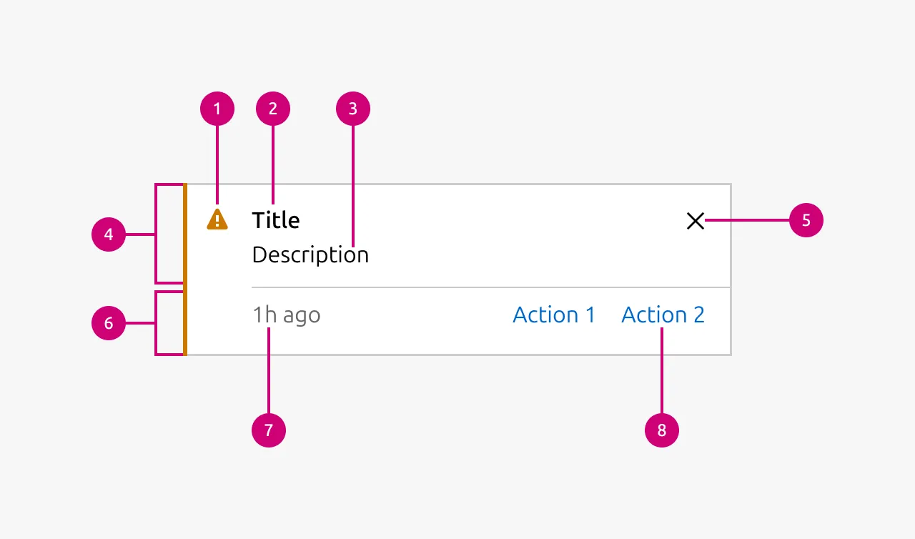
Properties
| Name | Type | Required | Description | Constraint | Options | Default option |
|---|---|---|---|---|---|---|
| Type | single select | Yes | What semantic type the notification is. | - | information, negative, positive, caution | - |
| Border | boolean | No | Wether the notification has a border or not. Borderless notifications are used for example in Table. | - | true, false | true |
| Inline | boolean | No | Wether the title and description of the notification are being shown in one line. reduces the overall height of the notification allowing it to be used where space is at a premium. | - | true, false | false |
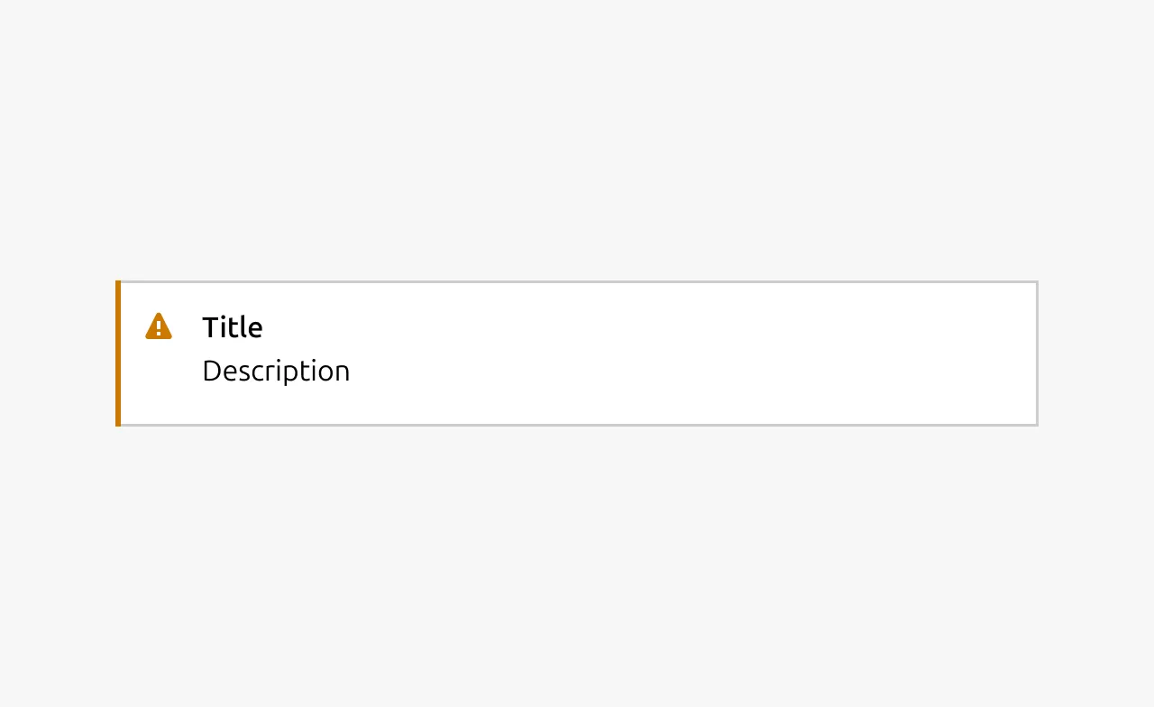
| Title | string | No | Sets the content of the title. | - | - | - |
| Description | string | No | Sets the content of the description. | - | - | - |
| Dismissible | boolean | No | Wether or not the notification can be dismissed. If it can be dismissed the dismiss button is being shown. | - | true, false | true |
| Actions | slot | No | Allows to give associated actions with the notification. | Action link components | - | - |
| Time stamp | string | No | Can be set to the timestamp when the event when that triggered the notification took place. | Date formatted string | - | - |
Change log
| Who | When | What |
|---|---|---|
| Maximilian Blazek | 21/11/2025 | Initial commit |
| Maximilian Blazek | 13/02/2026 | Added links |